Case Study
An automated notification messages editor
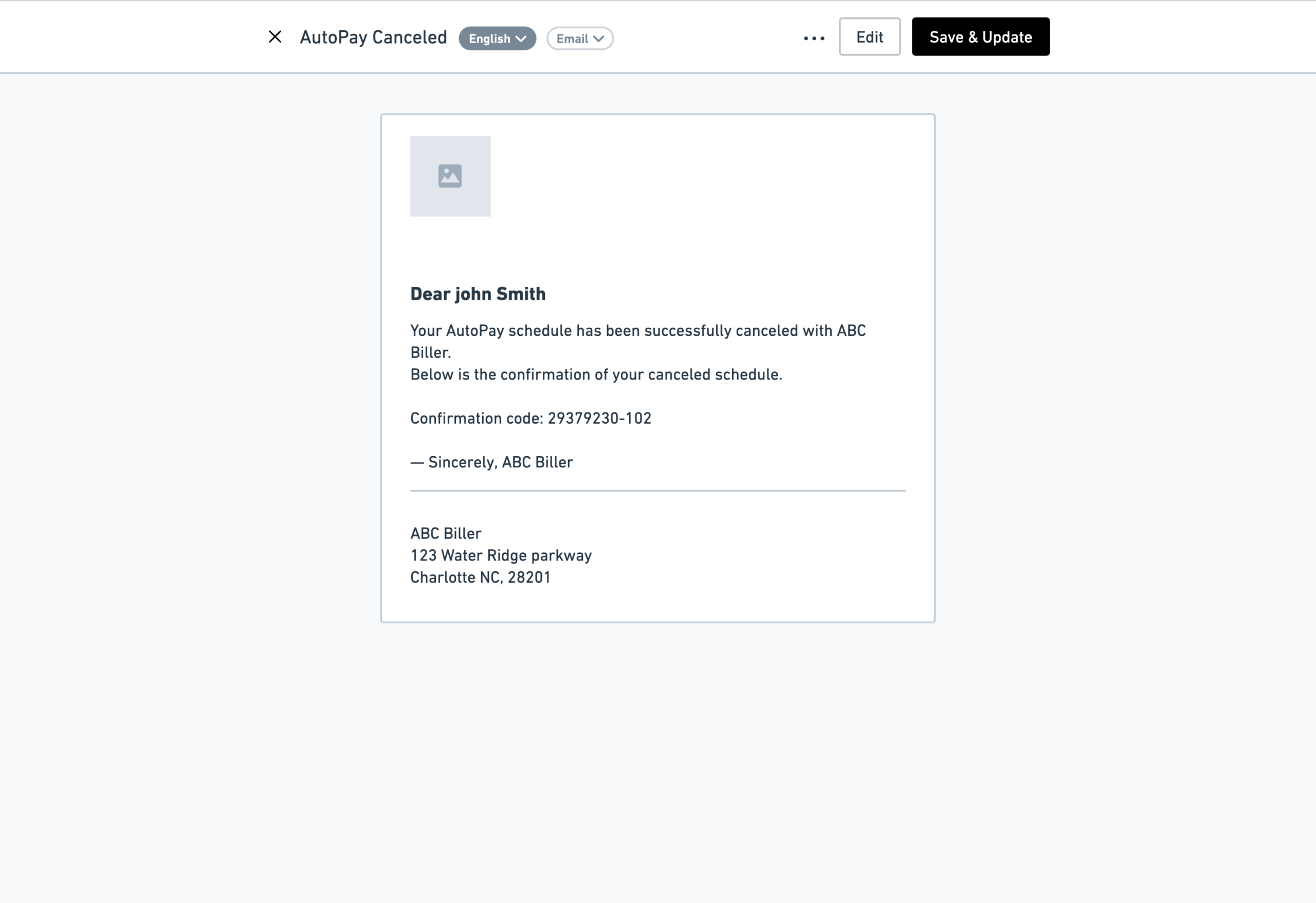
An intuitive email and SMS notification content editing experience for Paymentus' self-service customers, enabling them to edit the messages to better align with their brand voice identity.
Designing a self-service notification management experience that eliminated a costly support workflow
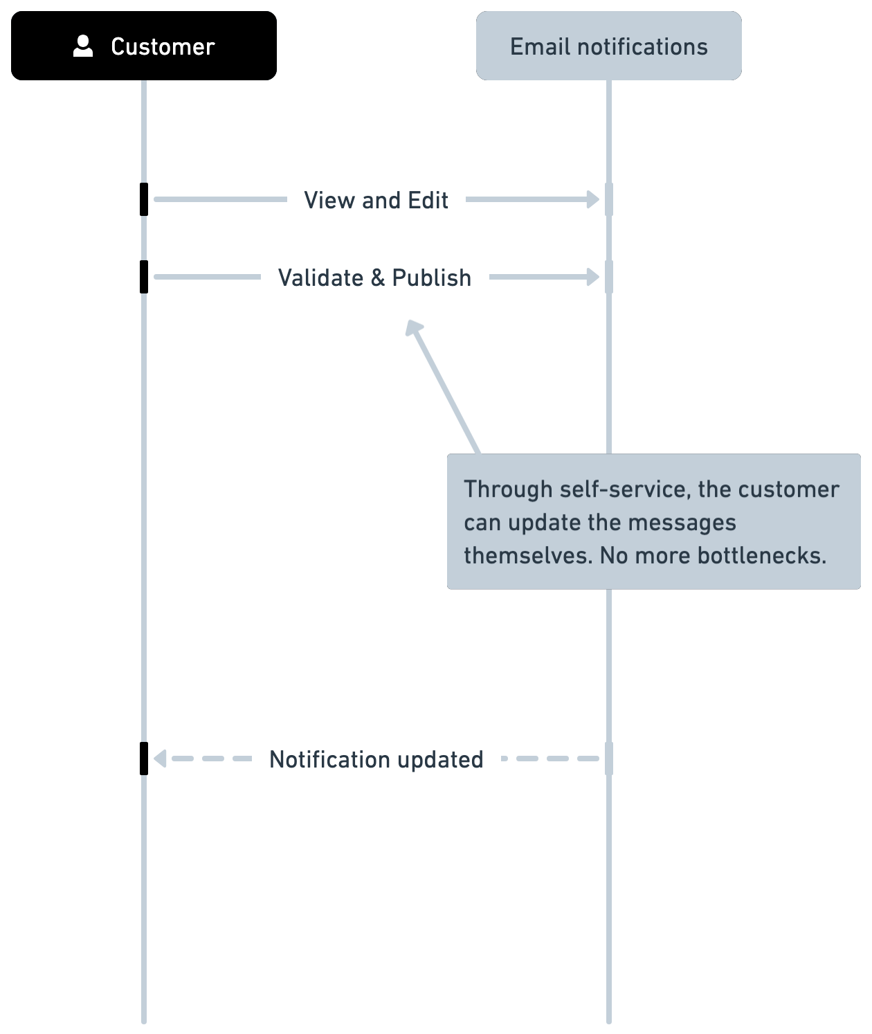
Paymentus customers relied on implementation teams to customize automated customer notifications such as payment reminders, security alerts, and account status updates. Even minor copy changes required coordination across account managers, support, and engineering, creating unnecessary delays, operational costs, and inconsistent customer experiences.
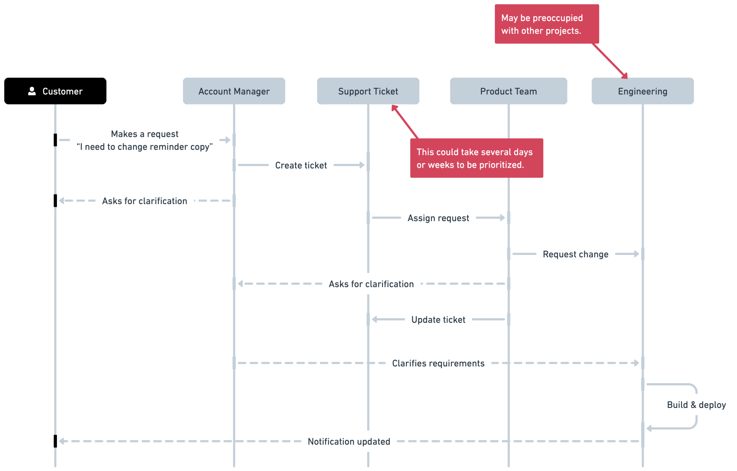
I led the redesign of this workflow by defining a self-service notification management experience that enabled billers to safely customize notification content themselves while respecting technical, compliance, and system constraints.
Improving an existing implementation instead of starting from scratch
Unlike most projects, the implementation already existed before UX became involved. Several architectural and interaction decisions had already been made before I was involved.
Rather than redesigning the product from first principles, I worked closely with Product and Engineering to understand the existing implementation, identify usability problems, and systematically improve the experience while respecting technical constraints and delivery timelines. This required redefining requirements as new usability findings emerged instead of treating earlier implementation decisions as fixed.
Designing for people who weren’t email editors
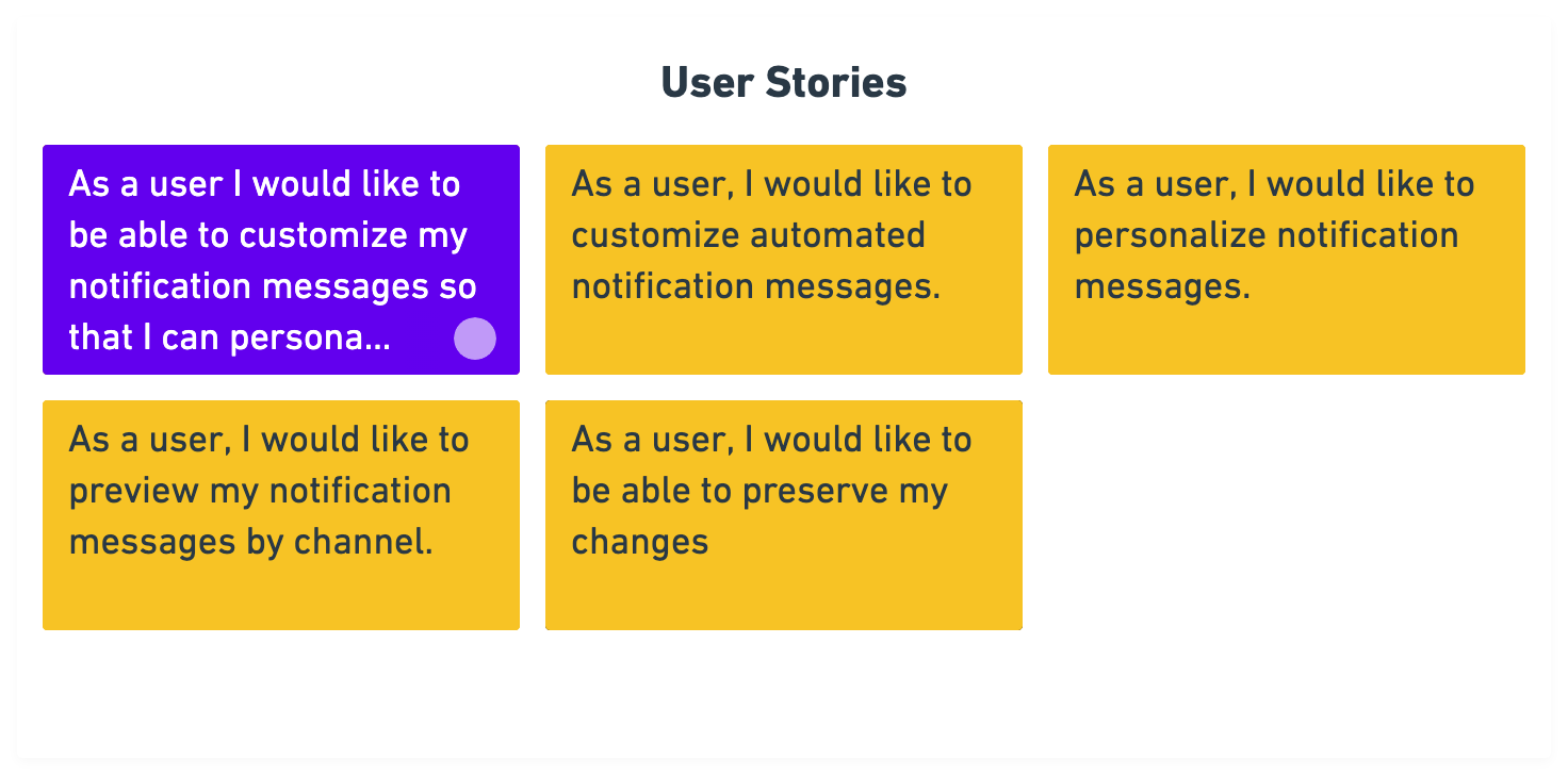
The people configuring notifications weren’t professional writers or email marketers. Most were administrators responsible for configuring billing systems and maintaining customer communications as part of broader operational responsibilities.
The editor therefore needed to prioritize clarity over flexibility. Rather than exposing unnecessary complexity, every interaction was designed to reduce uncertainty, prevent mistakes, and provide enough context for administrators to confidently modify notifications without understanding the underlying implementation.
Discovering where the workflow was breaking down
I began by conducting a heuristic evaluation of the existing implementation and supplementing those findings with feedback gathered from billers and internal stakeholders.
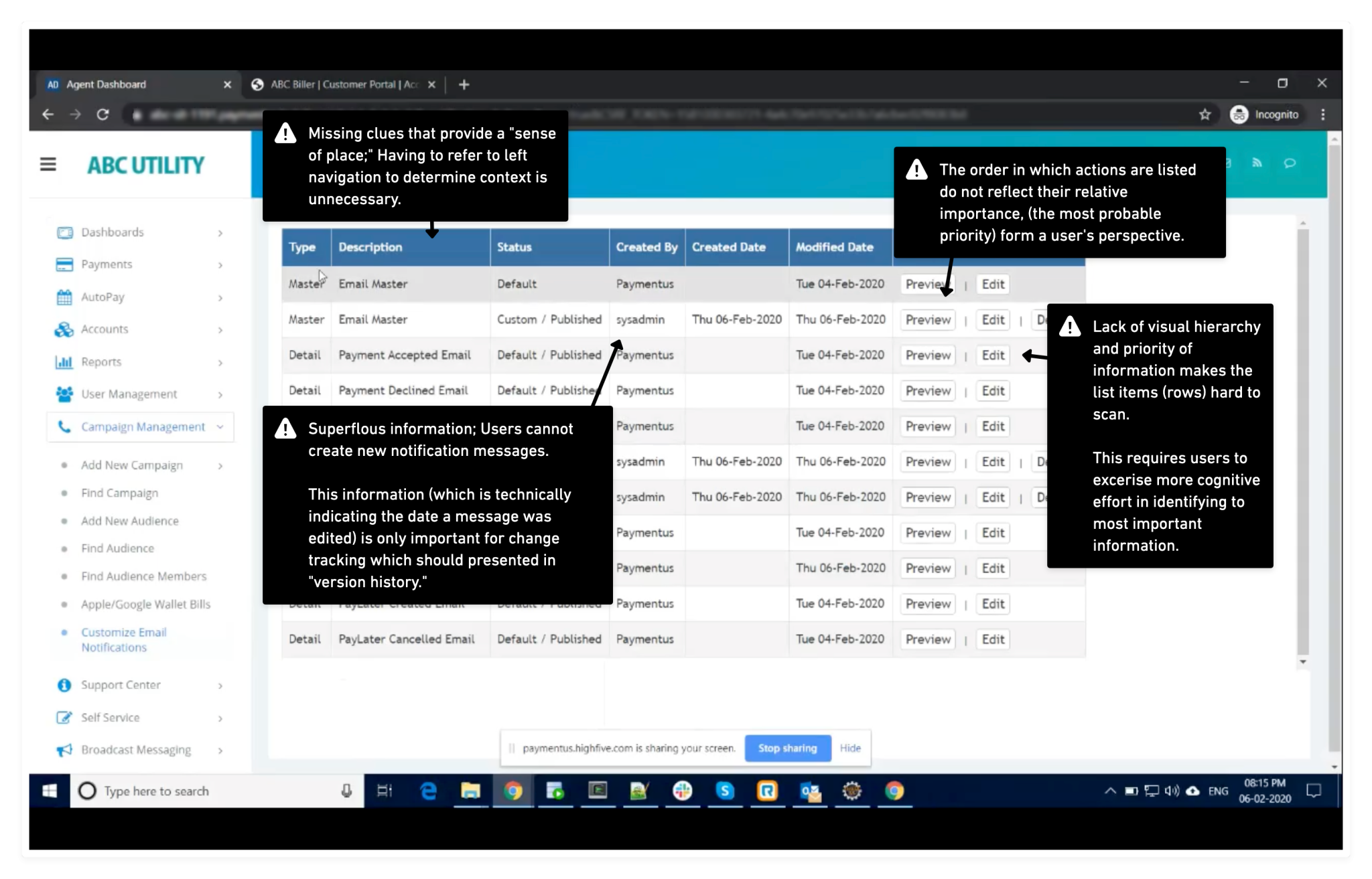
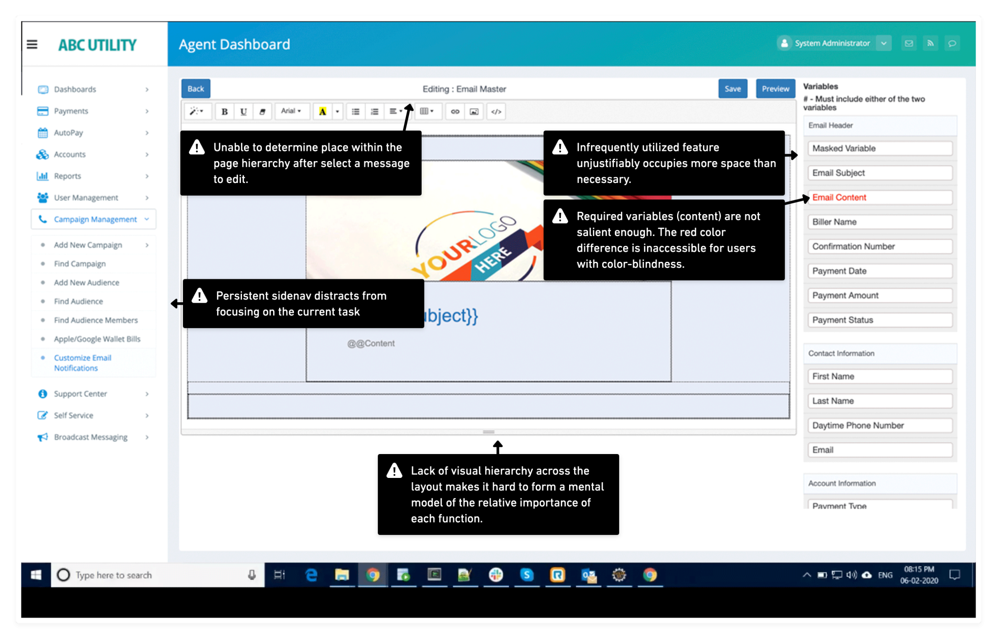
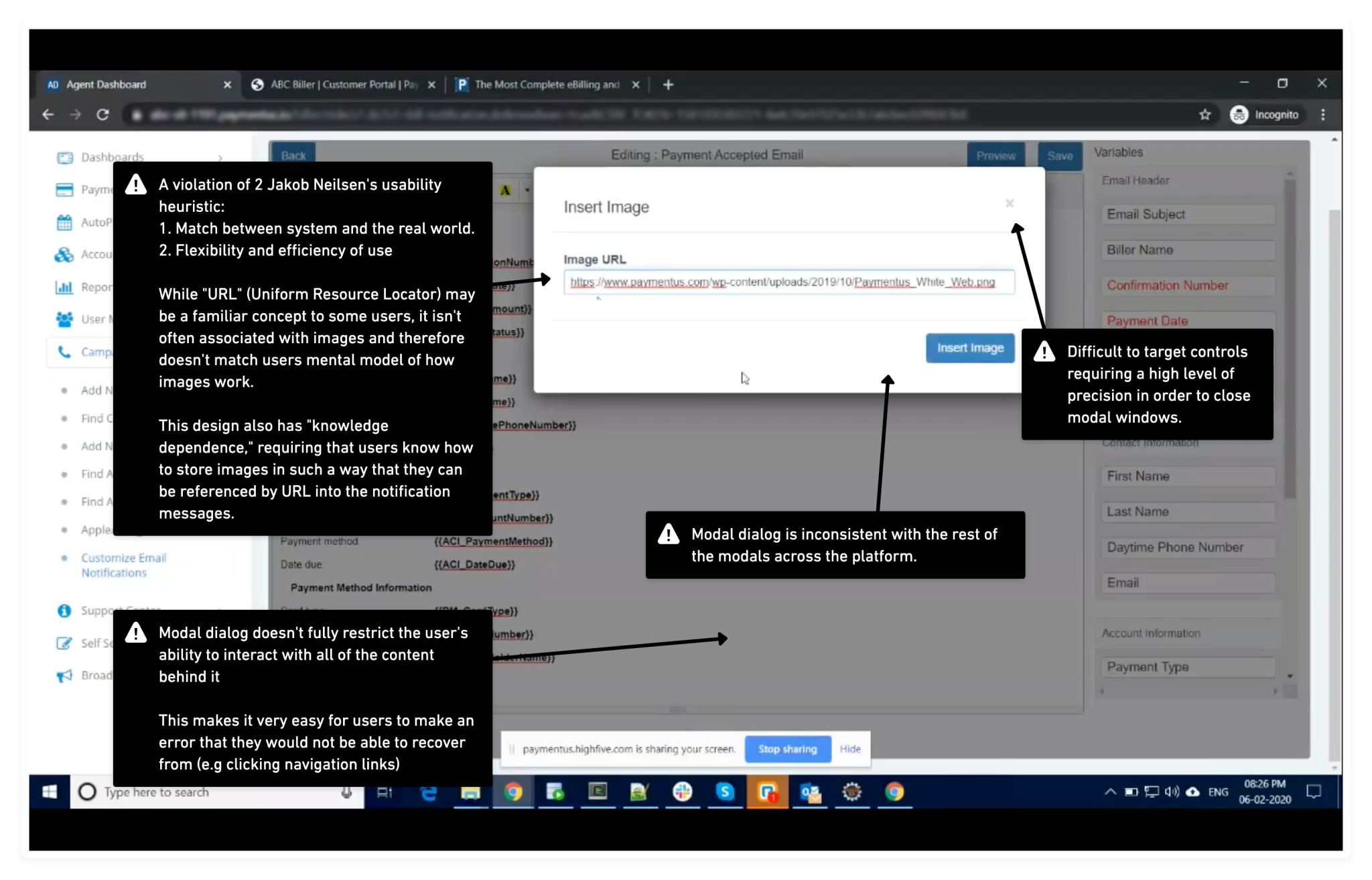
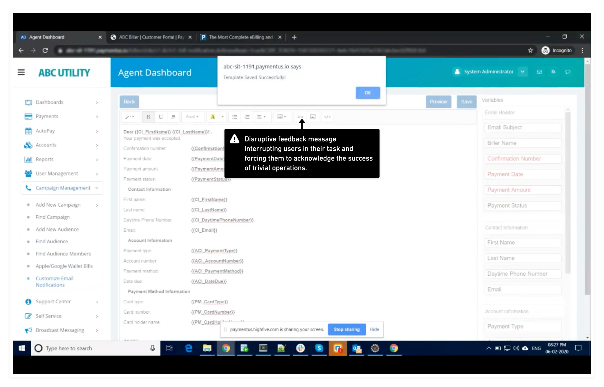
The evaluation revealed recurring usability problems including poor information hierarchy, insufficient system feedback, limited error prevention, inconsistent interaction patterns, and workflows that made users hesitant to publish changes. These observations became the foundation for prioritizing improvements throughout the project.
Supporting safe experimentation through version history
Editing customer-facing communications carries inherent risk. Users needed confidence that changes could be reviewed, compared, and reversed before affecting production systems.
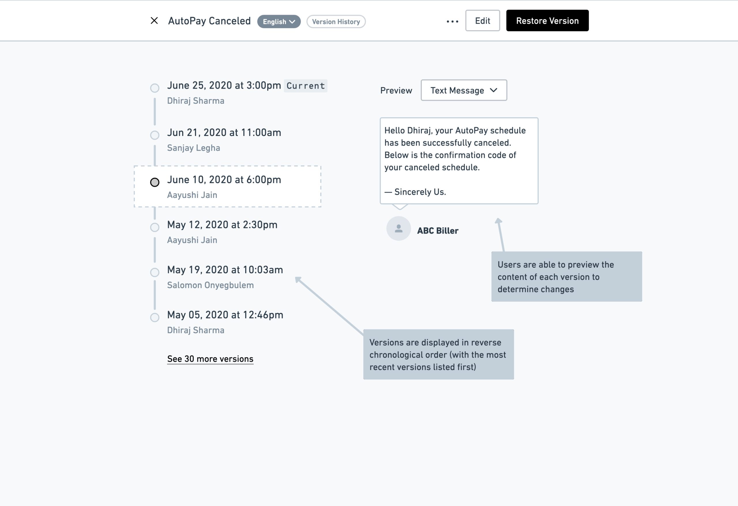
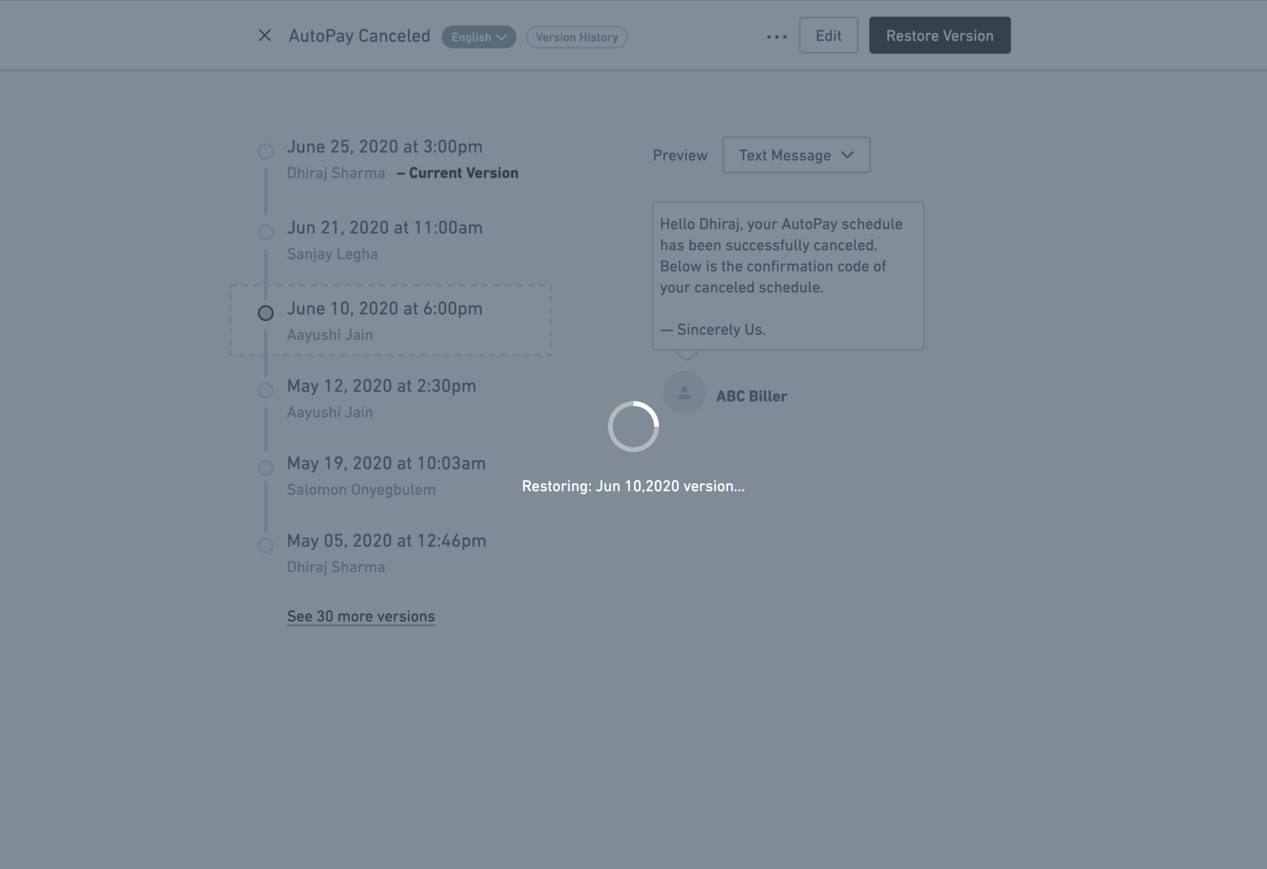
To support this workflow, I introduced version history that allowed administrators to inspect previous revisions, preview historical notification states, and restore earlier versions when necessary. This reduced the perceived risk of making changes while encouraging exploration without fear of permanent mistakes.
Keeping related decisions in context
Editing a notification extends beyond its body content. Subject lines and message content work together to communicate a single customer experience.
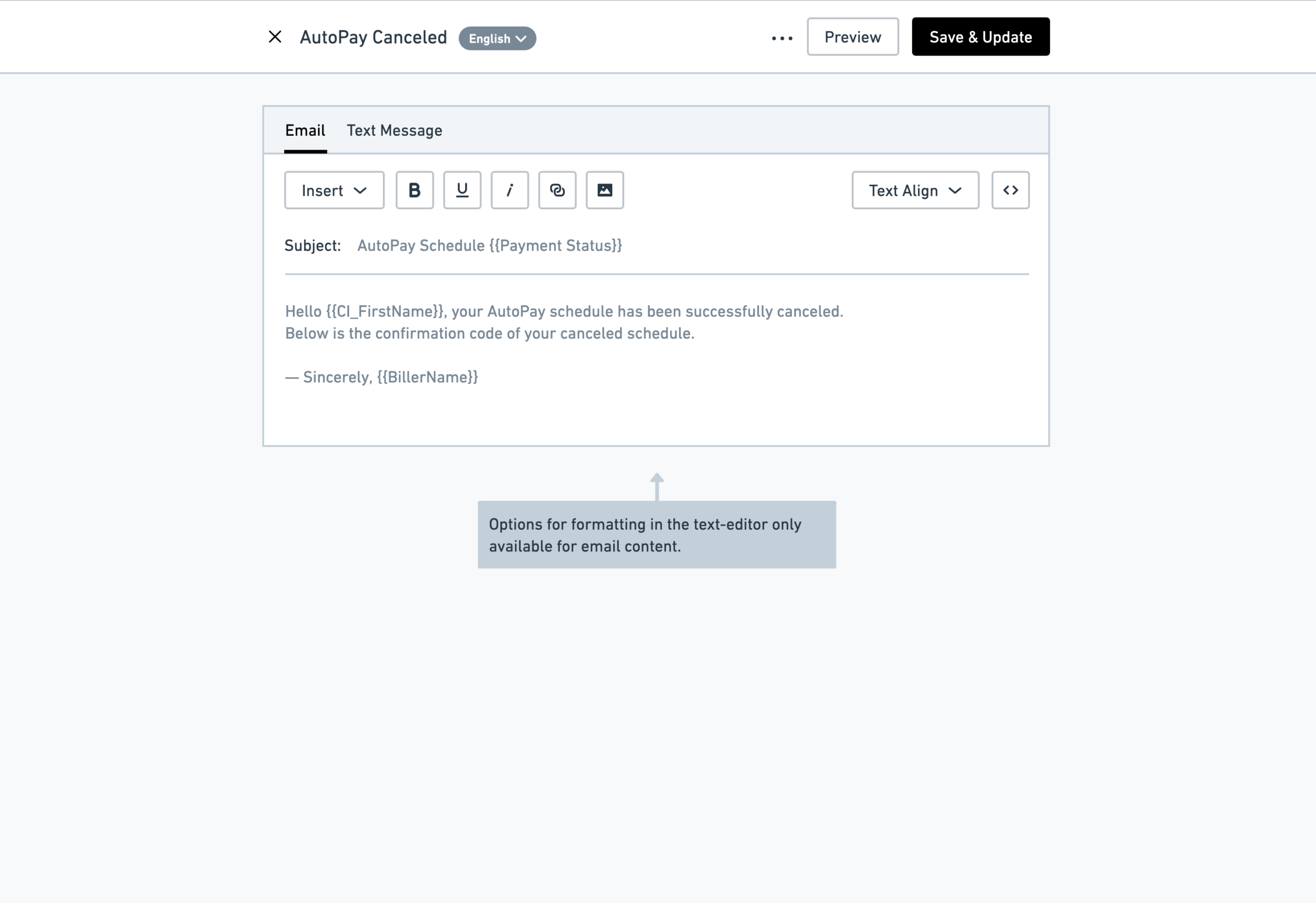
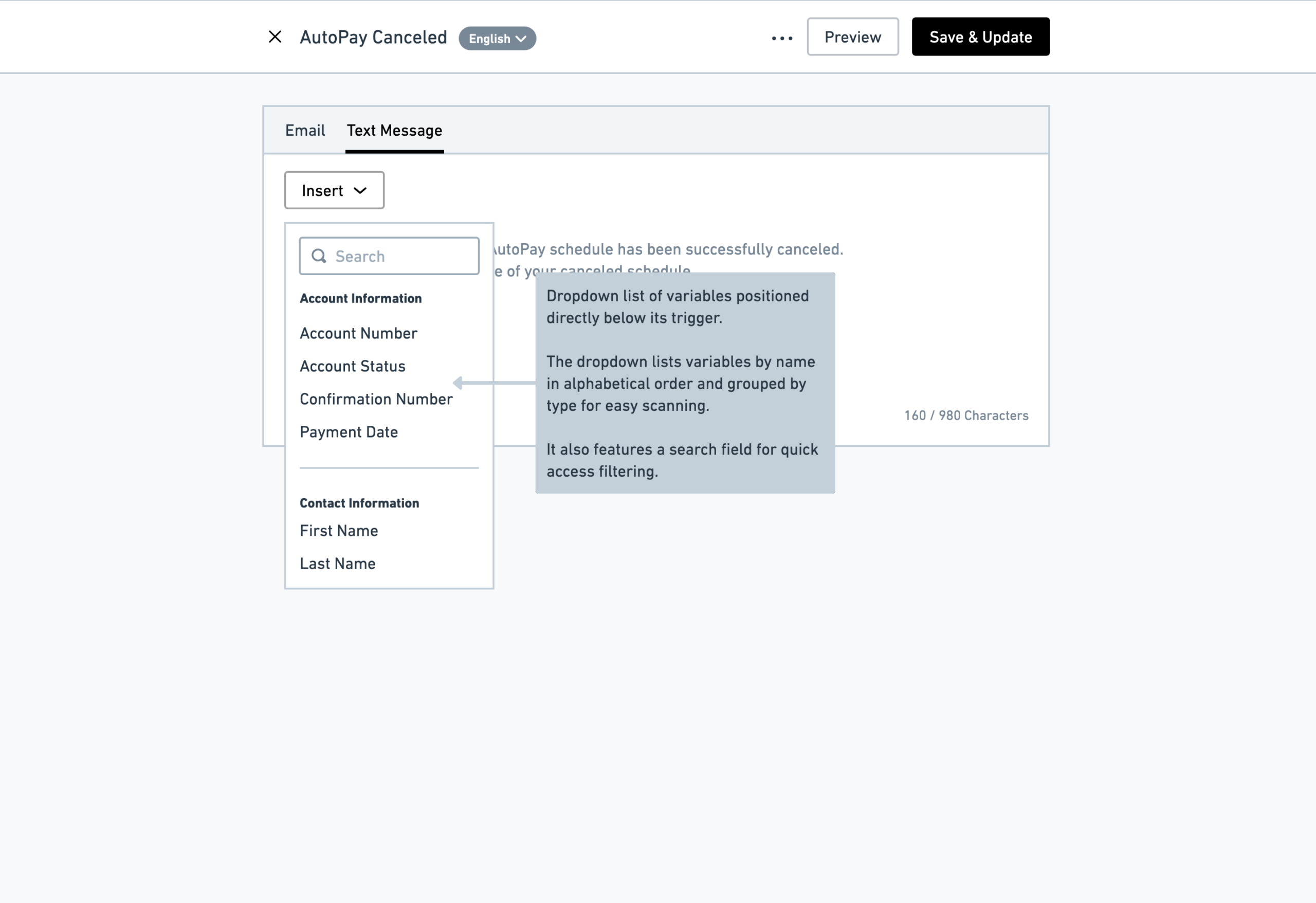
Rather than separating these decisions across different parts of the interface, I designed the editor so subject lines could be modified alongside the notification itself. Keeping these elements together reduced context switching and helped administrators evaluate the complete communication before publishing.
Preventing mistakes before they reached customers
Several interactions were designed specifically to reduce opportunities for user error.
The editor warned users before leaving with unsaved changes, reducing accidental data loss. Publishing and saving operations provided immediate feedback, ensuring users always understood the current system state. Test messages allowed administrators to validate changes before making them available to customers.
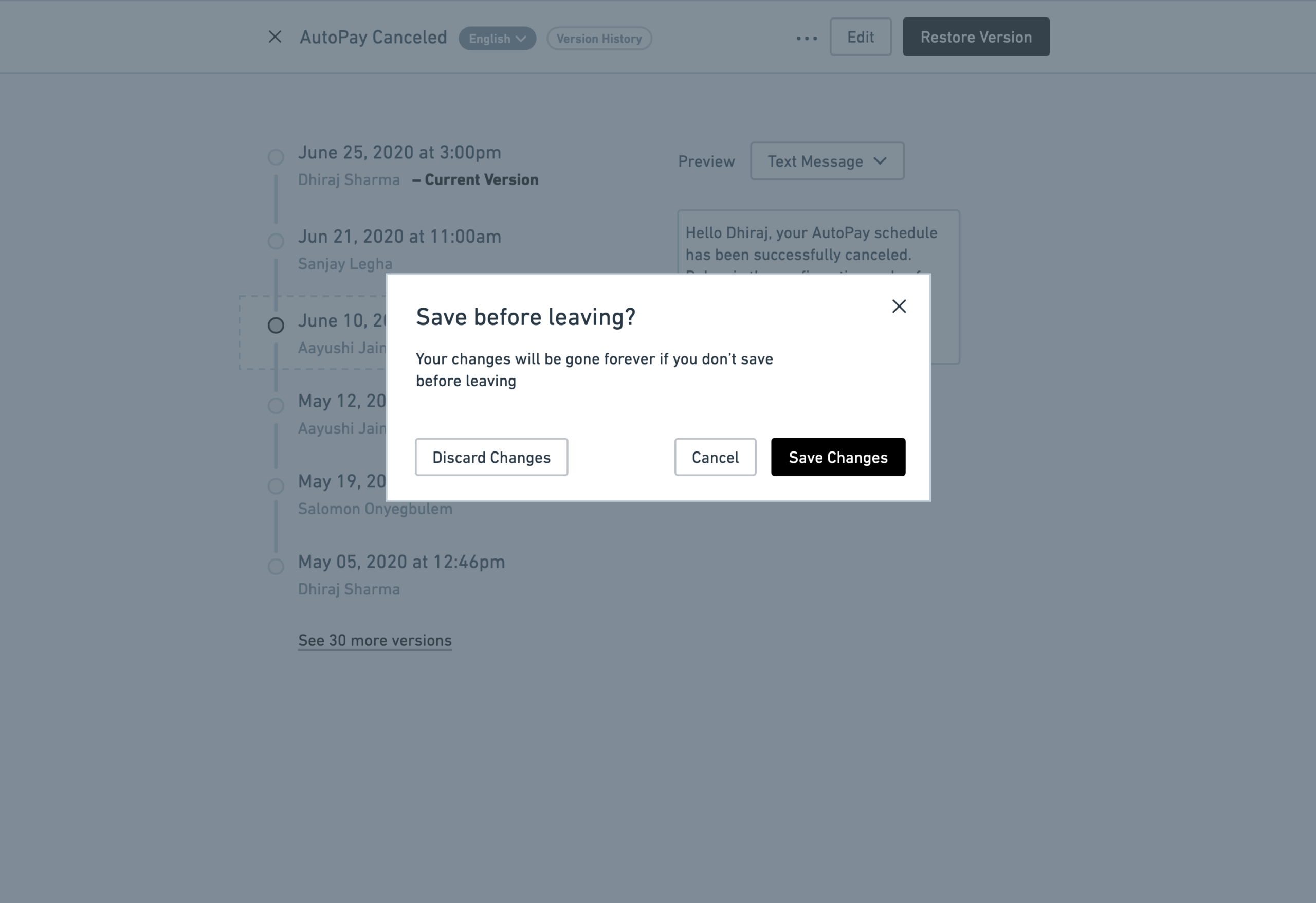


Collectively, these interactions increased confidence while reducing the likelihood of avoidable mistakes
Balancing usability with compliance requirements
One of the most challenging aspects of the project involved reconciling user freedom with business rules.
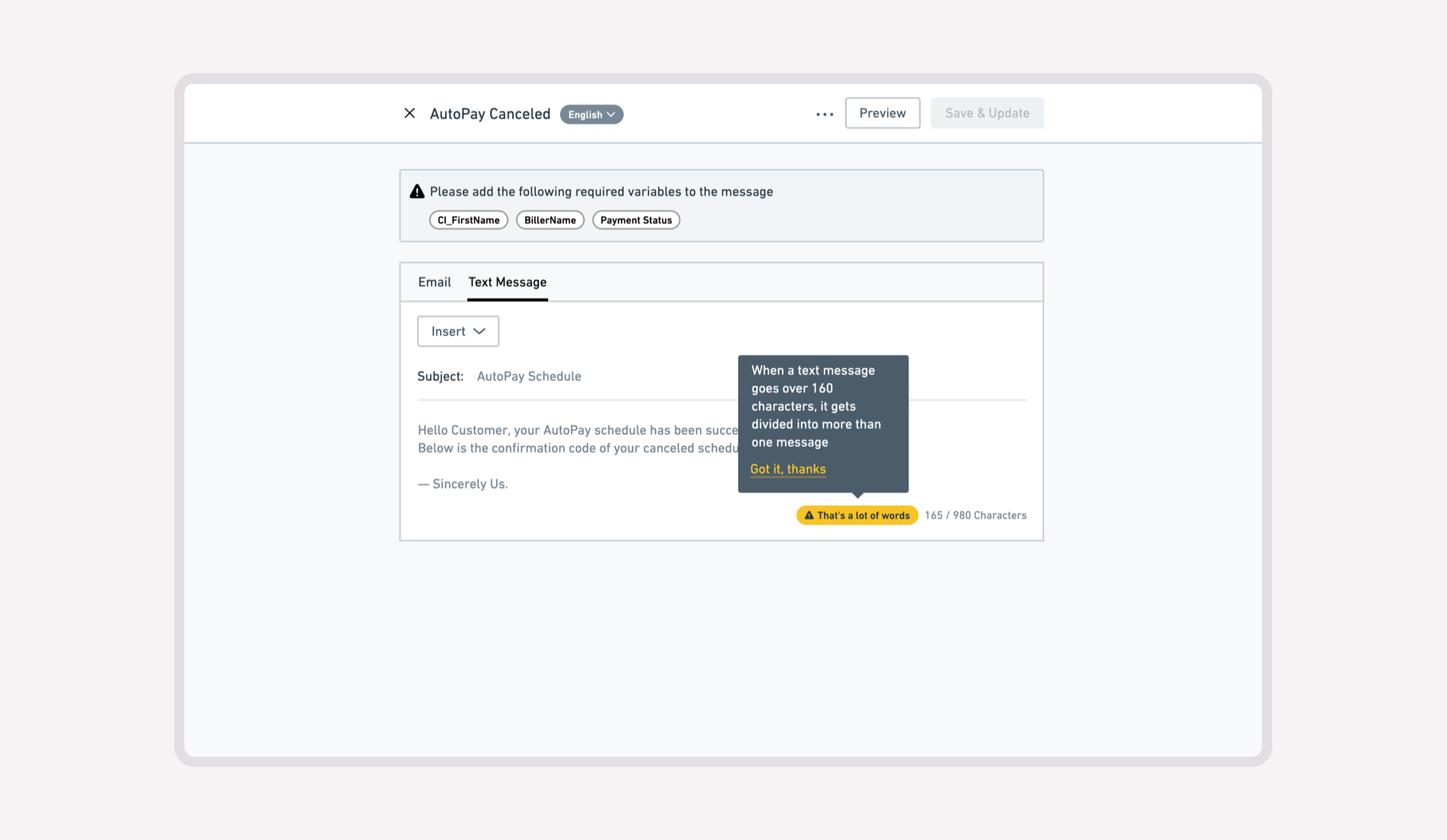
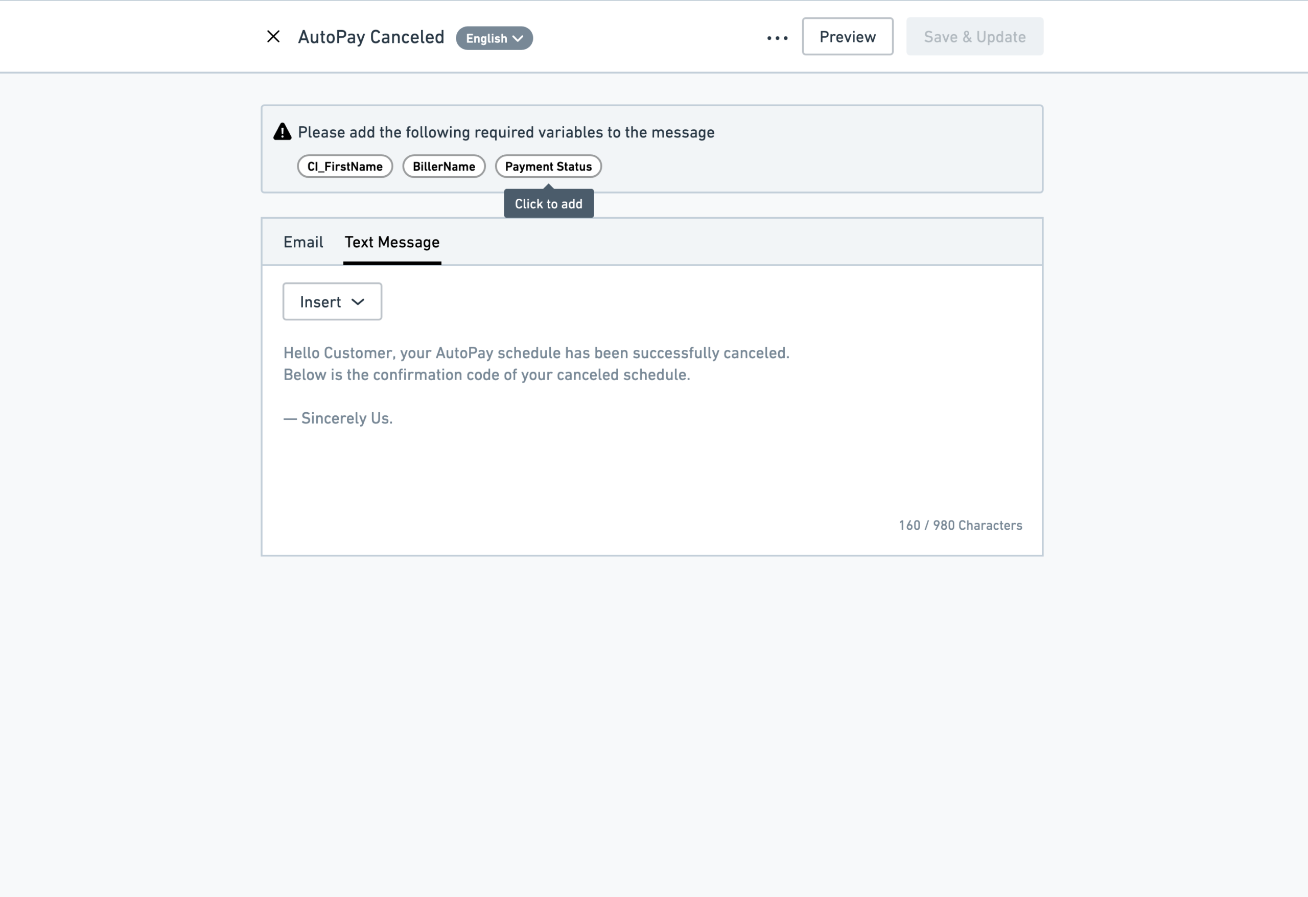
Certain template variables were mandatory for regulatory and operational reasons, preventing administrators from publishing notifications that omitted required information. While this limited user control, removing these safeguards would have introduced compliance risks.
Rather than treating this as a conflict between usability and business requirements, I designed interactions that clearly communicated why publishing was prevented and what users needed to resolve before continuing. This preserved transparency while satisfying system constraints.
Navigating architectural constraints
Time constraints limited the opportunity to conduct comprehensive information architecture research before implementation began. The product nevertheless required a logical location for notification management within an already established administrative interface.
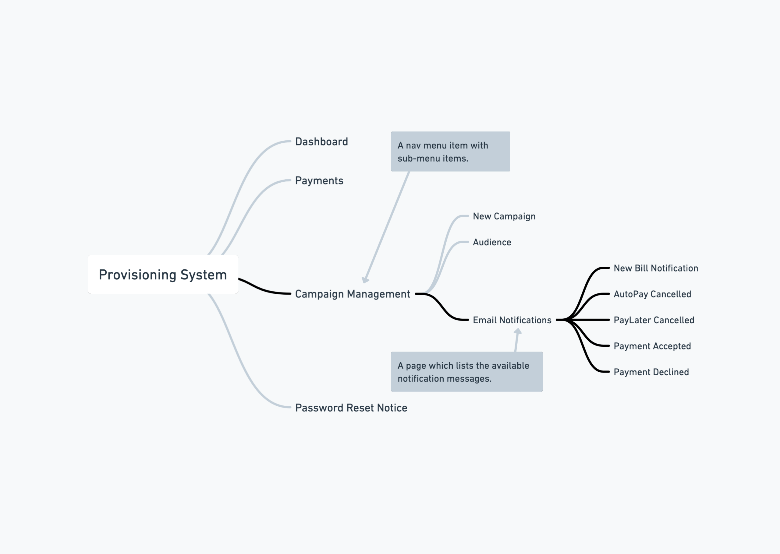
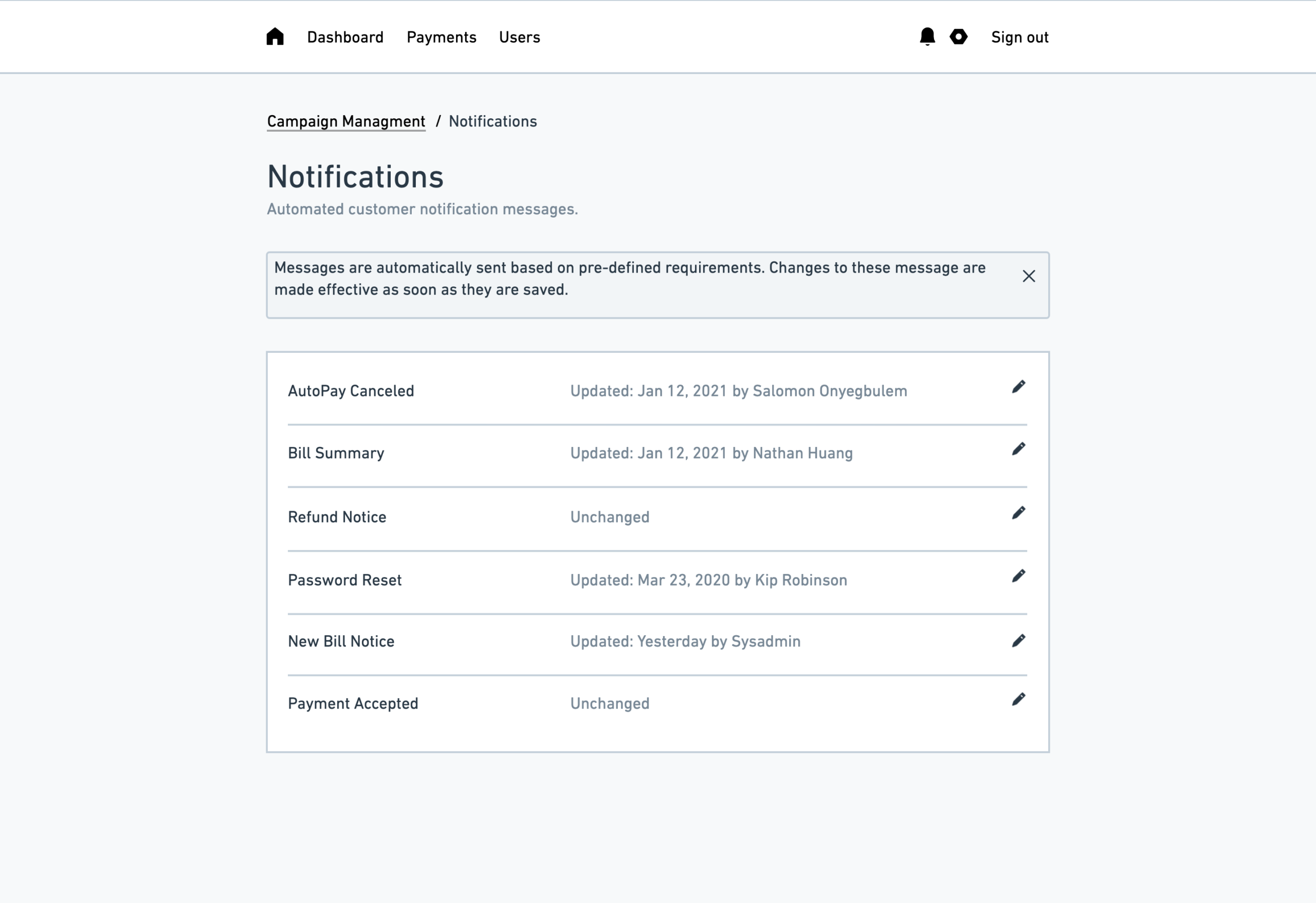
Based on the platform’s existing conceptual model, I introduced Notifications as a sub-section of Campaign Management. Although additional research may have further refined this decision, the placement aligned closely with users’ expectations while maintaining consistency with the surrounding product architecture.
Delivering a scalable enterprise workflow
The finished experience fundamentally changed how customers managed automated notifications. Instead of relying on multiple internal teams to coordinate relatively simple content updates, administrators could confidently edit, preview, validate, and publish notification messages independently.
Beyond improving usability, the project demonstrated how thoughtful interaction design can reduce operational dependency, improve scalability, and enable enterprise customers to accomplish complex administrative tasks with greater confidence and significantly less support.