Case Study
Designing an icon library
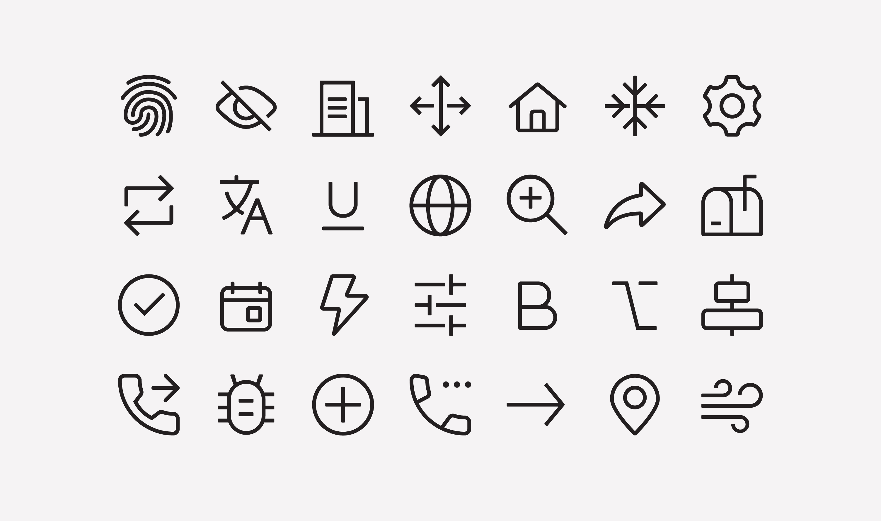
Designing a library of more than 300 icons that became part of Paymentus' design system. To support consistent implementation across products, I also developed a downloadable icon font and partnered with Engineering to drive its adoption across the company's digital payment platform. The icon library remains in active use today.
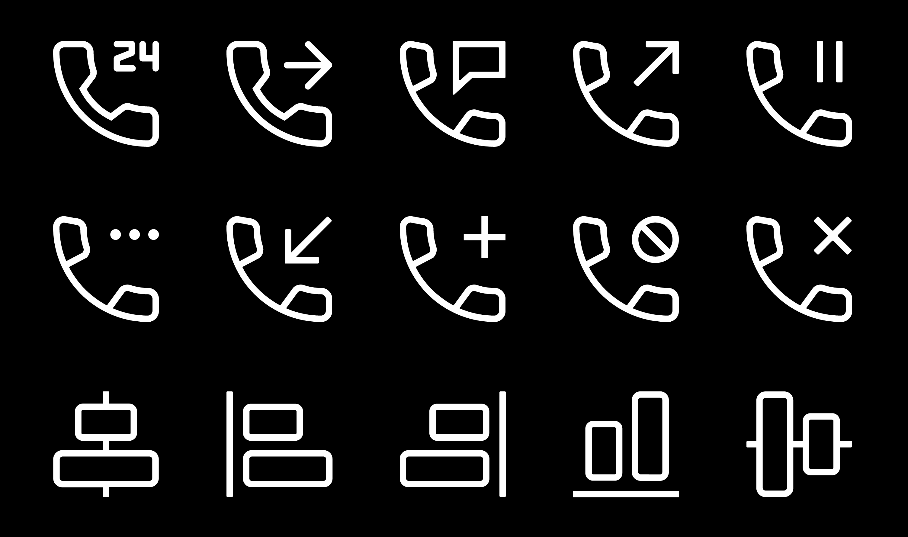
A collection of more than 300 icons designed to provide a consistent visual language across Paymentus’ digital products. The library supports navigation, feature discoverability, and usability while enabling a cohesive user experience.
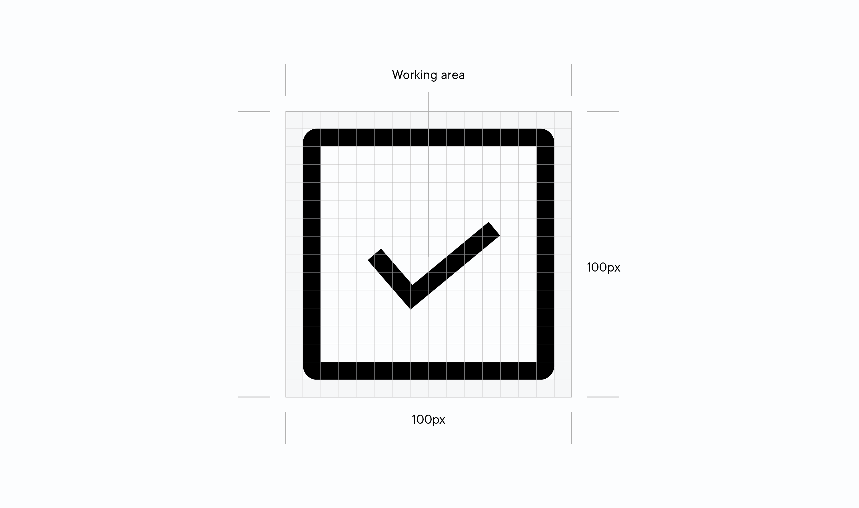
The icon system was built on a consistent 100 × 100 px grid, with each icon aligned to the baseline of the Proxima Nova typeface used throughout Paymentus’ products. Designing the icons around the typography minimized alignment adjustments during implementation and ensured they sat naturally alongside text in production.
Each icon was carefully crafted and optically balanced to ensure consistent visual perception, with subtle geometric adjustments applied where necessary to achieve visual harmony

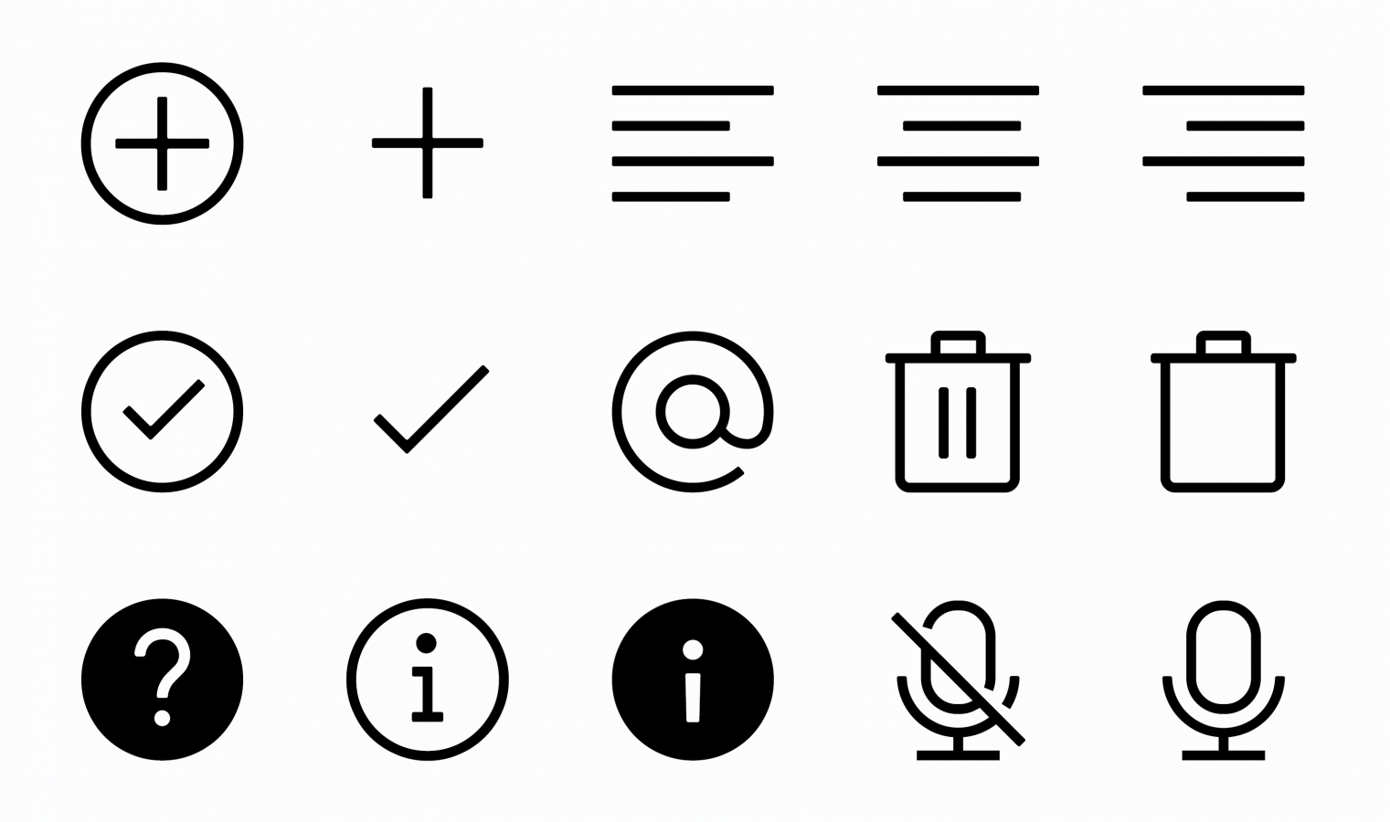
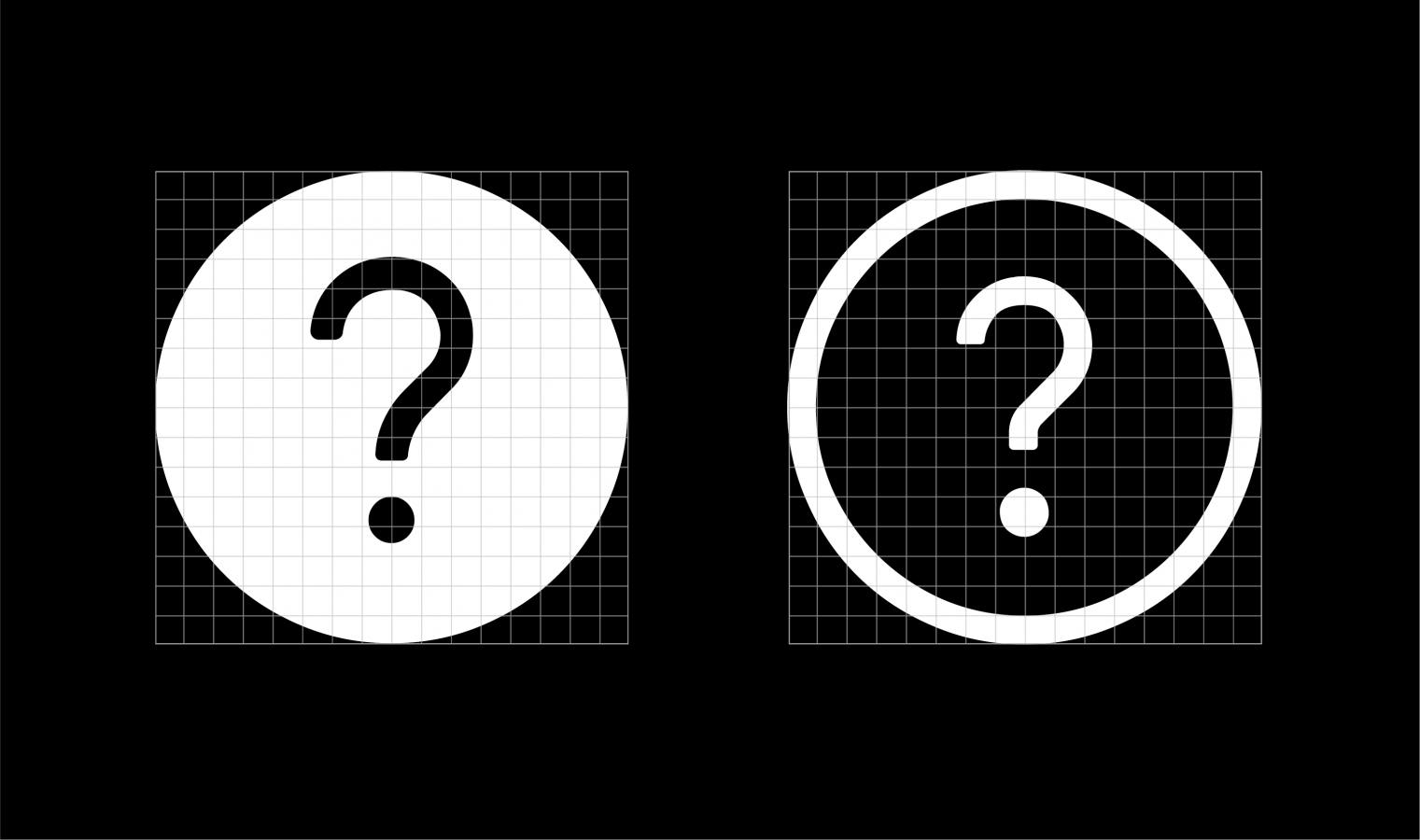
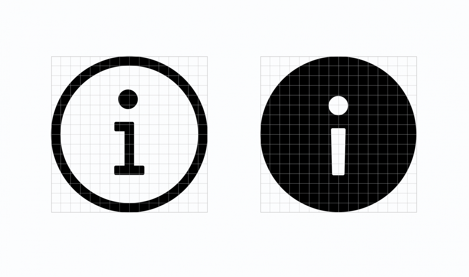
The library was initially developed as an outline icon set to provide a clean and consistent visual language. As the design system evolved, I introduced filled variants for icons primarily used in buttons and other high-emphasis interactive controls, improving affordance while maintaining consistency across the system.