Case Study
Simplifying large-scale content navigation
Organizing navigation around how people learn
I led the navigation redesign for the O’Reilly learning platform, working with designer Shirley Jin to understand why learners struggled to find relevant content. Our research informed a structure organized around topics and learning goals, with most of our recommendations reaching the final prototype and the first phases of implementation.
The challenge was to simplify access to a large catalog while supporting different reasons for learning: exploring a subject, solving a technical problem, or practicing a skill.
The catalog reflected platform categories more than learner intent
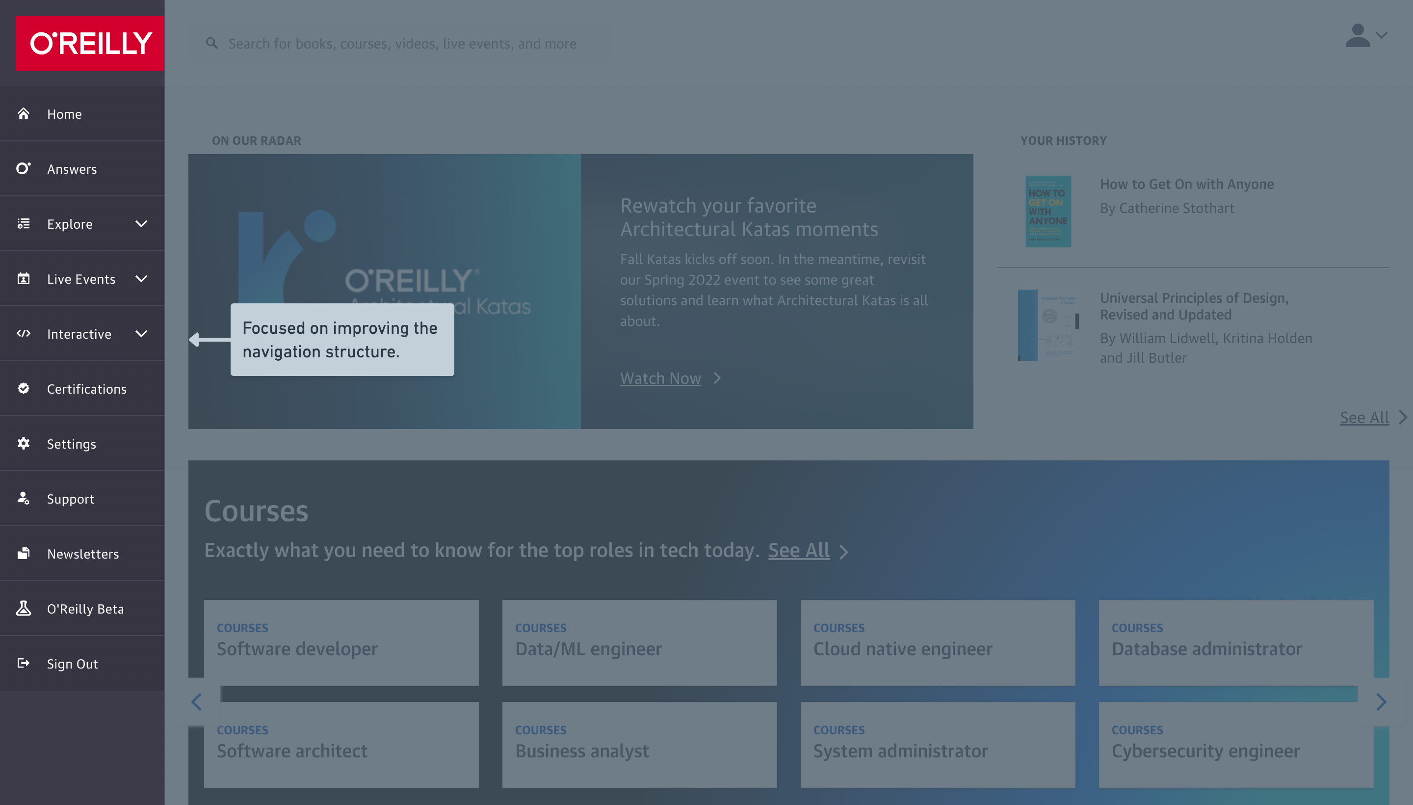
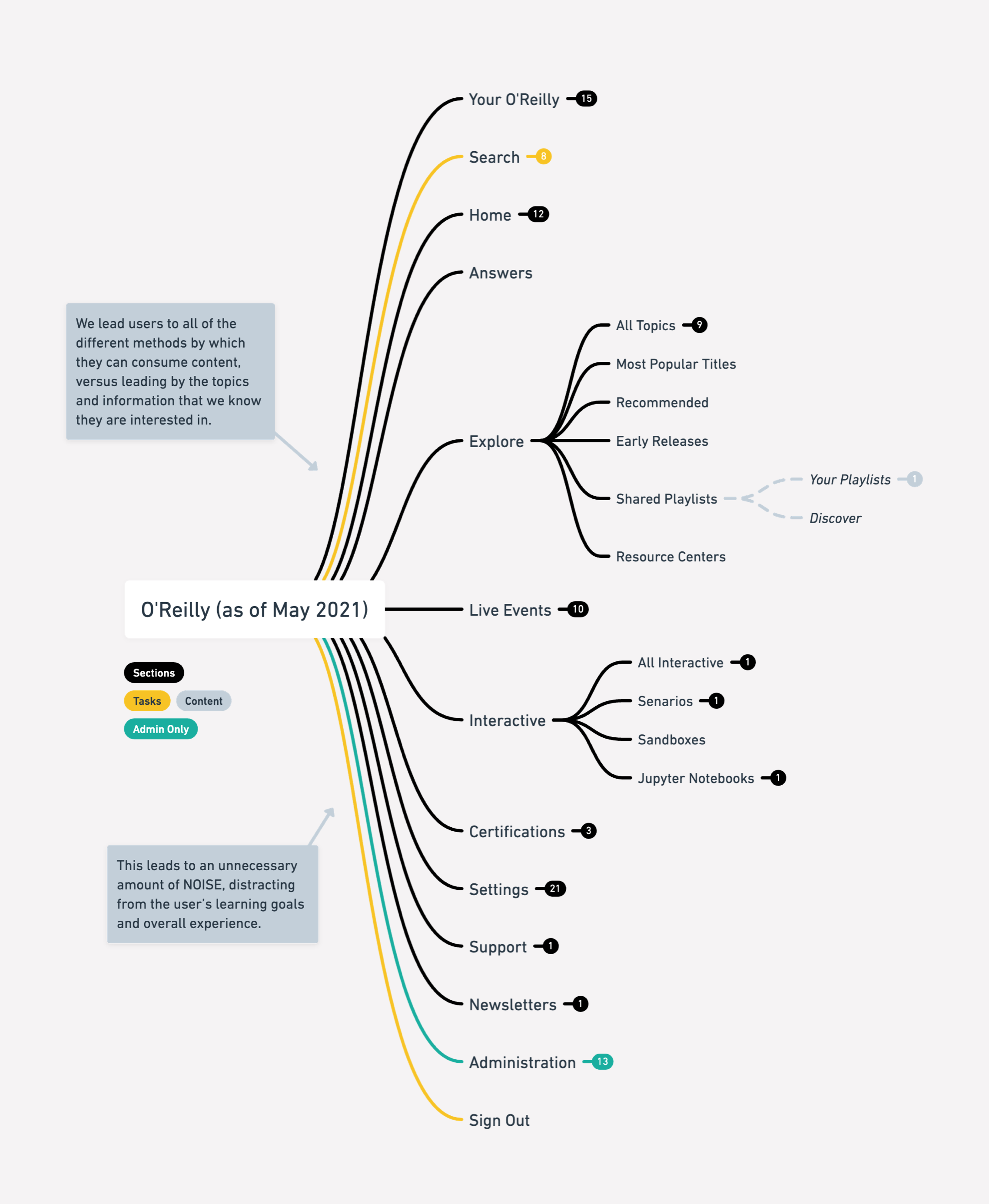
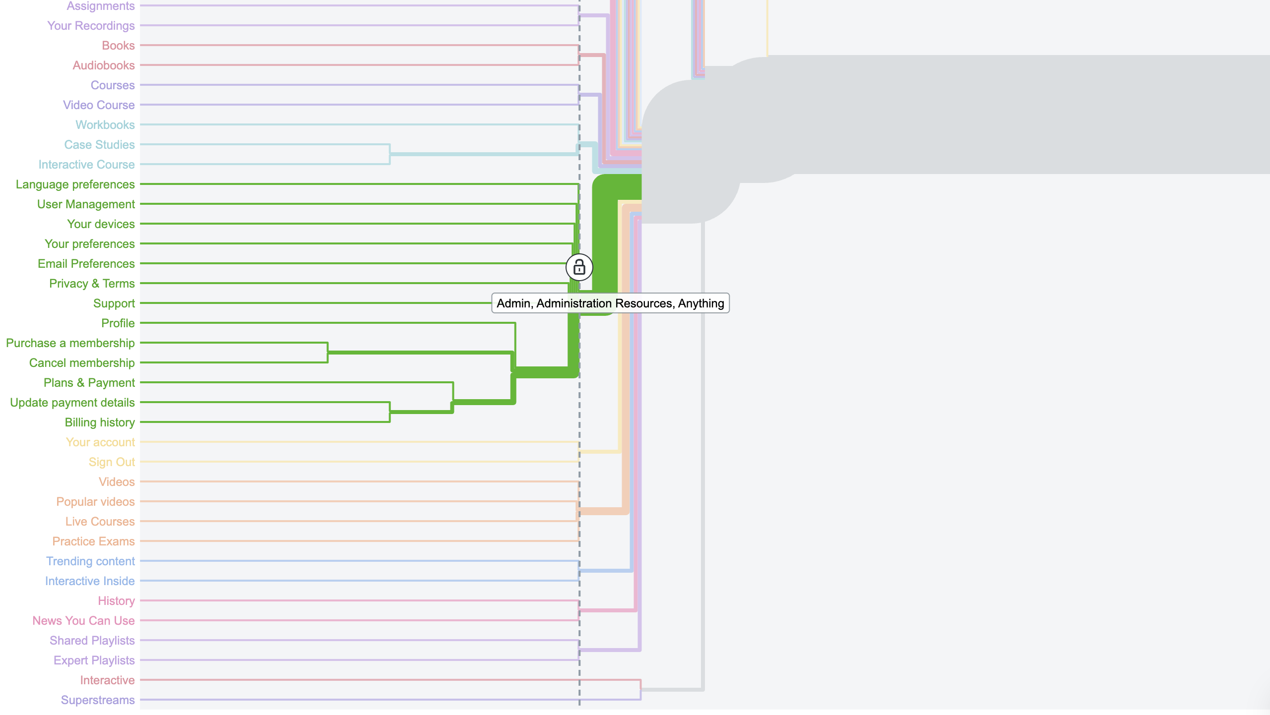
Customer feedback and usability studies showed learners losing their way to content. Conversations with Customer Support reinforced that the existing navigation was not meeting their needs. Shirley and I reviewed this evidence together and mapped the structure to understand where it broke down.
Our working hypothesis was that consolidating navigation around learners’ goals would make the catalog easier to navigate. Reducing the number of links alone would not be enough; we needed to understand which distinctions mattered to learners and which reflected the platform’s organization.
Testing where labels and expectations diverged
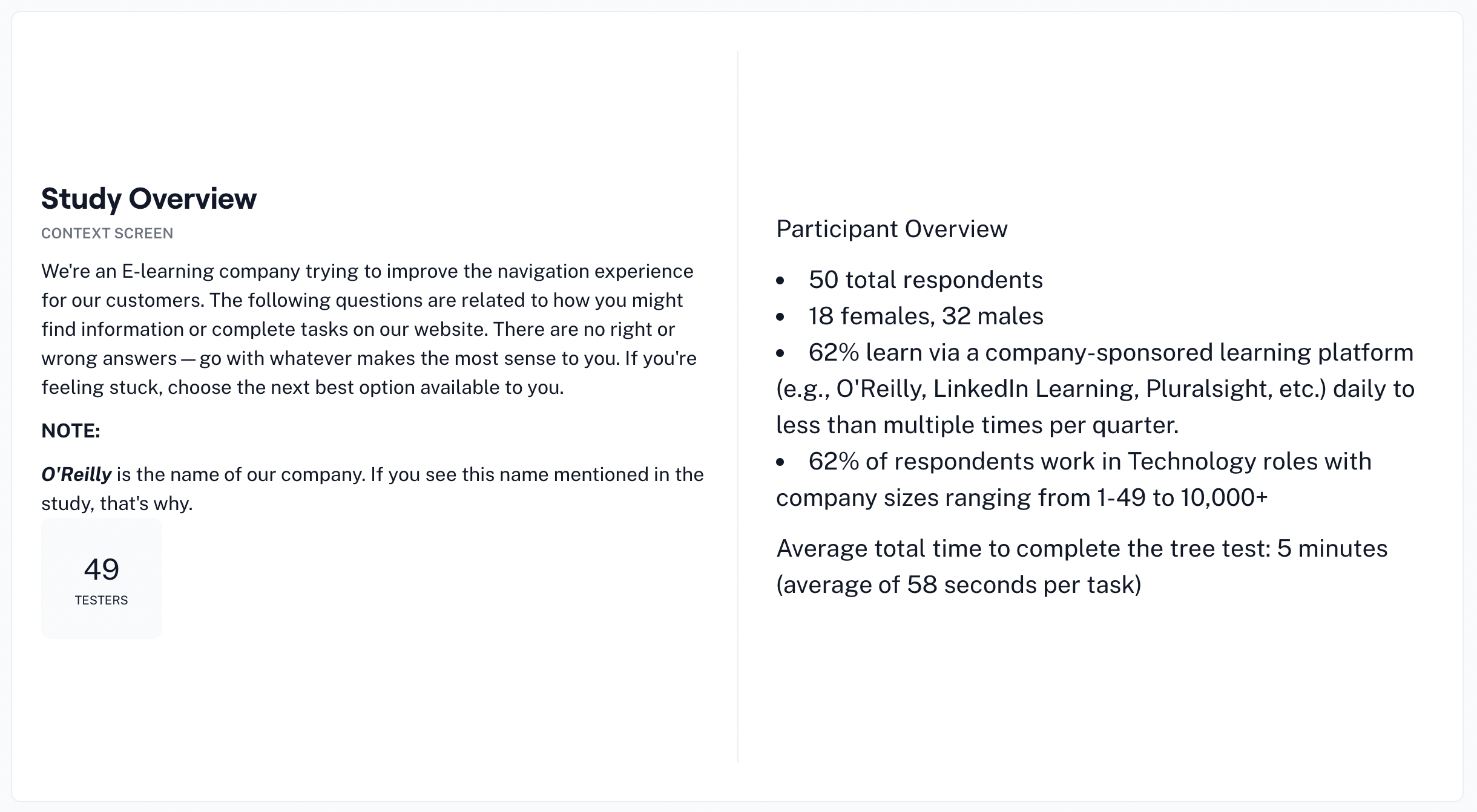
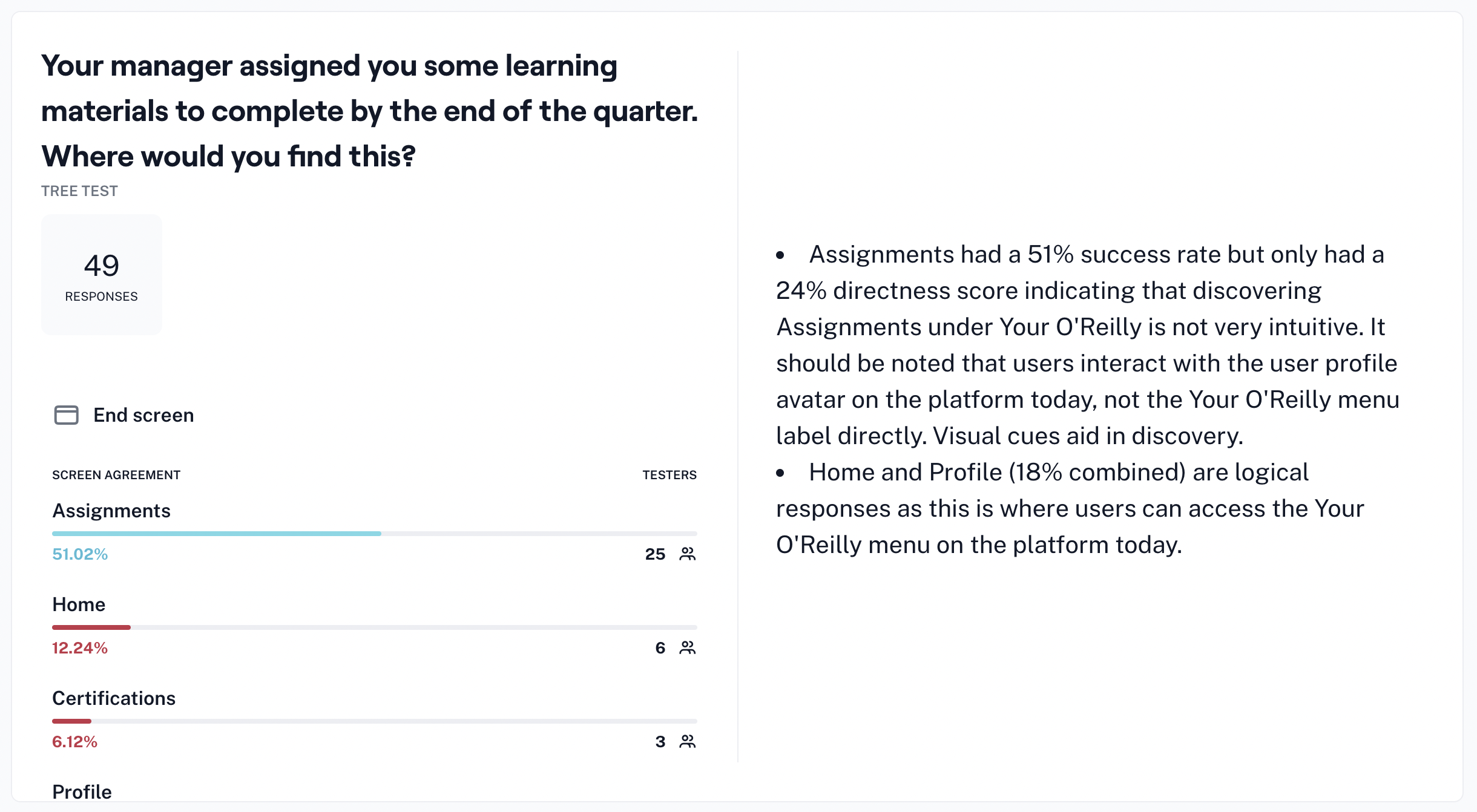
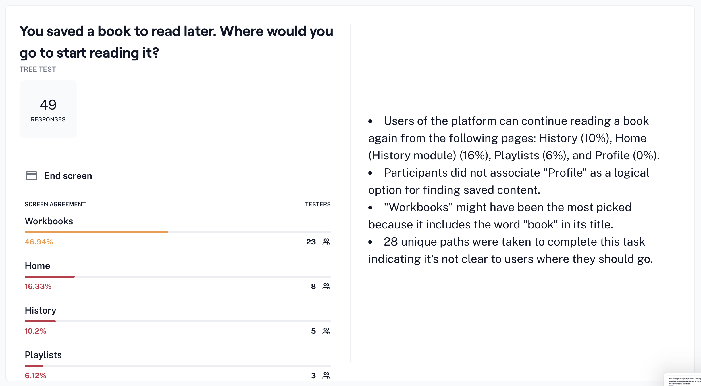
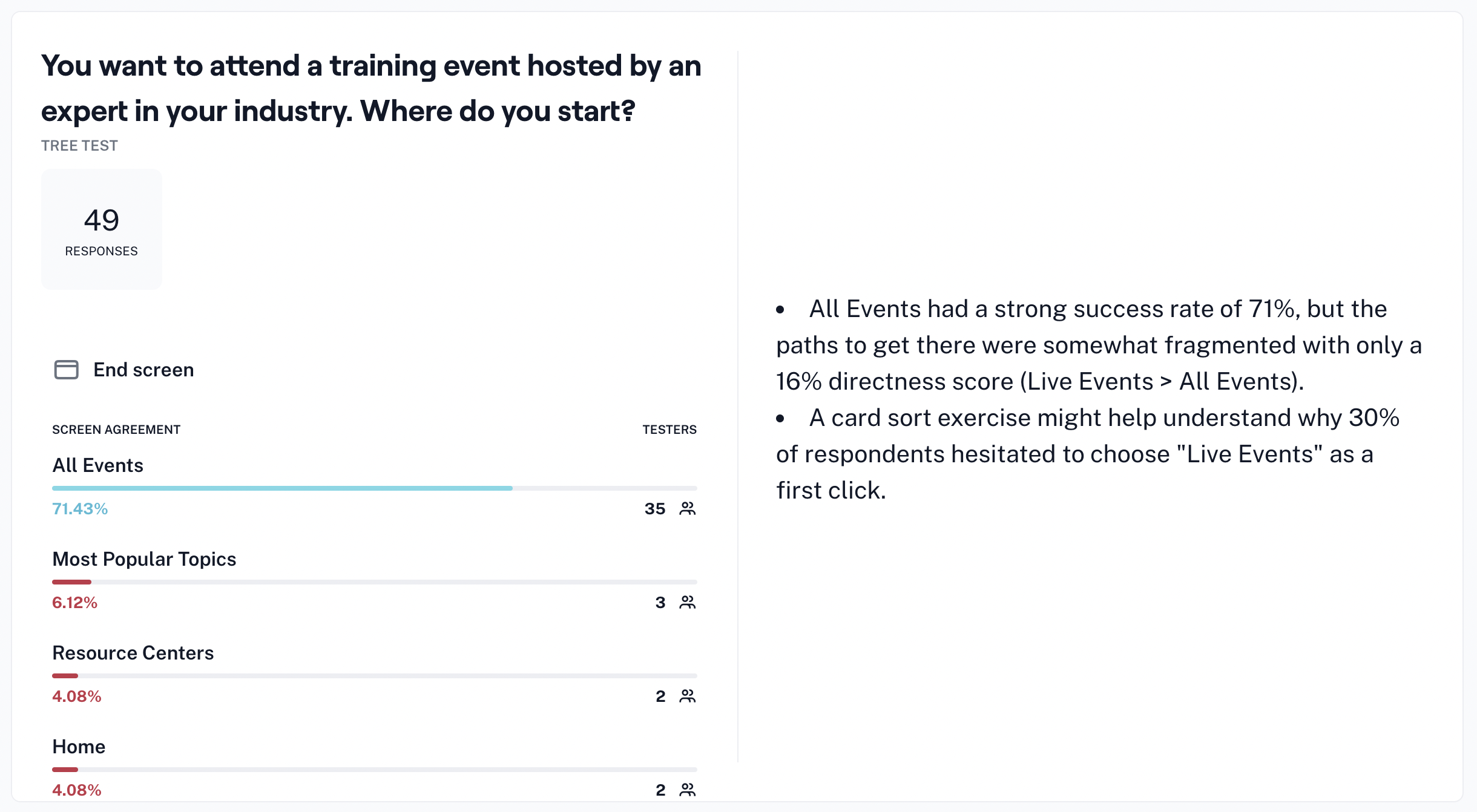
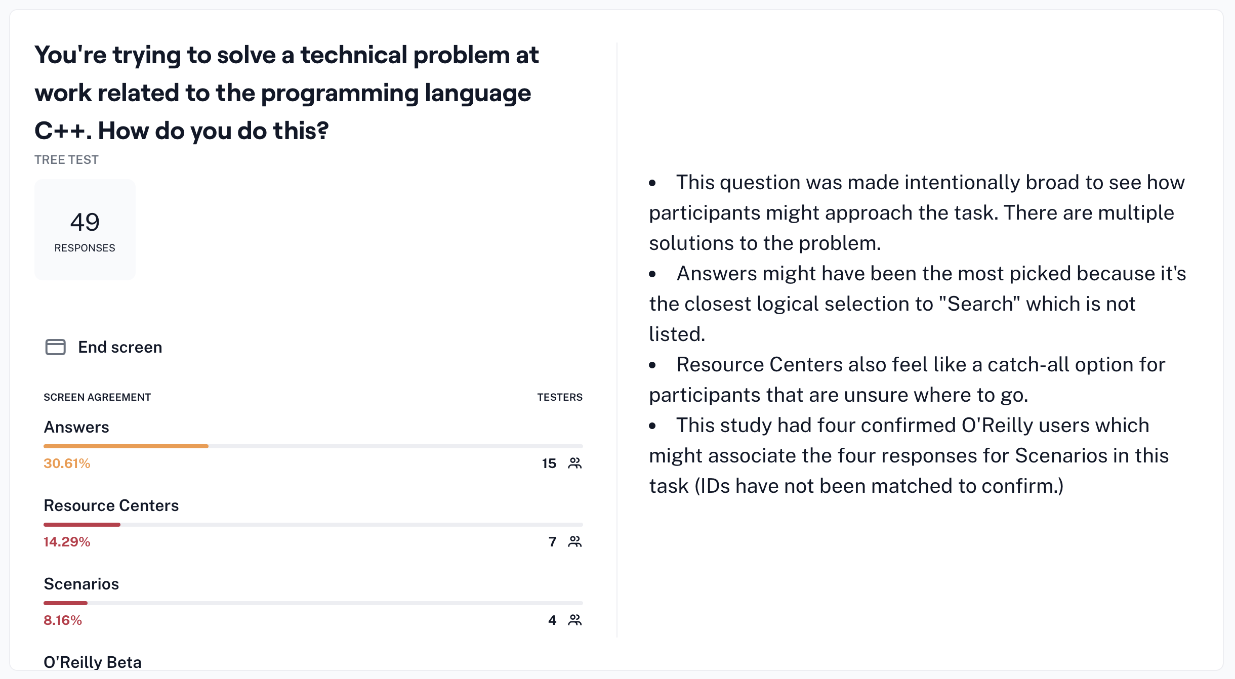
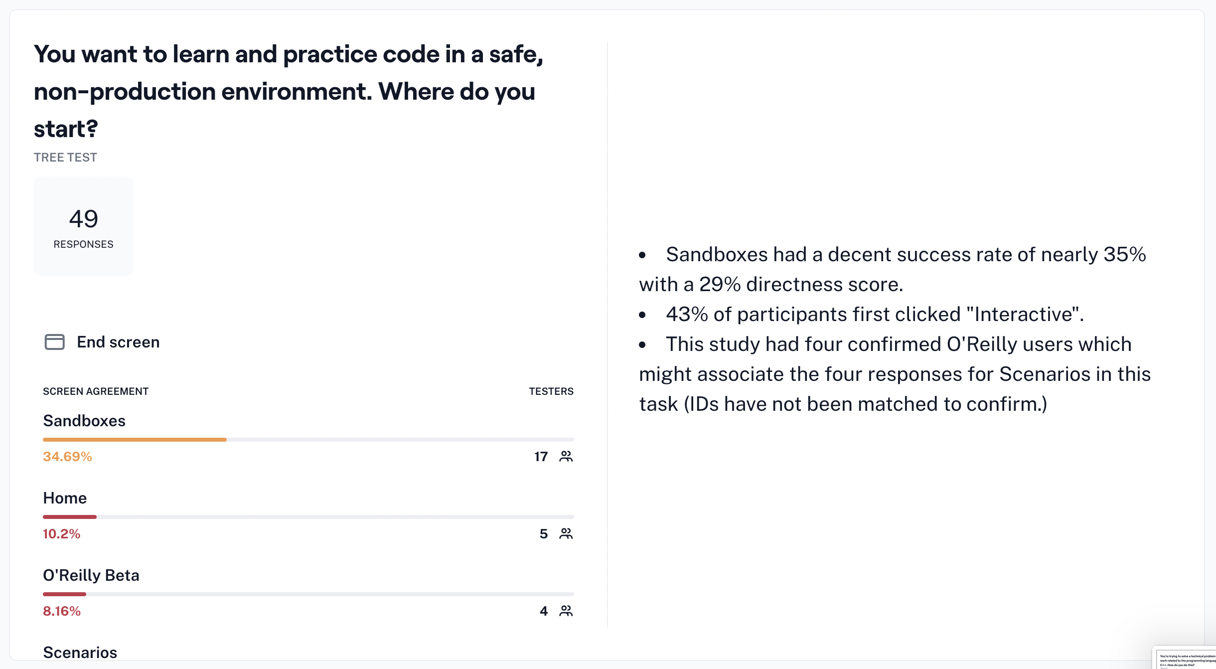
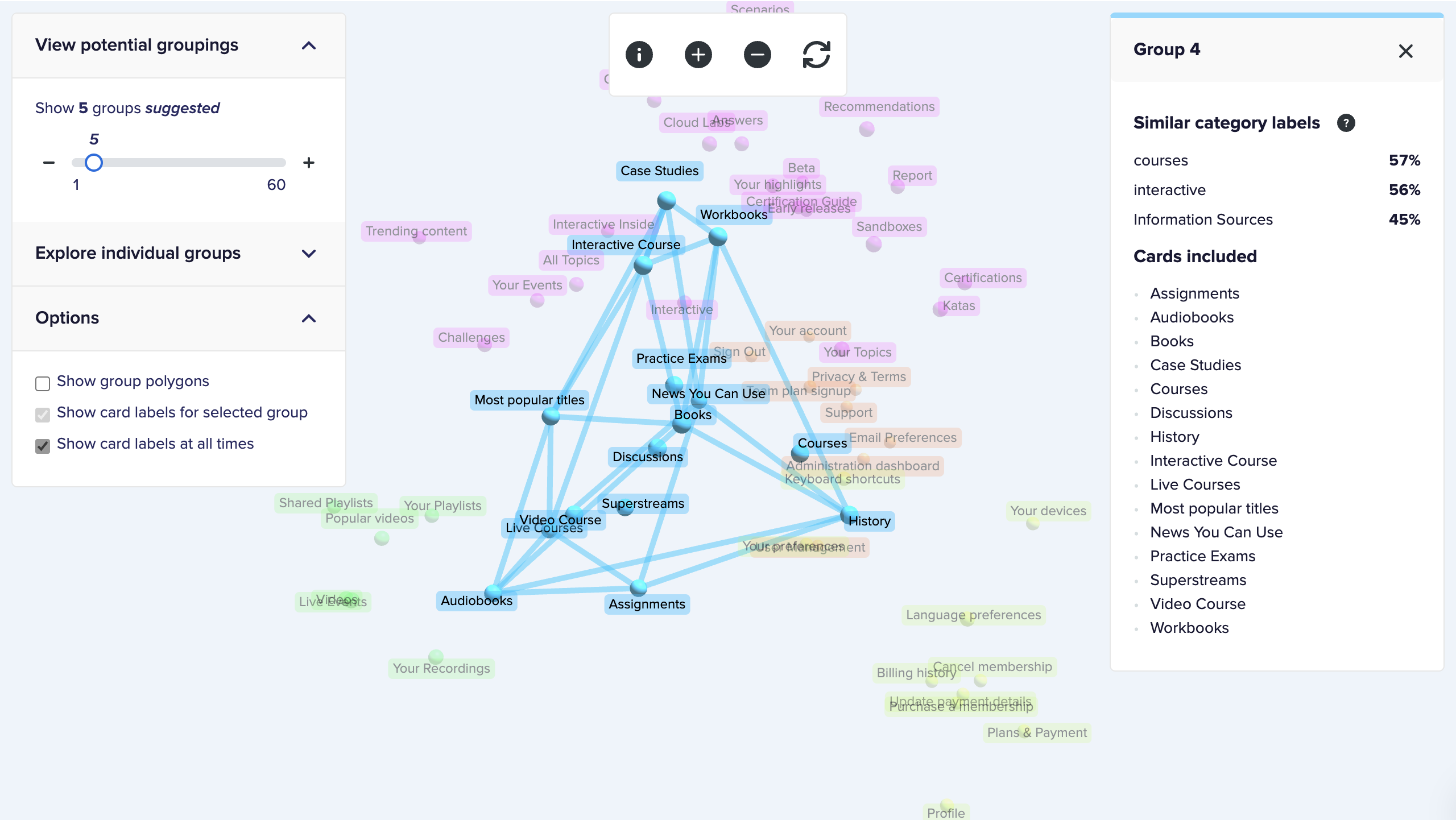
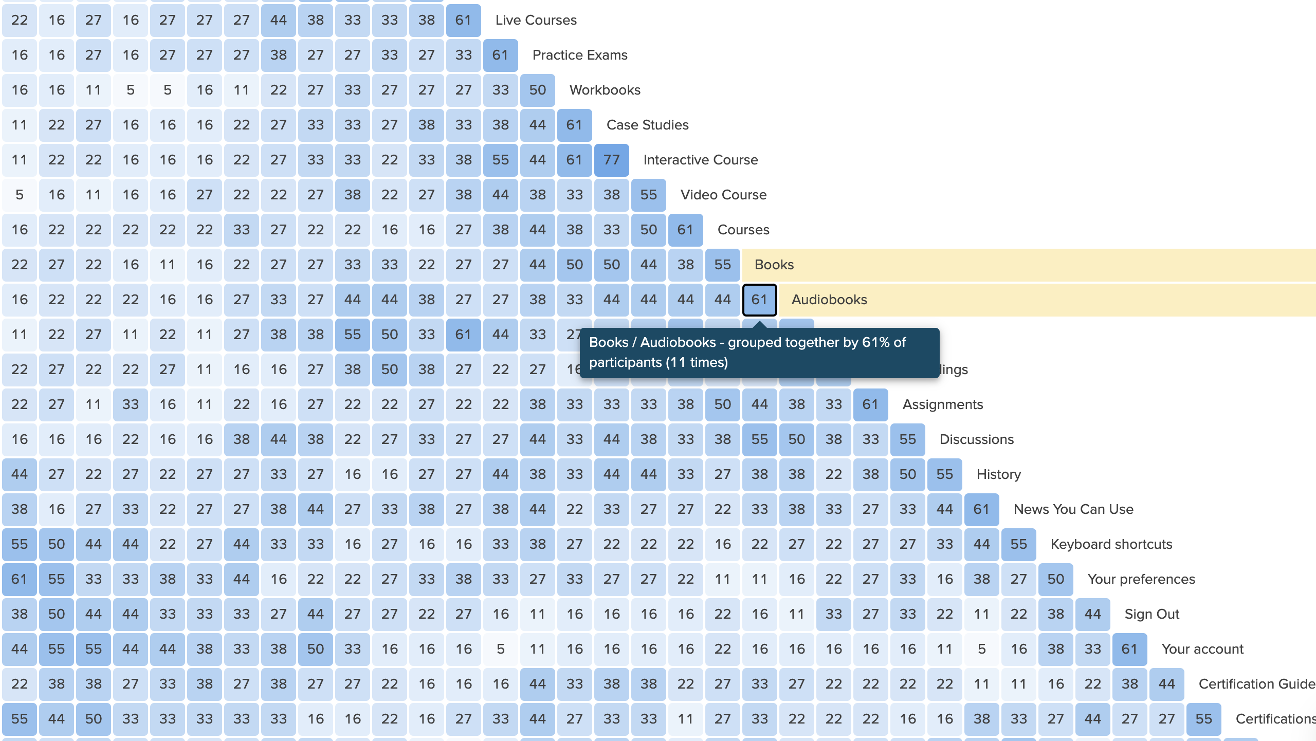
We used tree testing to benchmark the existing structure and card sorting to investigate how participants grouped its content. Our target audience was mid-career software engineers who used online learning platforms. Shirley and I shared study planning, execution, analysis, and documentation.
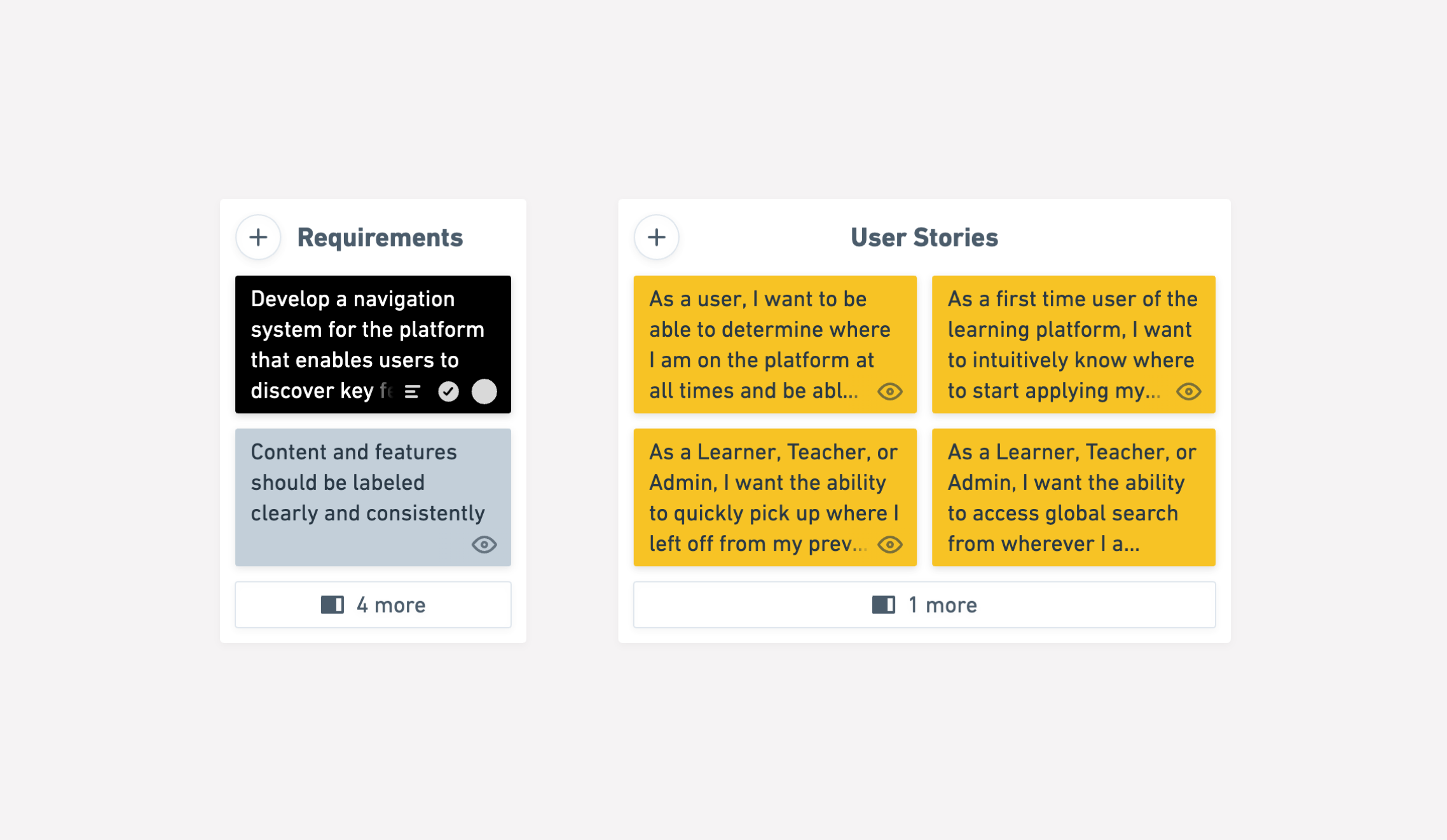
The findings pointed to four requirements for the new structure:
- Support topic-first discovery. Most users began with a subject, while the existing categories emphasized formats such as books, videos, and interactive content.
- Keep routes for specific learning goals. Someone looking to experiment with cloud technology might seek a hands-on format directly.
- Use labels that explain the destination. Terms such as “katas” and “scenarios” made it difficult to anticipate the content behind them.
- Separate account administration from learning content. Participants’ groupings supported a clearer boundary between those tasks.
Supporting several paths without multiplying top-level choices
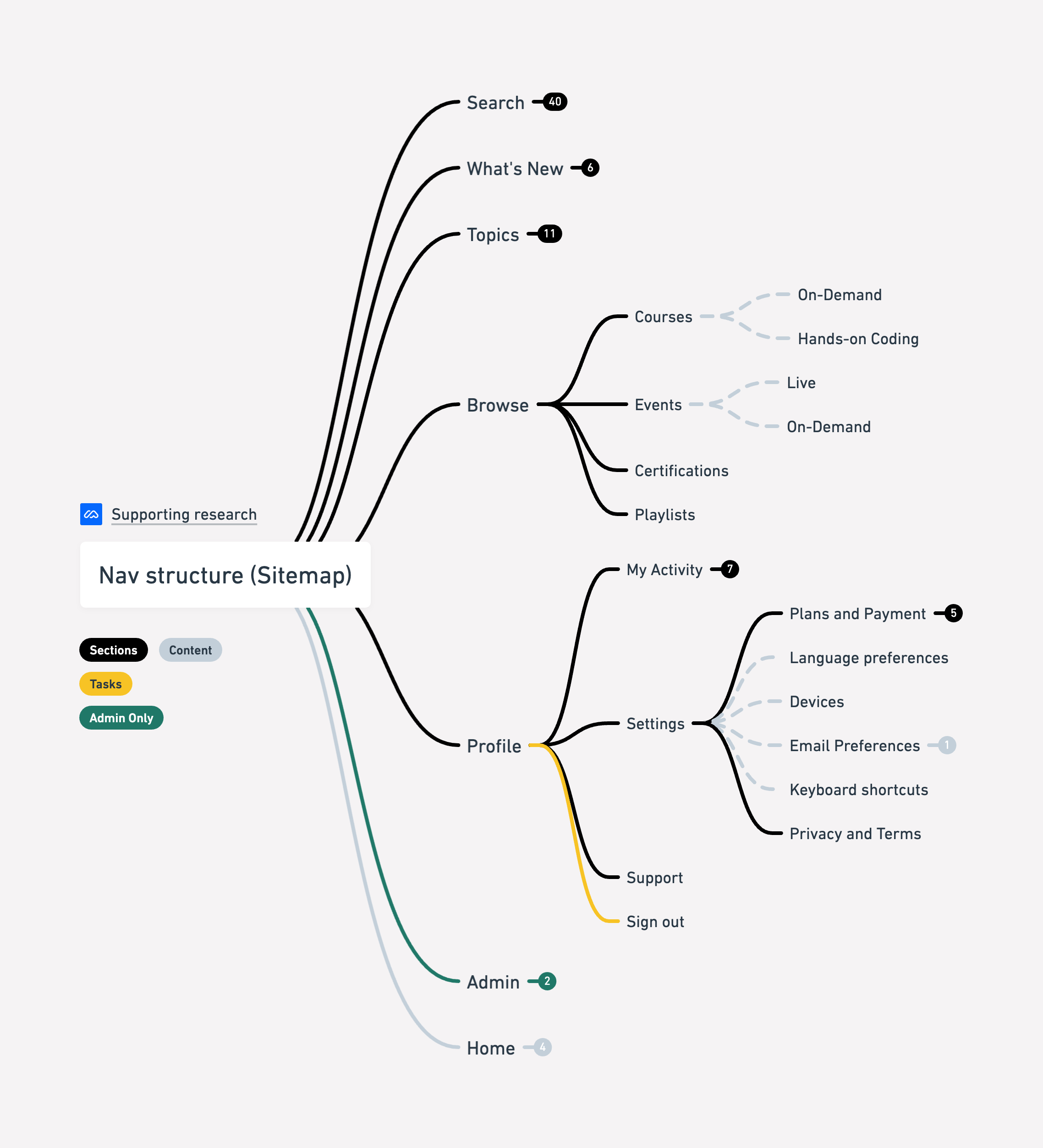
I used these findings to shape a navigation model with distinct routes for topics, search, and learning activities. The proposed sitemap consolidated content formats under Browse and separated profile settings and administration from discovery.
We defined the redesign around a small set of product decisions:
- Keep topic browsing close to search so learners can move between exploration and a specific query.
- Replace obscure labels with concrete descriptions of topics, formats, and actions.
- Group related formats rather than giving each one a separate top-level entry.
- Simplify the structure while preserving access to content and key platform capabilities.
Using limited space to force clearer priorities
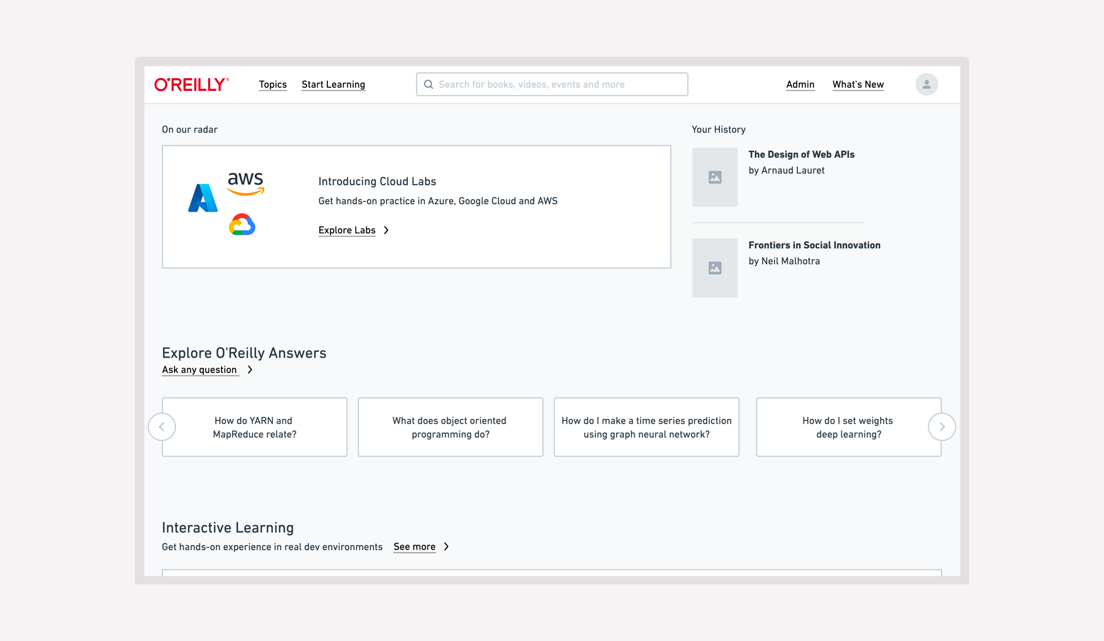
We chose a horizontal top bar to give content more page width and constrain the number of primary navigation items. That constraint required us to group capabilities meaningfully instead of giving every feature its own link.
The design paired a Topics menu with search and a Start Learning menu organized around actions. It supported learners who knew the subject they wanted to explore as well as those who knew the kind of activity they wanted to undertake.
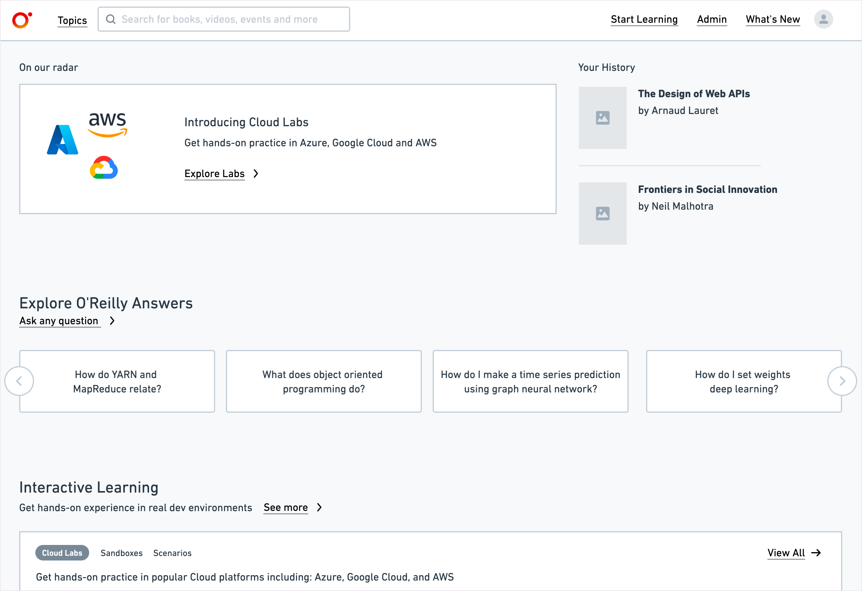
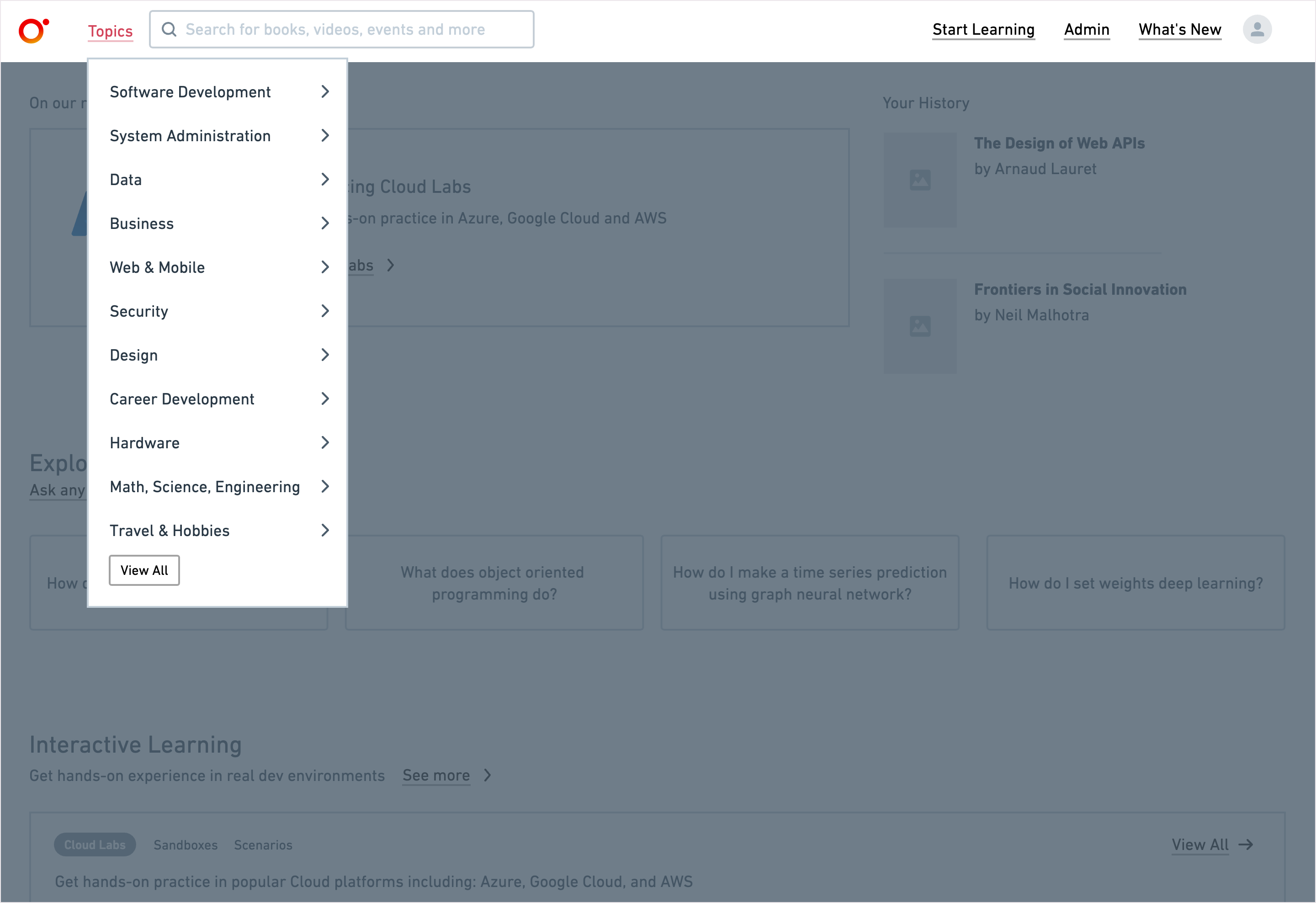
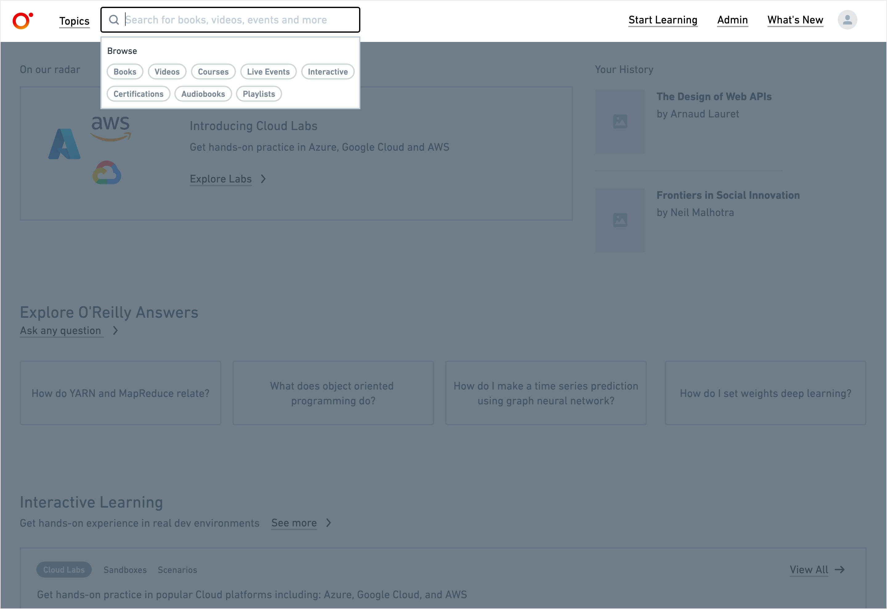
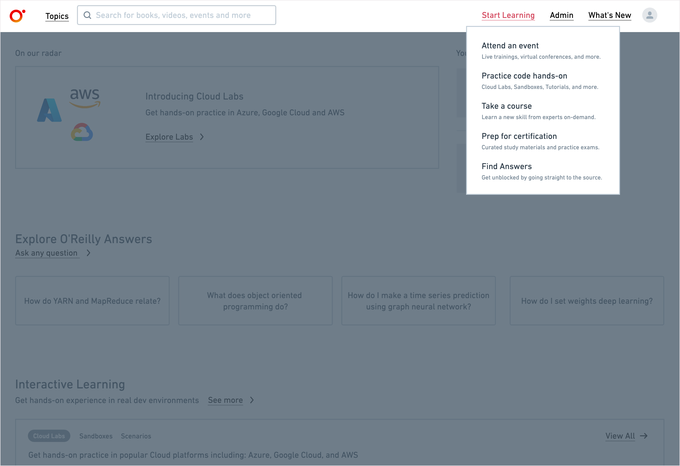
The trade-off was visibility: teams wanted their capabilities represented in the primary navigation. Grouping related options preserved routes to those capabilities while limiting the number of choices competing for attention at the top level.
Balancing discovery with existing customer and technical needs
Product Marketing was hesitant to remove format-based landing pages because it used those pages to direct customers to content. This made the redesign a cross-functional decision about access to the catalog, beyond the navigation layout itself.
Product Design Director James Touhey, VP Julie Baron, and Senior VP of Product Adam Witwer helped align expectations across Marketing, Editorial, and Customer Support. Their involvement helped us work through resistance to changes in the platform’s information architecture.
Engineering also raised concerns about whether the existing implementation stack could support the changes.
Moving the proposed structure into early implementation
The direction received support from executives, Product, Marketing, Customer Support, and Sales. Most of our information architecture recommendations made it into the final prototype and the first phases of implementation.
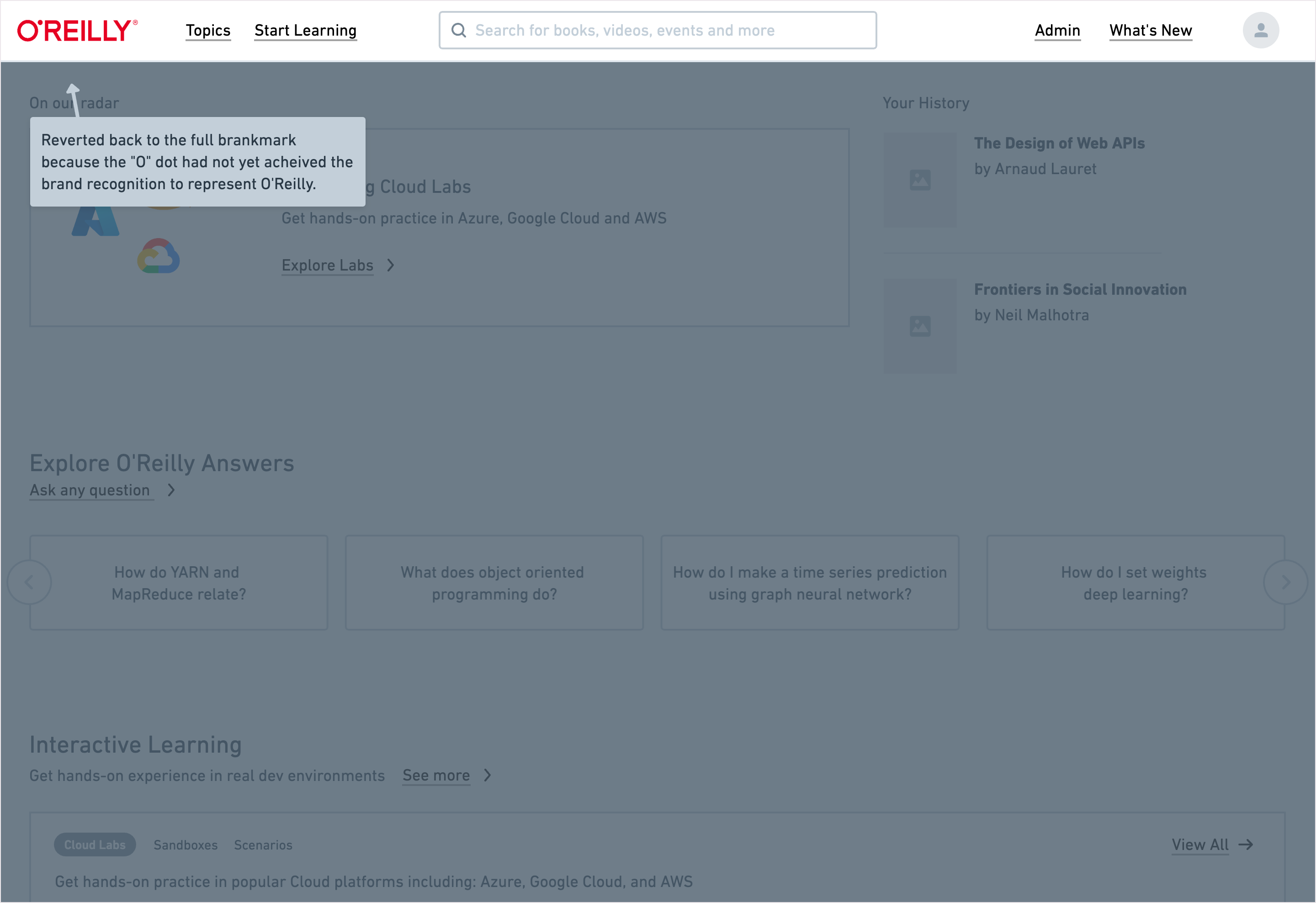
The documented outcome is a revised navigation model and progress into implementation. This case study does not include post-launch evidence of faster discovery or increased engagement, so those remain intended benefits rather than measured results.