Case Study
An OCR extraction configuration editor
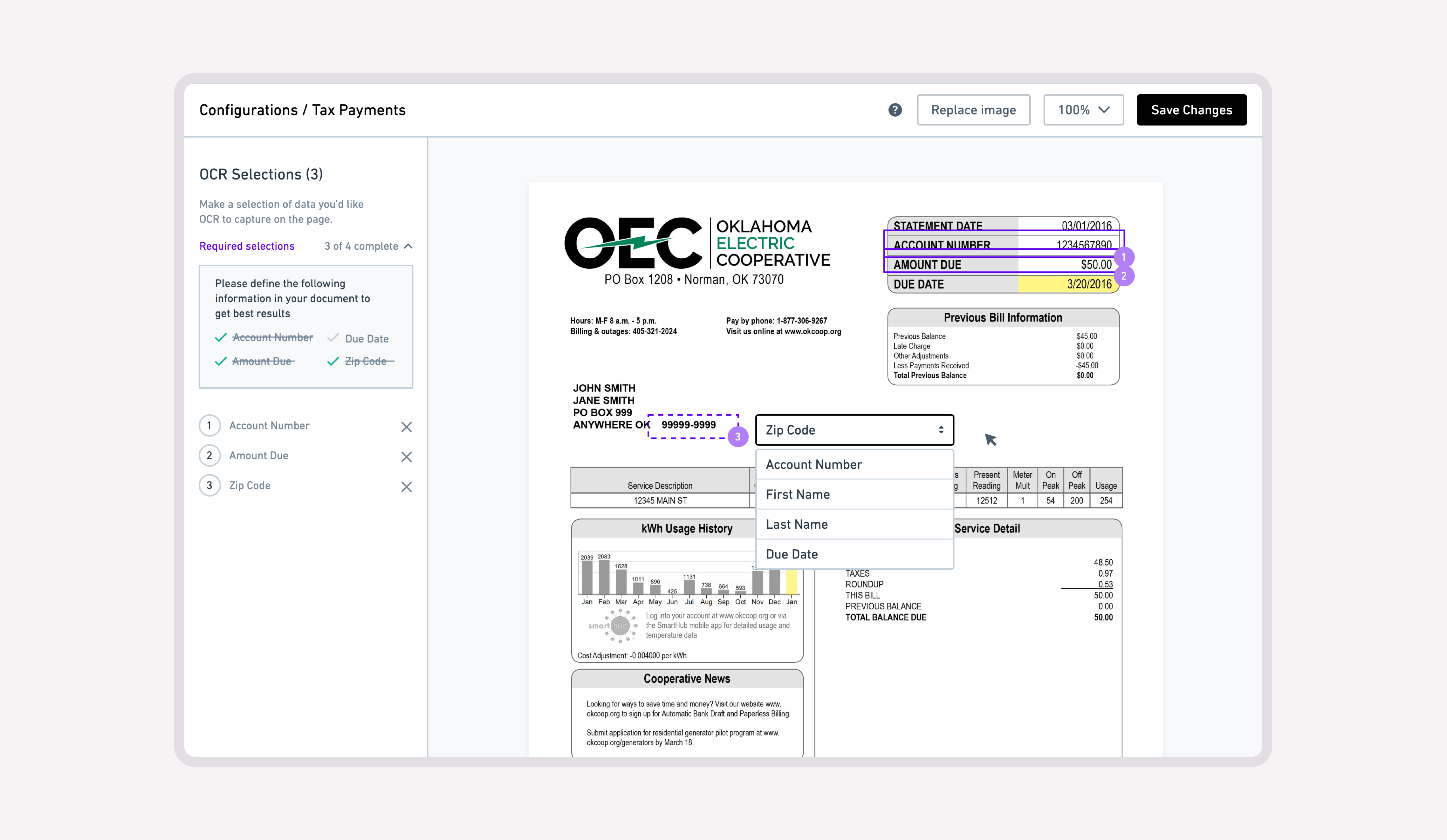
A Paymentus internal tool enabling the configuration of documents for OCR (Optical Character Recognition) capture. This tool allowed account managers to specify the location of key payment information enabling the system to correctly identify them.
Making document configuration easier to understand
Paymentus had built a proof of concept for configuring documents for optical character recognition (OCR). Account managers used it to specify where key payment information appeared on a document so the system could capture it. I led the usability redesign and worked with Engineering to implement improvements iteratively.
The initial editor was difficult to use. My review identified unconventional controls, unpredictable feedback, and data-loss issues. The design work focused on making the steps and state of document configuration clearer.
Separating document controls from individual selections
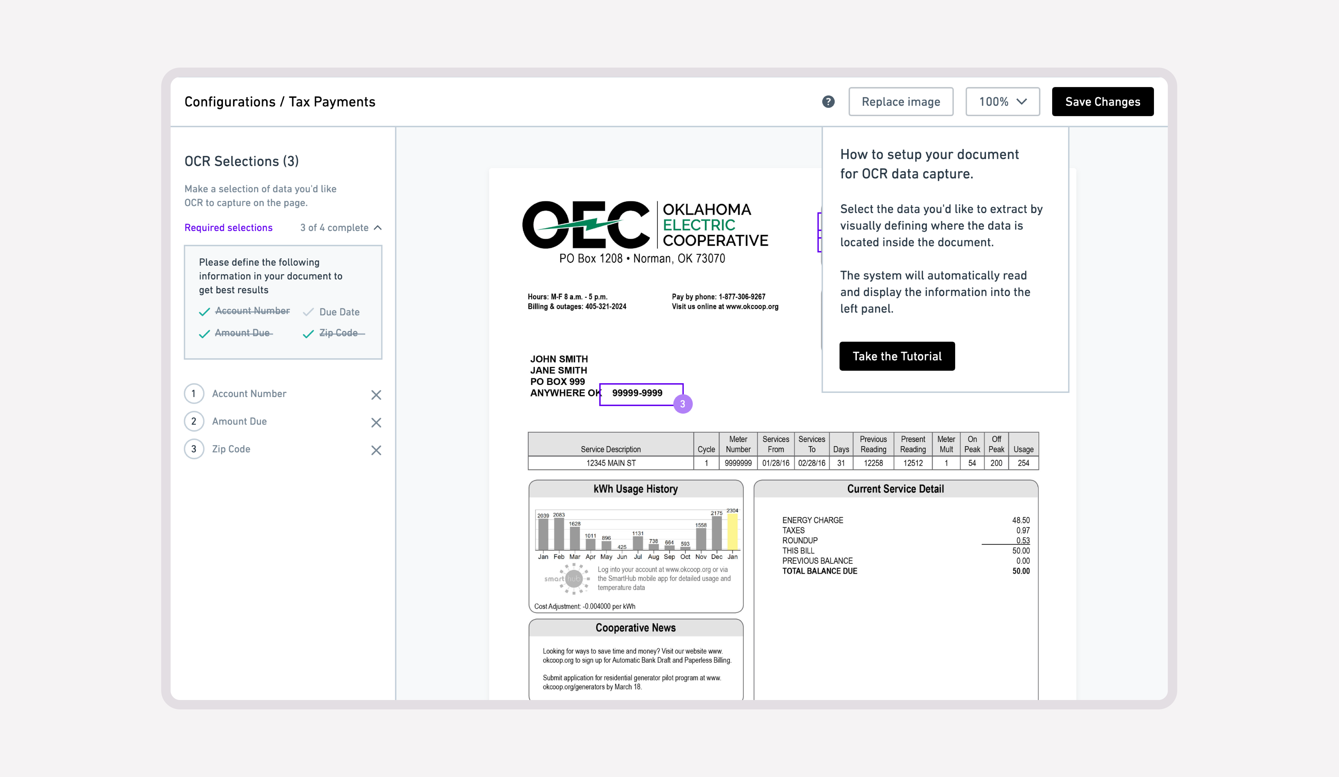
I organized the editor around two scopes of action. Controls for the document as a whole—saving changes, adjusting zoom, and replacing the image—belonged in the top toolbar. Individual extraction regions belonged in a sidebar beside the document canvas.
This gave document-level actions a consistent location and kept the list of configured fields visible while users worked on the page.
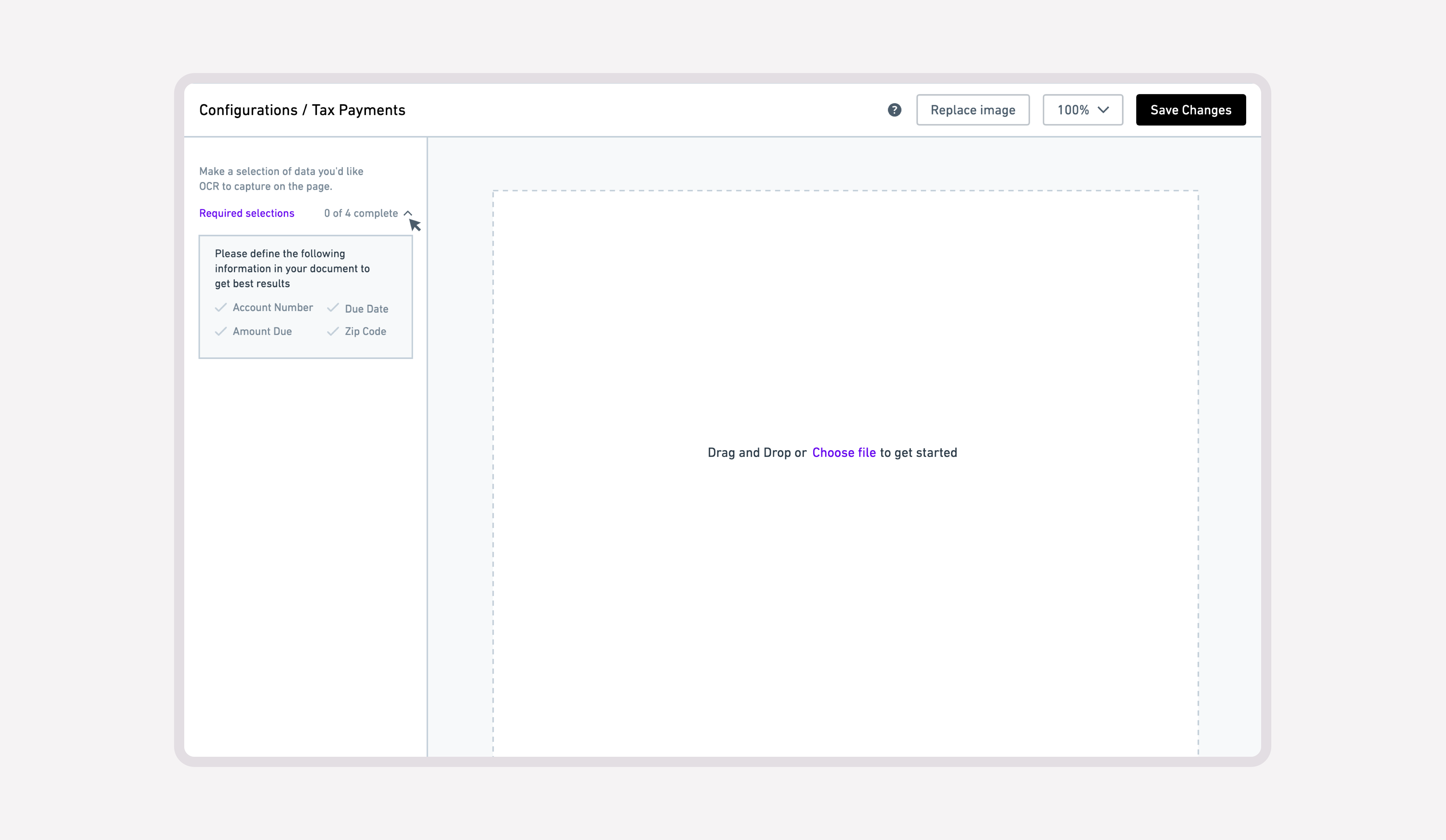
Explaining the next step where users need it
The editor needed to communicate both what users should capture and how to define it. I placed setup guidance alongside the selections and designed visual states that made the selection workflow easier to follow.
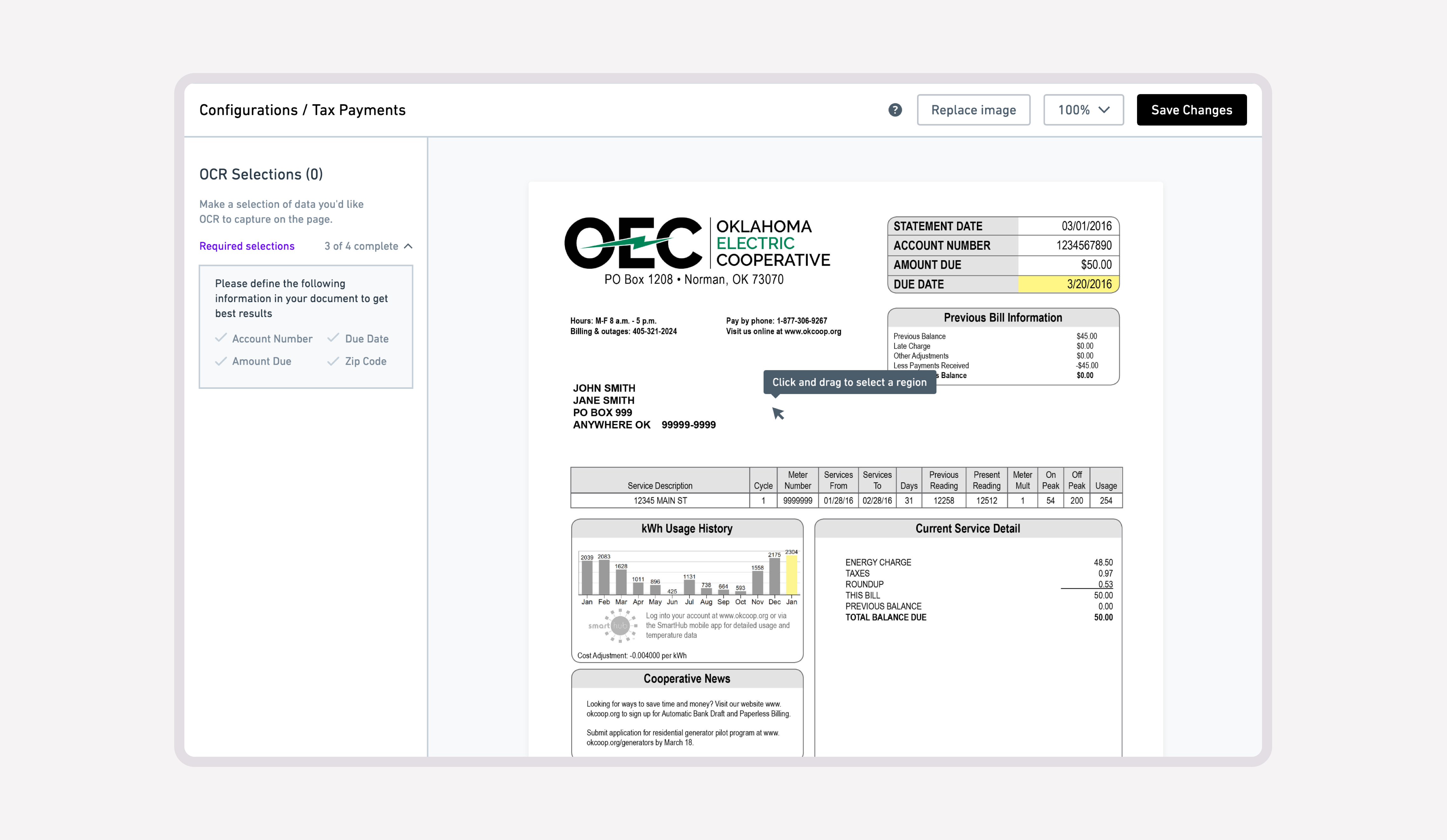
Connecting each region to the information it represents
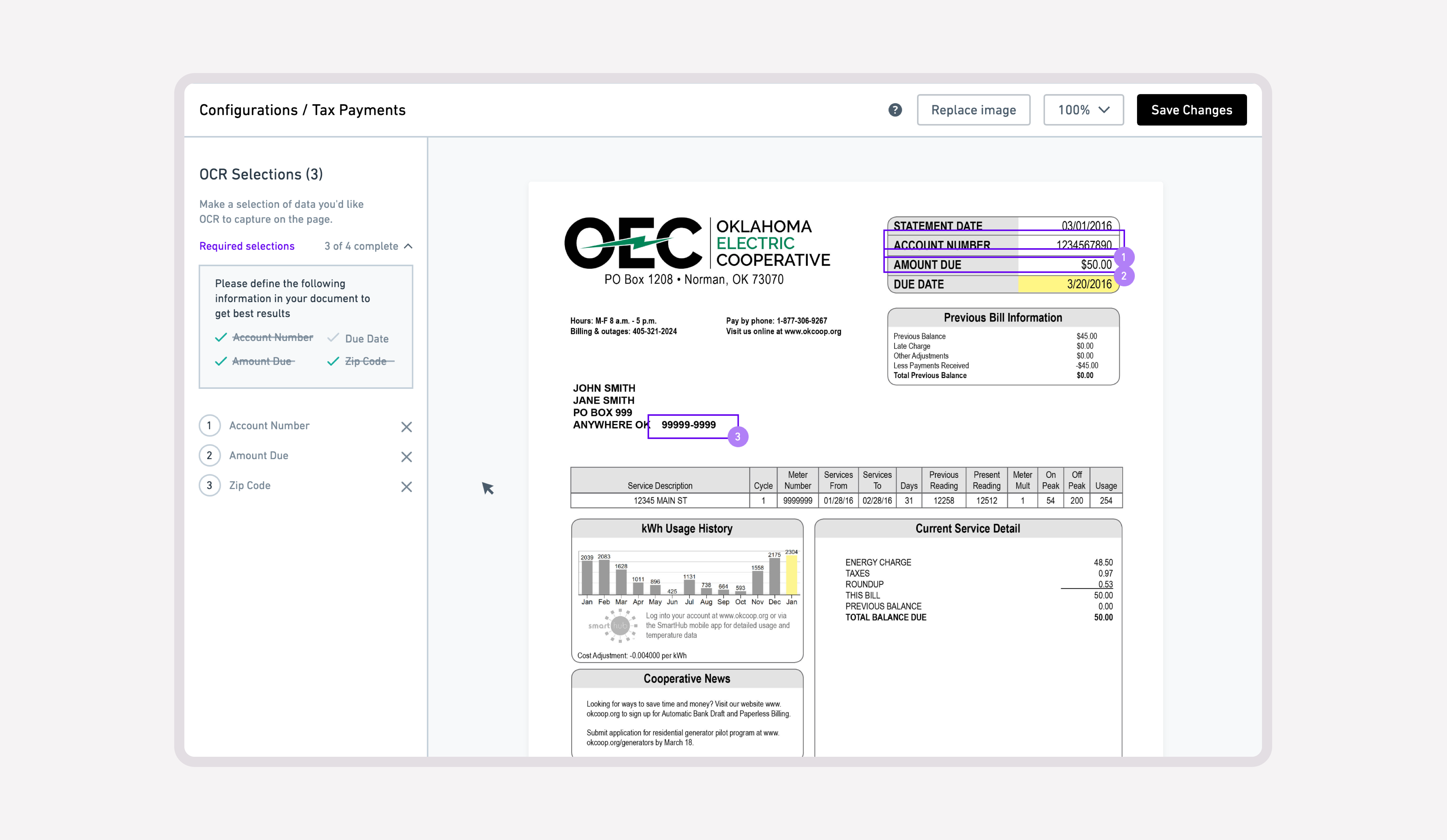
A region on the canvas and a record in the sidebar describe the same configuration. I introduced a shared numbering system so users could match them directly, and redesigned the selection states to make regions easier to distinguish.
Working through the editor’s technical behavior
I worked with Engineering to understand the underlying technical behavior and mathematics that made the editor work. That understanding informed my recommendations for the usability issues identified in the initial interface, which we addressed through iterative implementation.
The work established a more explicit interaction model: document controls in the toolbar, extraction regions on the canvas, and corresponding records in the sidebar. The documented outcome is the redesign and iterative implementation; this case study does not include measured changes in setup time or extraction accuracy.