Case Study
Designing intuitive advanced filtering
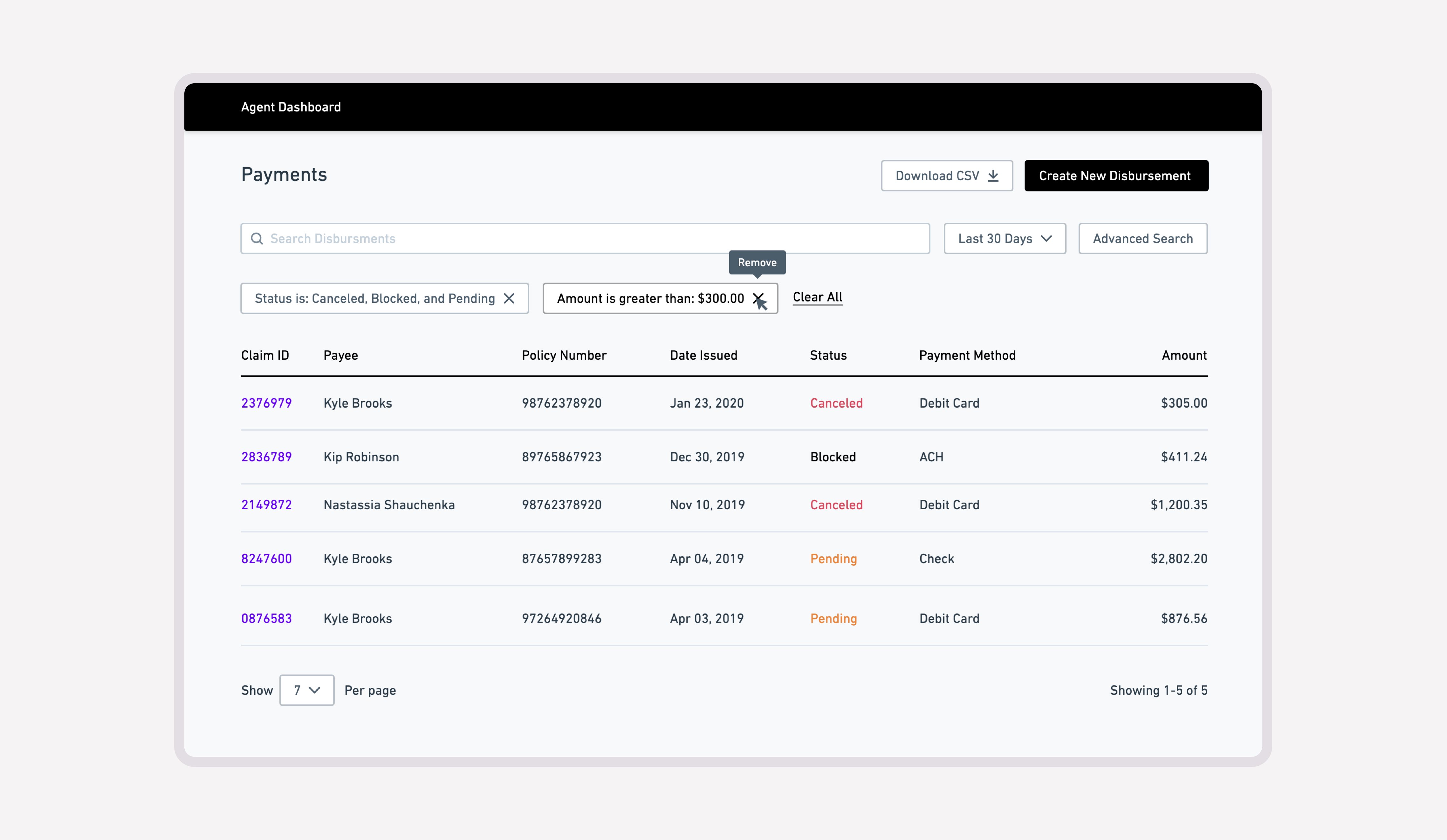
An enhancement for a disbursement management system's list view; It allows users (insurance agents) to filter the list by various meaningful fields to find disbursed claim payments as needed.
Designing advanced filtering for payment reconciliation
Client-side representatives needed to review and reconcile large volumes of claim payments issued by an insurance organization. The payments list contained the records they depended on for reporting, investigation, and operational follow-up, but locating a meaningful subset of transactions required a filtering experience capable of handling many different search criteria without overwhelming the interface.
I designed an advanced filtering model that allowed users to progressively narrow the dataset while preserving enough surrounding context to understand what they were filtering.
Reducing a large dataset into an actionable result set
Reconciliation work often begins with an incomplete understanding of the record being sought. A user may know the approximate payment period, status, policy, or recipient, but not the exact transaction identifier.
The filtering experience therefore needed to support both broad investigation and precise lookup, allowing users to begin with what they knew and progressively narrow the results as additional details became available.
Separating filtering from the records it controls
The number and variety of available parameters made an inline filter bar impractical. Displaying every control above the table would have compressed the records view, weakened hierarchy, and made the interface more difficult to scan.
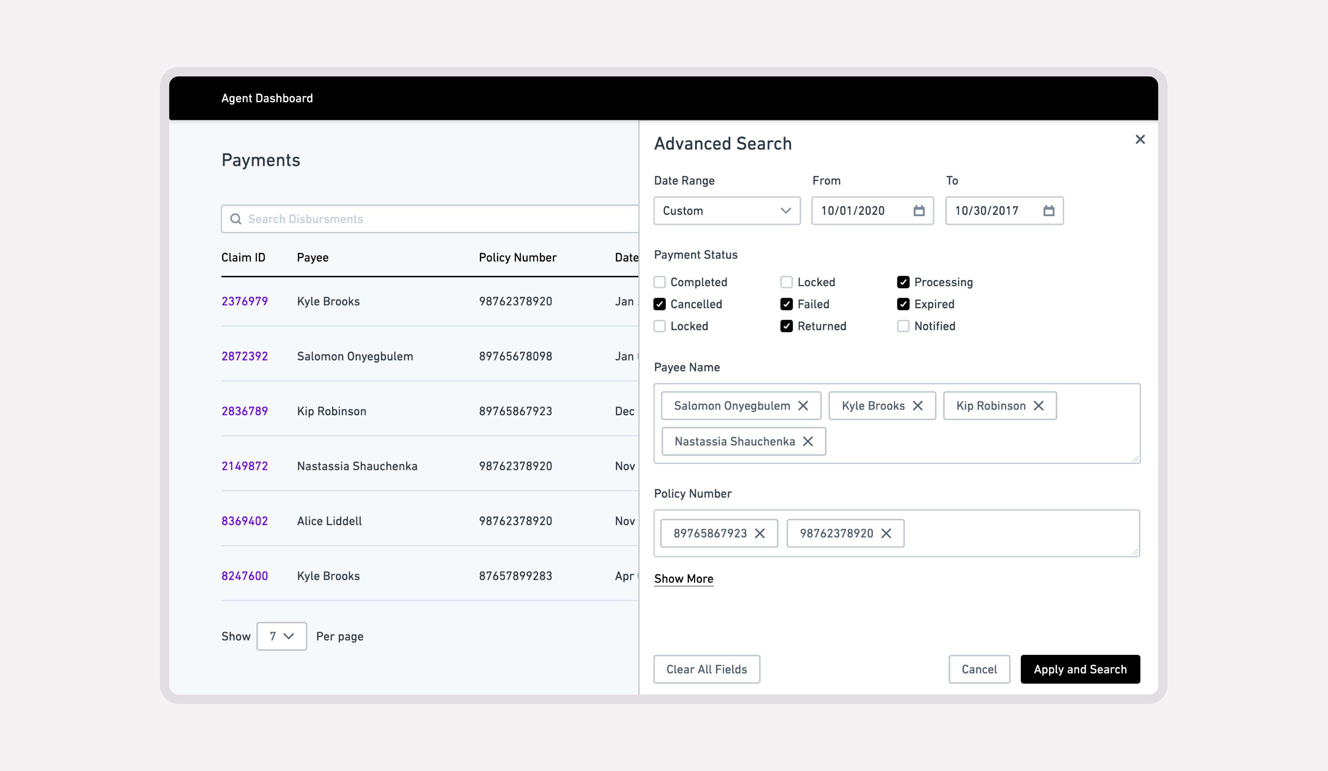
Because the workflow was primarily desktop-based, I placed advanced filters within a dedicated right-side panel.
This created a focused space for configuring search criteria while preserving partial visibility of the payments list underneath. Users could adjust filters without entirely losing context or feeling as though they had entered a separate workflow.
The pattern also provided enough vertical space to accommodate future parameters without requiring the primary records interface to become increasingly crowded.
Matching each parameter with the appropriate interaction
The filter model supported different types of payment data, so applying one generic input pattern across every parameter would have increased effort and introduced avoidable errors.
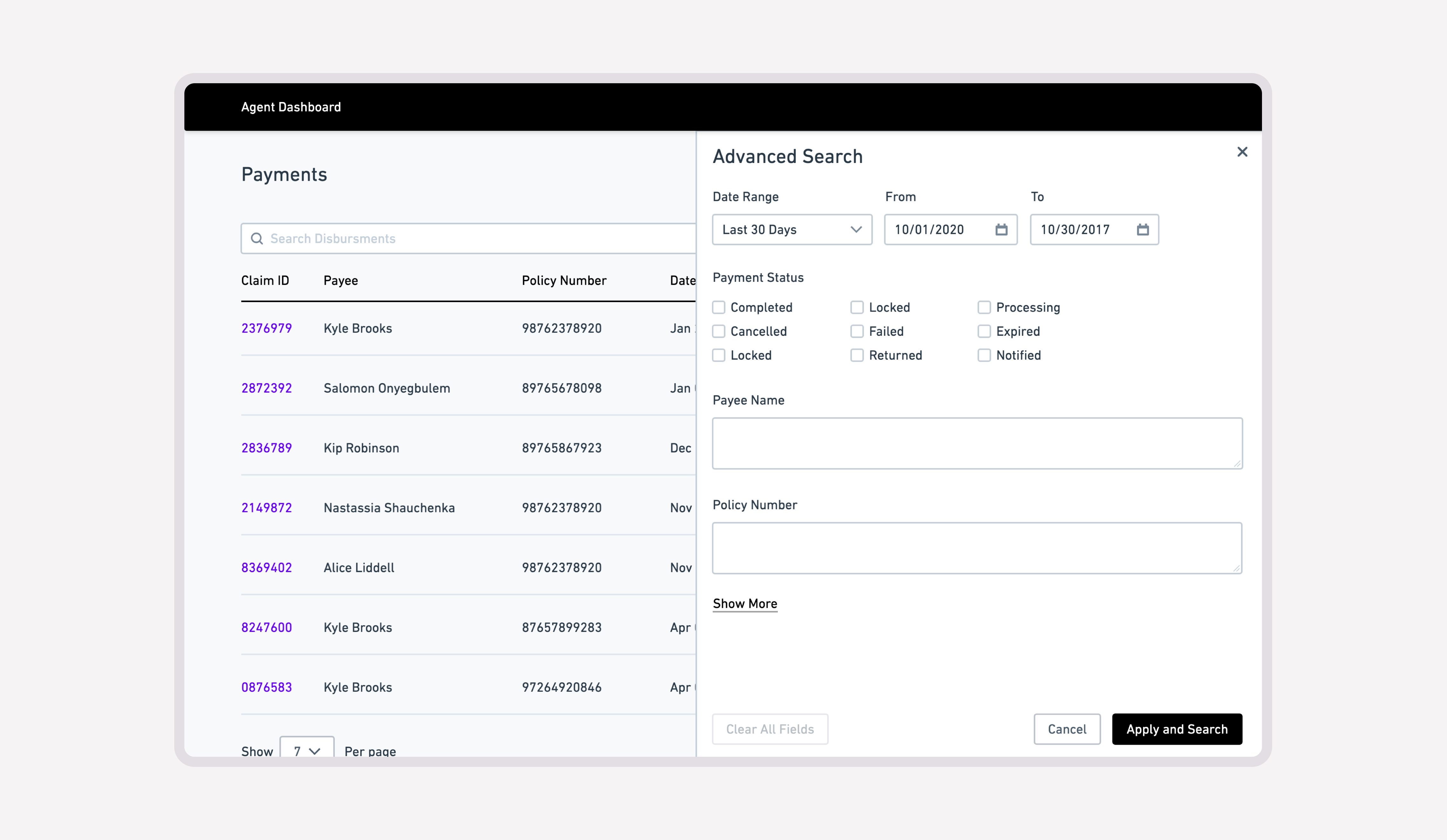
Parameters with known values, such as payment status, used selection controls that exposed available options directly. Open-ended criteria, such as identifiers and custom date ranges, used inputs suited to their data type.
This allowed the interface to reflect the structure of the underlying information rather than forcing users to translate every condition into text.
Prioritizing the criteria users relied on most
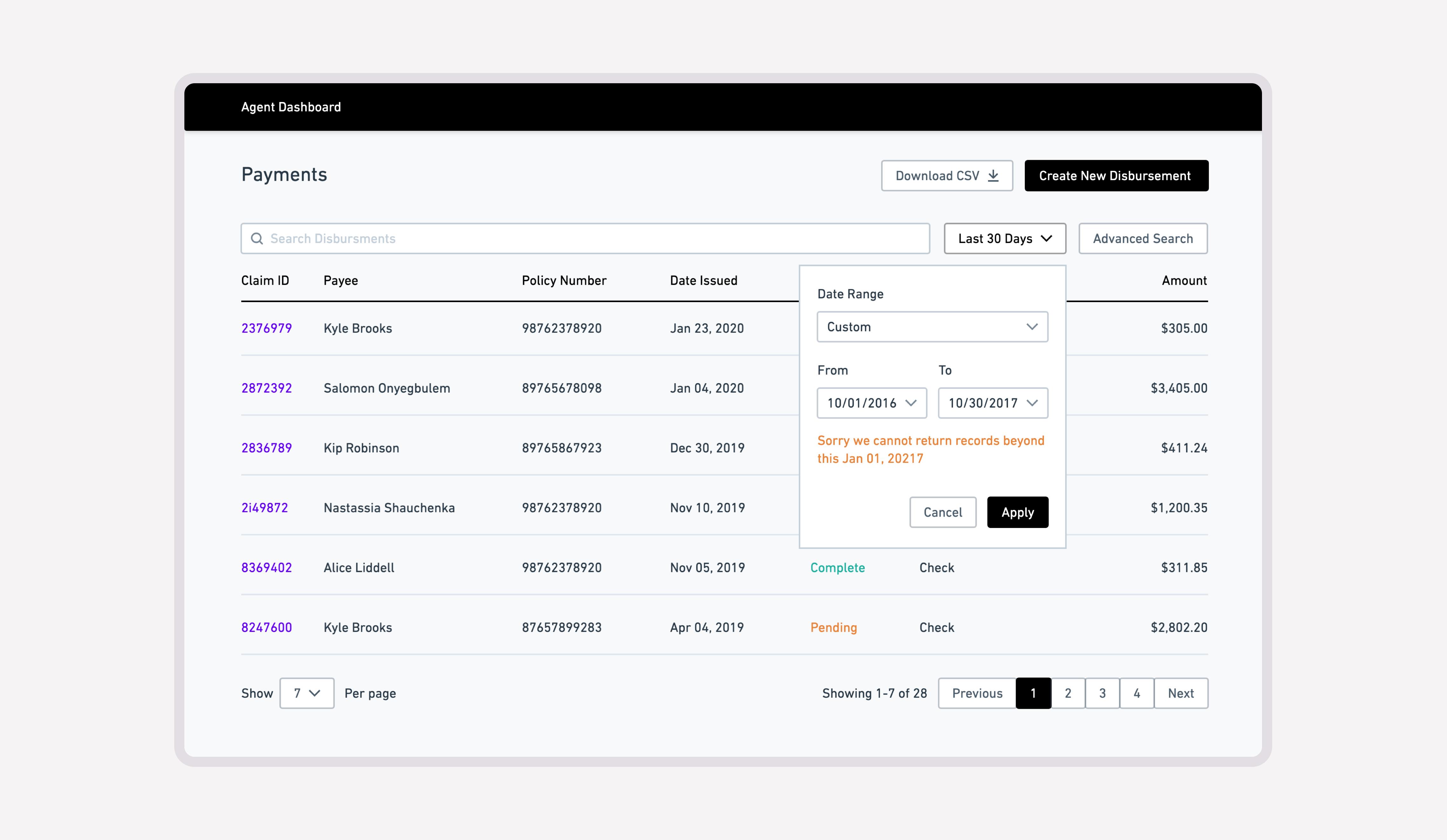
Date range was the most frequently used reporting parameter, so I made it immediately accessible and preset it to the previous 30 days.
The default supported the most common reporting scenario while remaining easy to adjust for users investigating a different period.
Rather than treating every parameter with equal priority, the interface emphasized the conditions most likely to help users produce a useful result quickly.
Supporting multiple values without requiring syntax
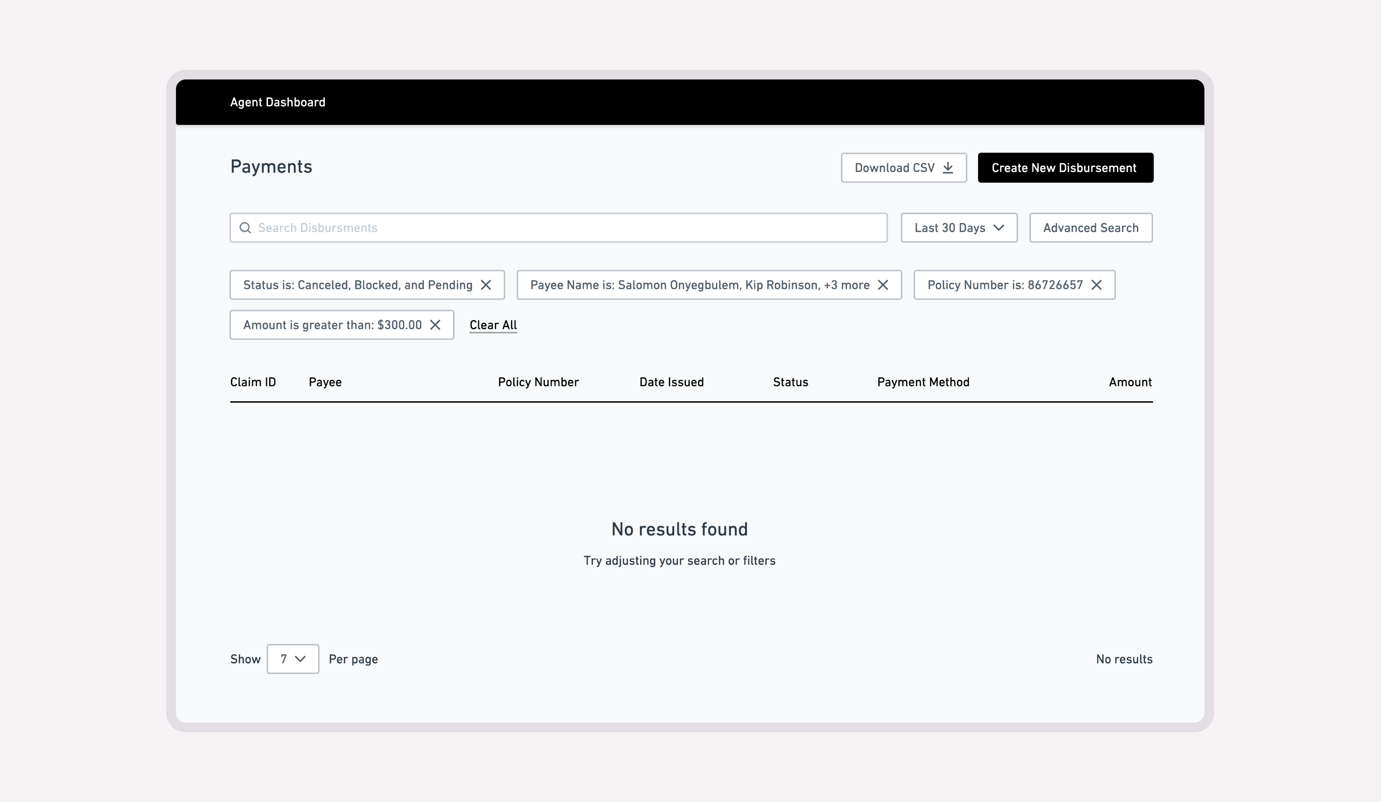
Some reconciliation scenarios required users to search against several possible values within the same parameter.
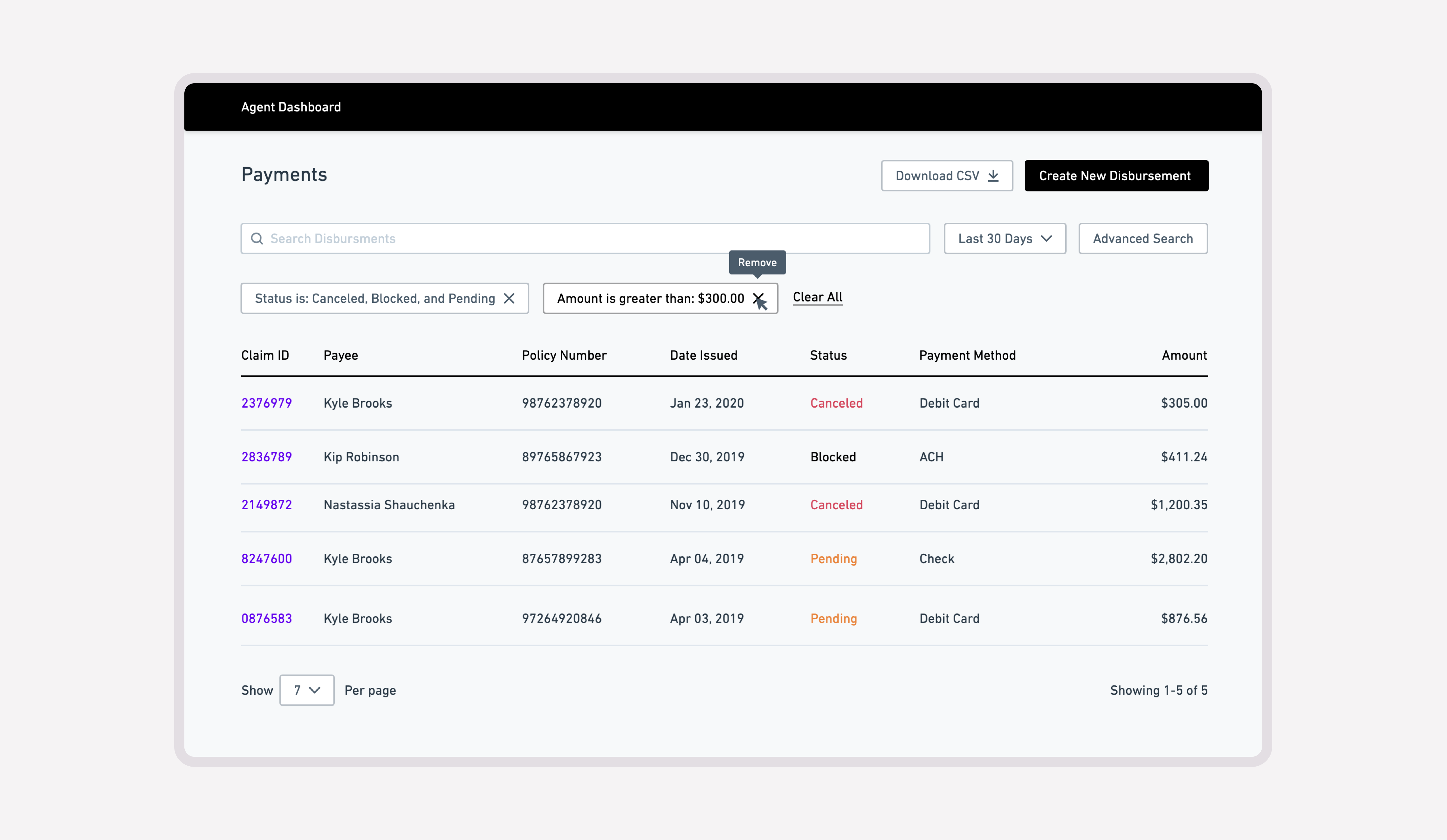
Instead of asking users to enter comma-separated text—a pattern that depends on formatting accuracy—I designed a multi-select tag input that represented each value independently.
This made the query easier to review, modify, and correct while reducing the risk that an unnoticed formatting error would affect the results.
Ordering filters from broad patterns to unique records
The parameters were deliberately ordered according to how widely their values could apply across the dataset.
Broad conditions, such as date range and payment status, appeared first because they could reduce thousands of records into a more relevant working set. More specific criteria followed, including policy numbers, claim details, and unique identifiers.
A claim ID might retrieve a single record, while a date range could describe many. Organizing parameters from broadly shared attributes to increasingly specific ones allowed the interface to mirror the natural progression from exploration to verification.
Designing for progressive refinement
The final interaction model allowed users to begin with minimal information and add specificity only when necessary.
Rather than requiring a perfectly formed query upfront, the system supported progressive refinement: users could define an initial result set, inspect what remained, and apply additional parameters until the records matched their operational objective.
This made advanced filtering feel less like completing a complex form and more like narrowing an investigation.