Case Study

Establishing a design system
tl;dr

A 0-1 design system and component library for Compass Digital's healthcare design team to support product development efficiency.

Designing a shared product language that aligned design and engineering

Compass Digital‘s product organization was growing quickly. Multiple designers, product managers, and engineering teams were shipping features across several products that all shared a common codebase. While each designer owned a different product, engineering viewed the ecosystem as a single platform.

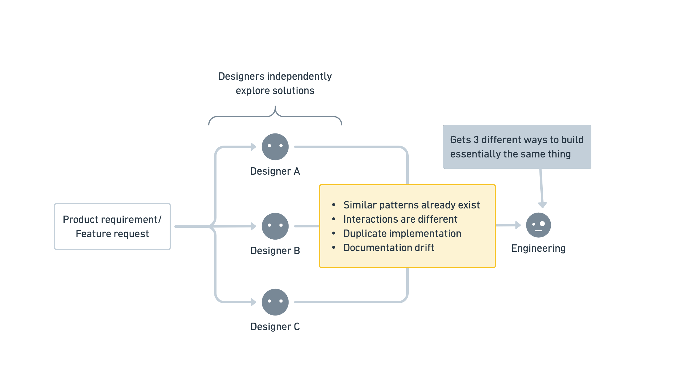
Before the design system, designers solved similar problems independently, resulting in inconsistent interactions, duplicate engineering effort, and documentation drift. This became the organizational problem the design system was created to solve.

Without a shared design language, similar problems were being solved differently across products. Components evolved independently, interaction patterns diverged, and engineering increasingly found themselves rebuilding the same functionality to accommodate inconsistent design decisions.

I was brought in to establish a design system. I built a shared product language that aligned design, product, and engineering around a common way of designing and building software.

Solving organizational misalignment rather than inconsistent interfaces

Although “design system” was the term everyone used, it quickly became apparent that inconsistent components were only a symptom of a much larger organizational problem.

Each discipline experienced the consequences differently.

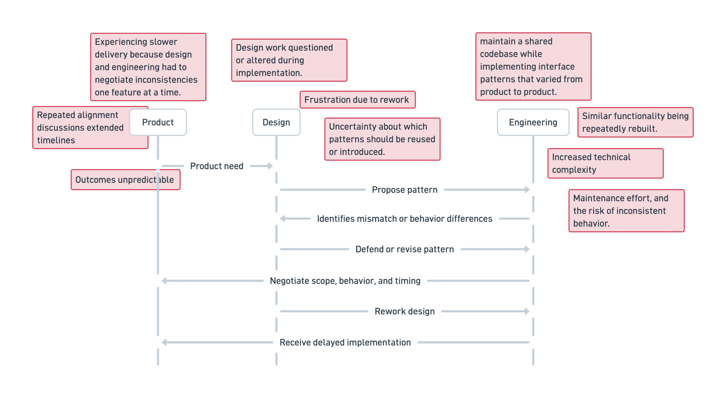
Engineering struggled to maintain a shared component library while implementing increasingly inconsistent interface patterns. Designers were frustrated that their work was frequently challenged during implementation. Product teams experienced slower delivery as design and engineering negotiated inconsistencies feature by feature.

Product needs became a cycle of negotiation and rework. Without shared interface standards, designers proposed patterns that engineering could not consistently support, forcing teams to resolve mismatches feature by feature. The result was slower delivery for product, repeated revisions for design, and growing technical complexity for engineering.

Rather than approaching the project as a component library initiative, I reframed it as an alignment problem. Before standardizing interfaces, the organization first needed a shared understanding of how interface decisions should be made.

Establishing a shared understanding before defining standards

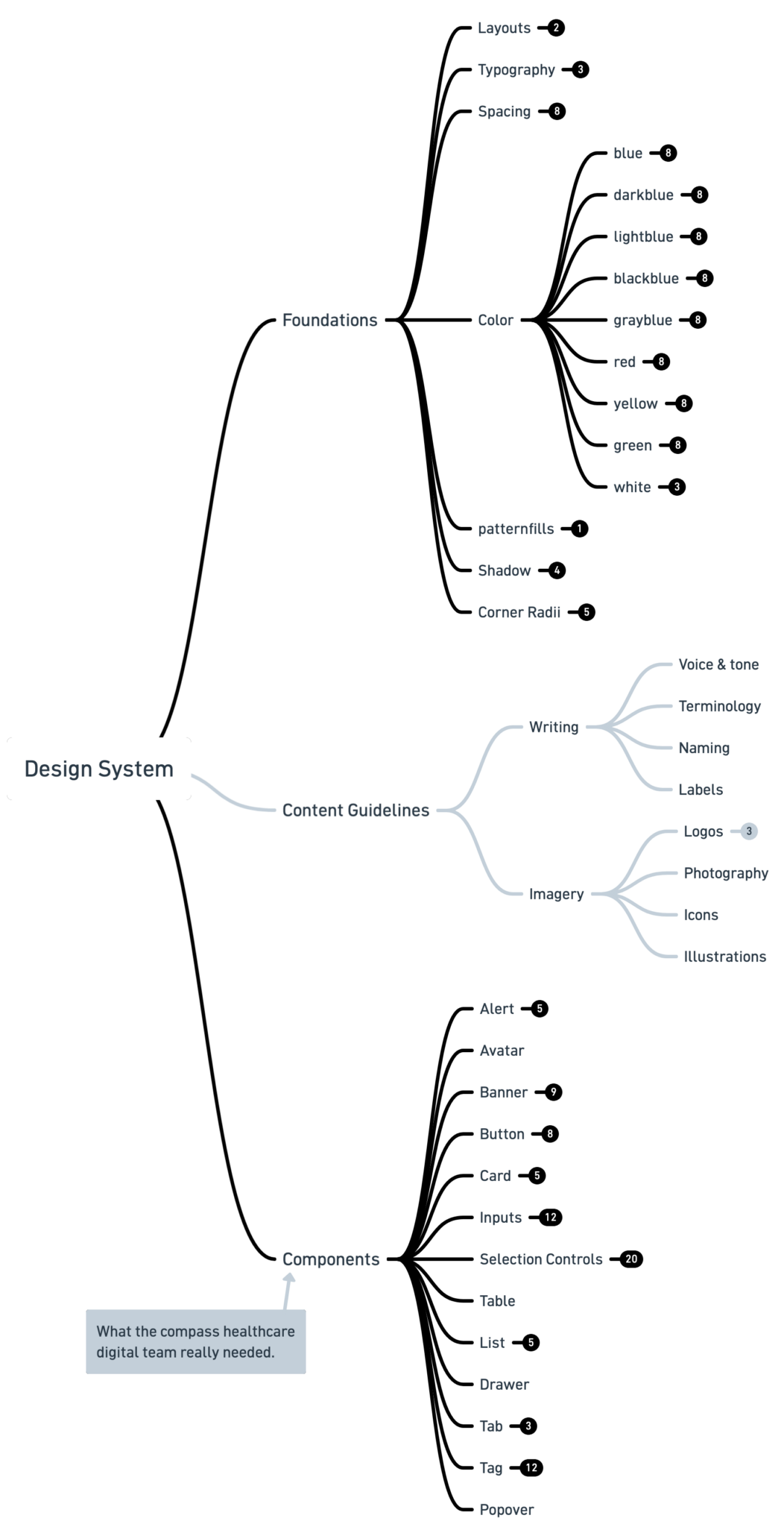
One of my first initiatives was facilitating a cross-functional workshop to establish a common understanding of what a design system actually is and what it isn’t.

The objective was to establish a shared conceptual model that product, design, and engineering could use when discussing consistency, reuse, and product quality.

A high-level map of the design system, showing how design foundations, content guidelines, and reusable components work together as a single product language.

Interestingly, this exercise also surfaced valuable allies. Several senior engineers already approached software development systematically and immediately recognized the broader organizational value of establishing shared standards. That early alignment became instrumental throughout the remainder of the project.

Auditing existing decisions before creating new ones

Rather than beginning with components, I started by understanding the current state of the product ecosystem. I audited every product to identify the interface elements, interaction patterns, and visual decisions already in use. Rather than asking “What components should exist?”, I asked:

Which decisions have already proven themselves across multiple products, and therefore deserve to become standards?

This distinction fundamentally changed the direction of the project. The design system was identifying, refining, and formalizing the best decisions that already existed throughout the product suite.

At the same time, I worked closely with engineering to understand the technical landscape supporting those products. We reviewed the existing component architecture, implementation strategy, and development workflows to determine whether external libraries or technical constraints would influence the design language.

Discovering that engineering maintained their own internal component implementation rather than relying on a third-party design system provided significant flexibility. Instead of adapting another system’s opinions, we could optimize the design language specifically for Compass Digital’s products and engineering practices.

Standardizing decisions before standardizing interfaces

After understanding both the design landscape and the engineering architecture, I began formalizing the system itself. I first established the foundational decisions that every component would inherit.

These included:

  • Typography
  • Color
  • Spacing
  • Elevation
  • Iconography
  • Grid and layout principles
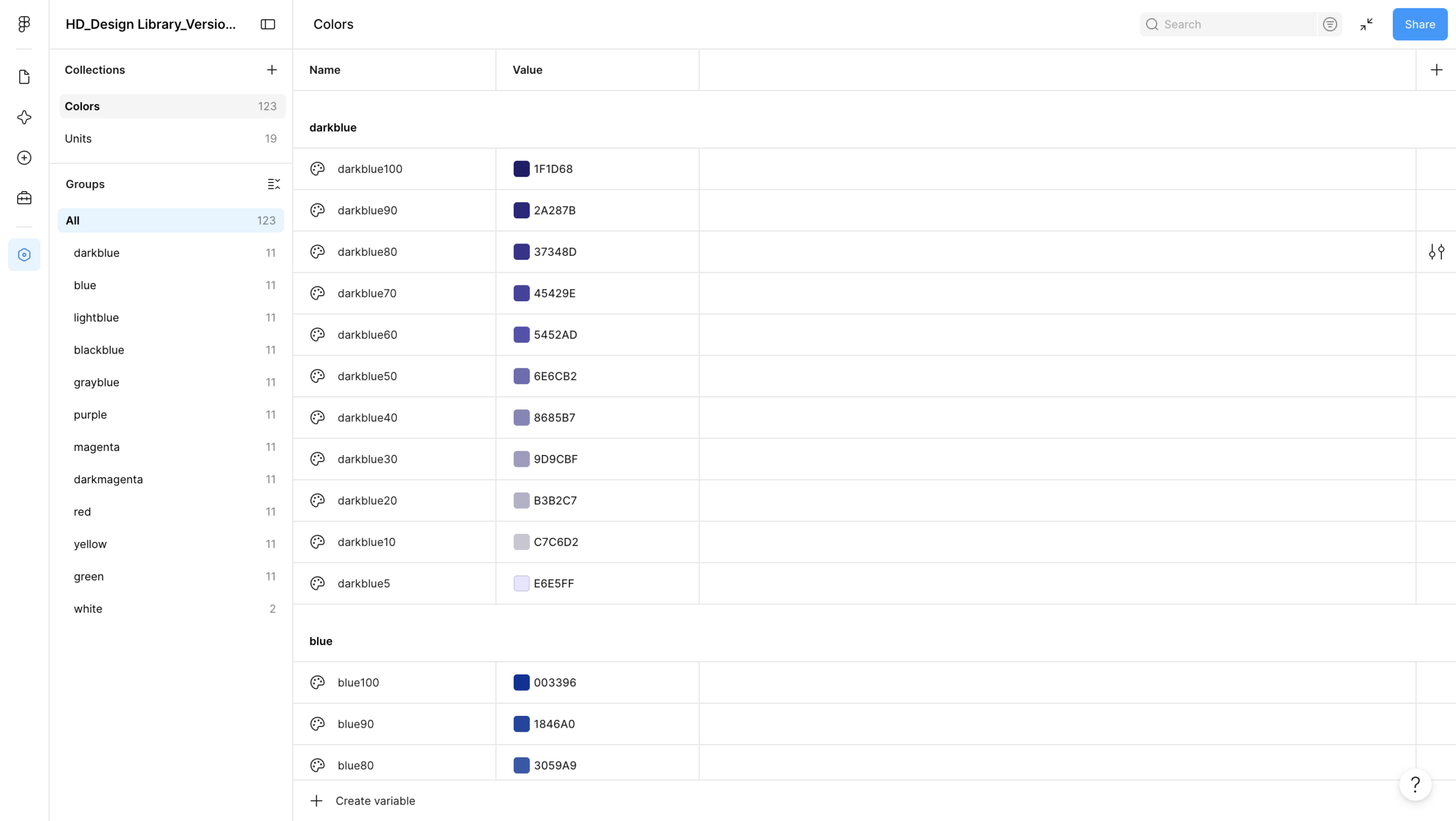
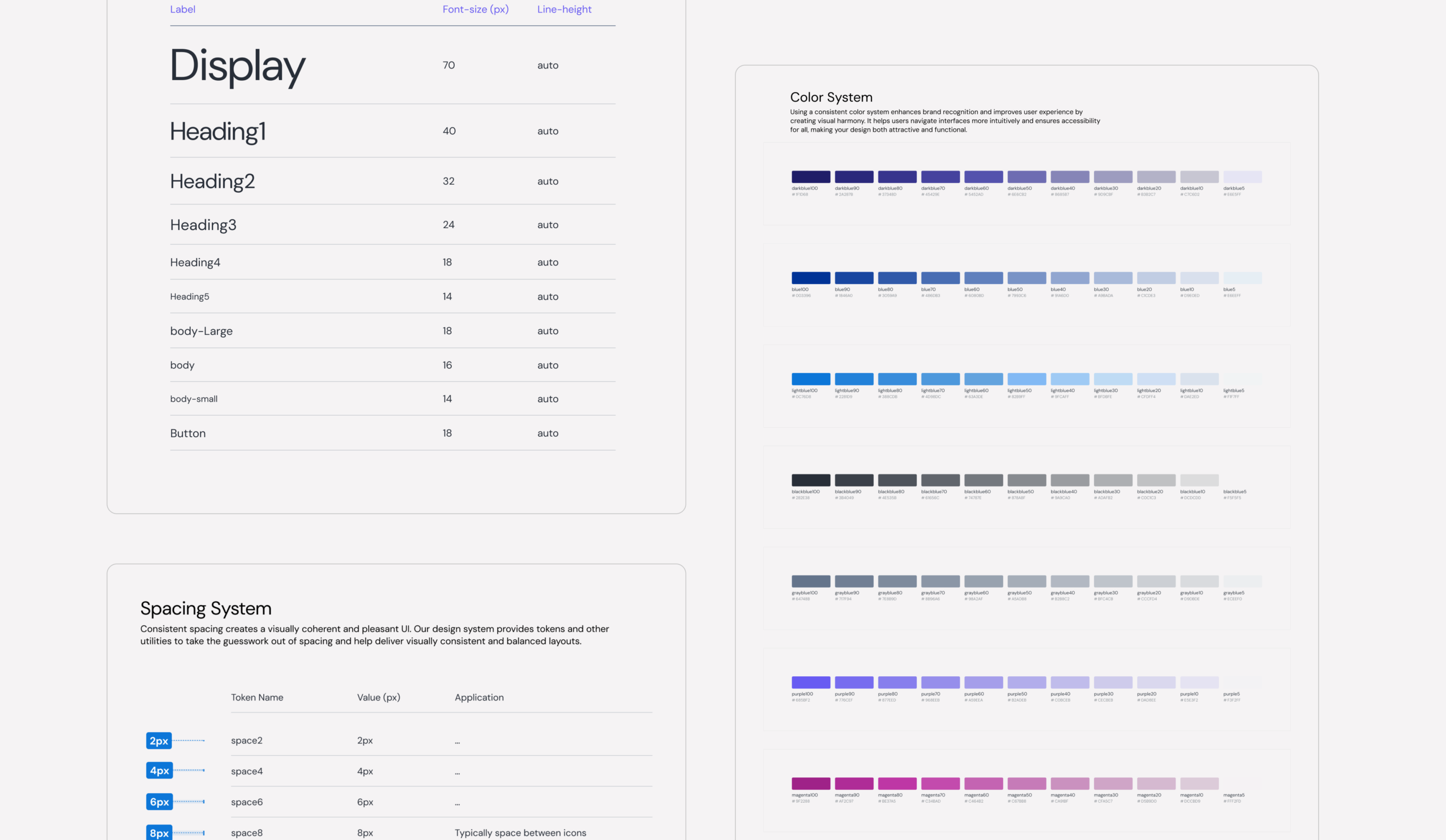
A semantic color system built with design tokens and variables. Standardized palettes ensured consistent application of color across products while making future theming and maintenance significantly easier.
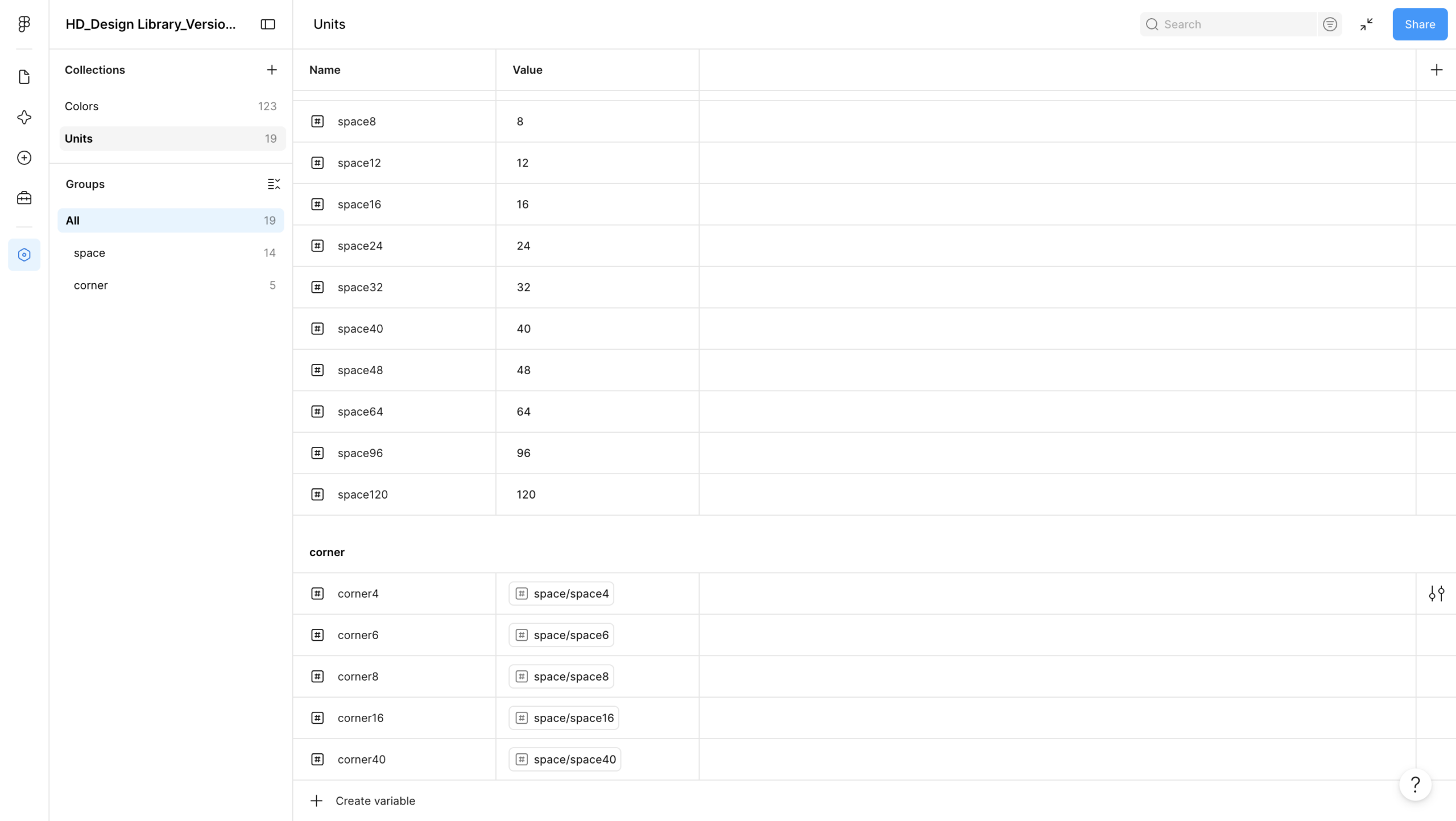
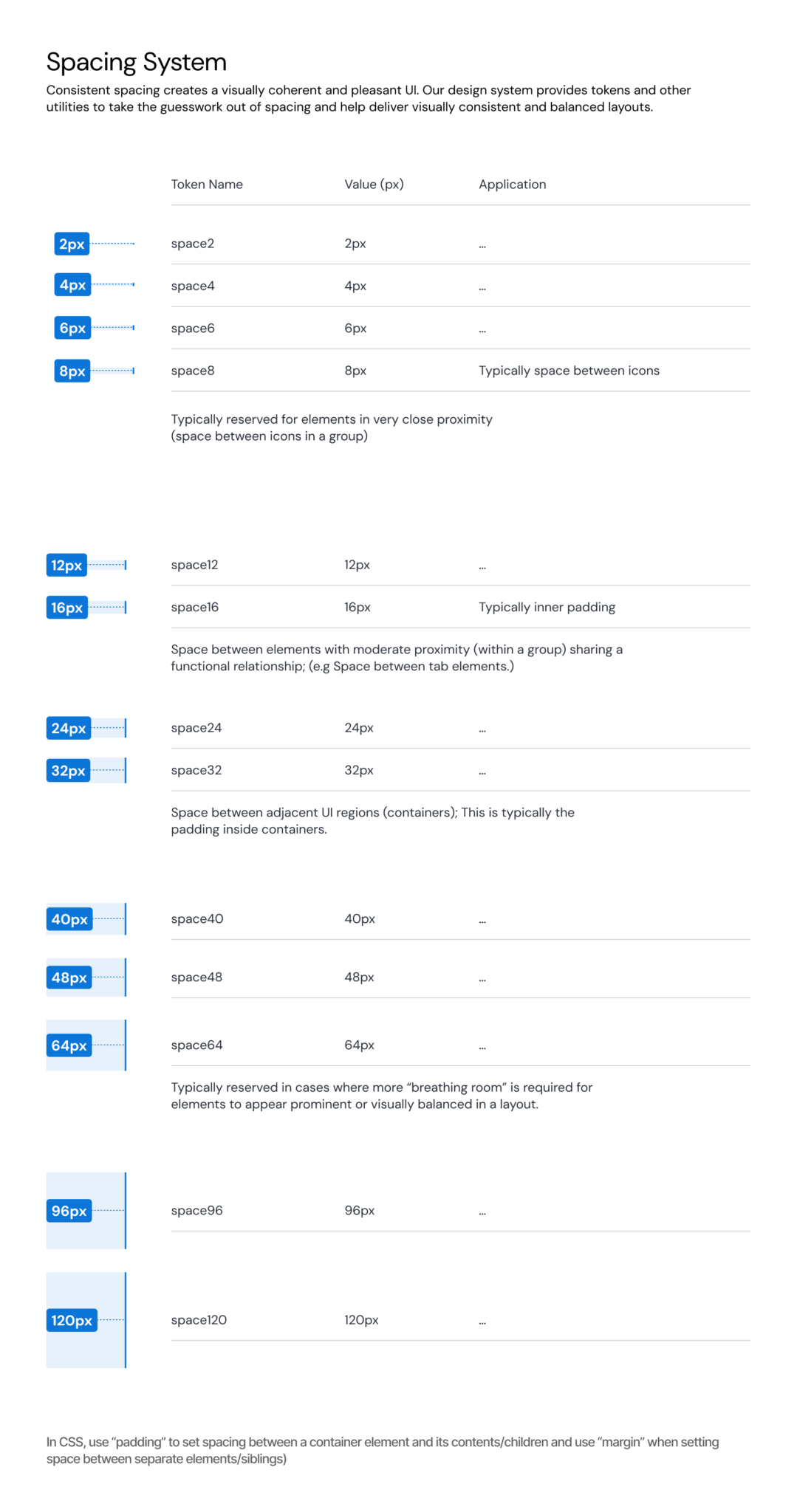
A spacing token system established consistent spacing and corner radii throughout the interface. By abstracting measurements into reusable variables, layouts became more scalable, maintainable, and easier to update over time.
Spacing guidelines defined when and how each spacing token should be applied, giving designers a shared framework for creating balanced layouts and reducing subjective spacing decisions.
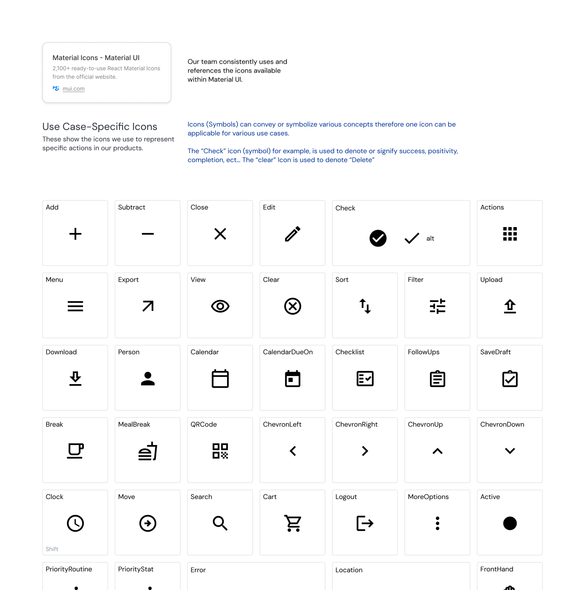
A curated icon library paired with usage guidelines to standardize iconography across products. Reusing a shared visual vocabulary reduced ambiguity, improved recognition, and prevented teams from introducing duplicate or inconsistent icon
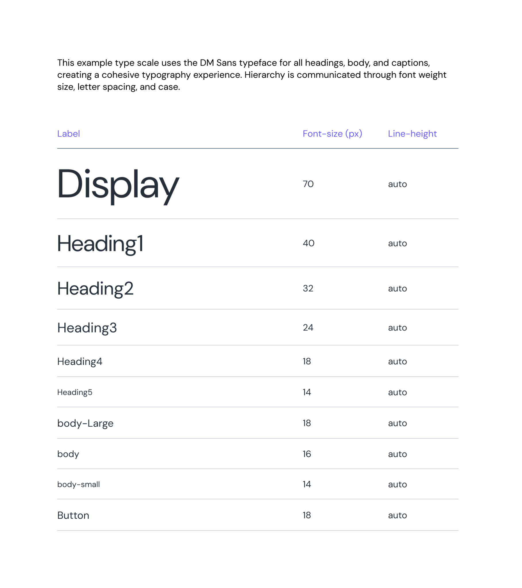
A standardized typography scale established consistent hierarchy across products. Defining reusable text styles for headings, body copy, and interface elements improved readability while simplifying implementation for engineering.
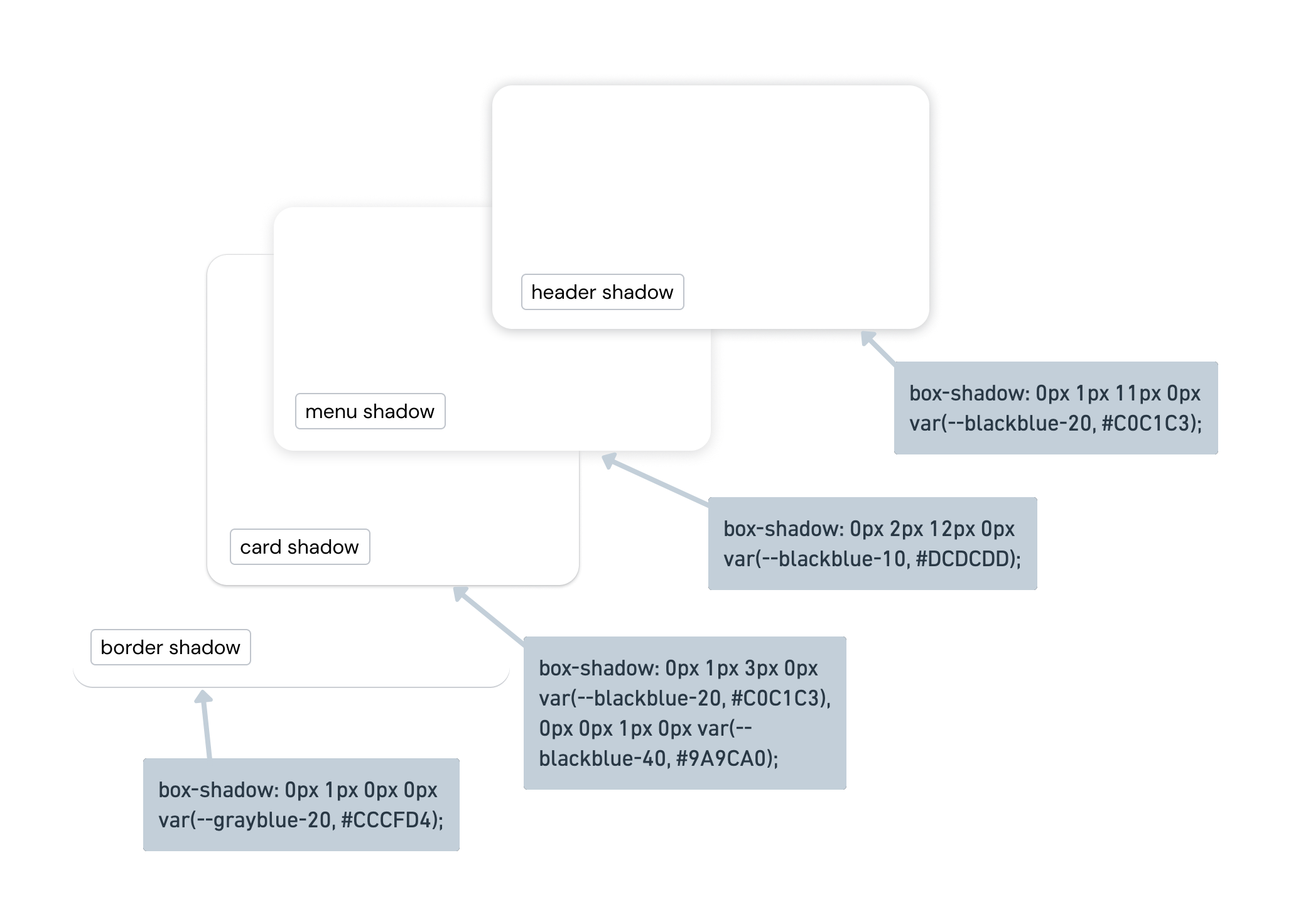
Elevation tokens defined consistent shadow styles for common UI surfaces such as cards, menus, and headers. Documenting these patterns helped establish a predictable visual hierarchy while giving engineering reusable implementation values.

Together, these primitives became the foundation of the visual language. Every decision was continuously reviewed with designers and engineers to ensure the emerging system reflected both user experience principles and implementation realities rather than personal preference.

Building agreement around these foundations made later component decisions significantly easier because they inherited an already accepted visual language.

Building components engineers wanted to adopt

Once the design language had been established, I began defining the reusable interface components that would become the shared source of truth for every product.

Each component represented an agreement between design and engineering rather than a purely visual artifact.

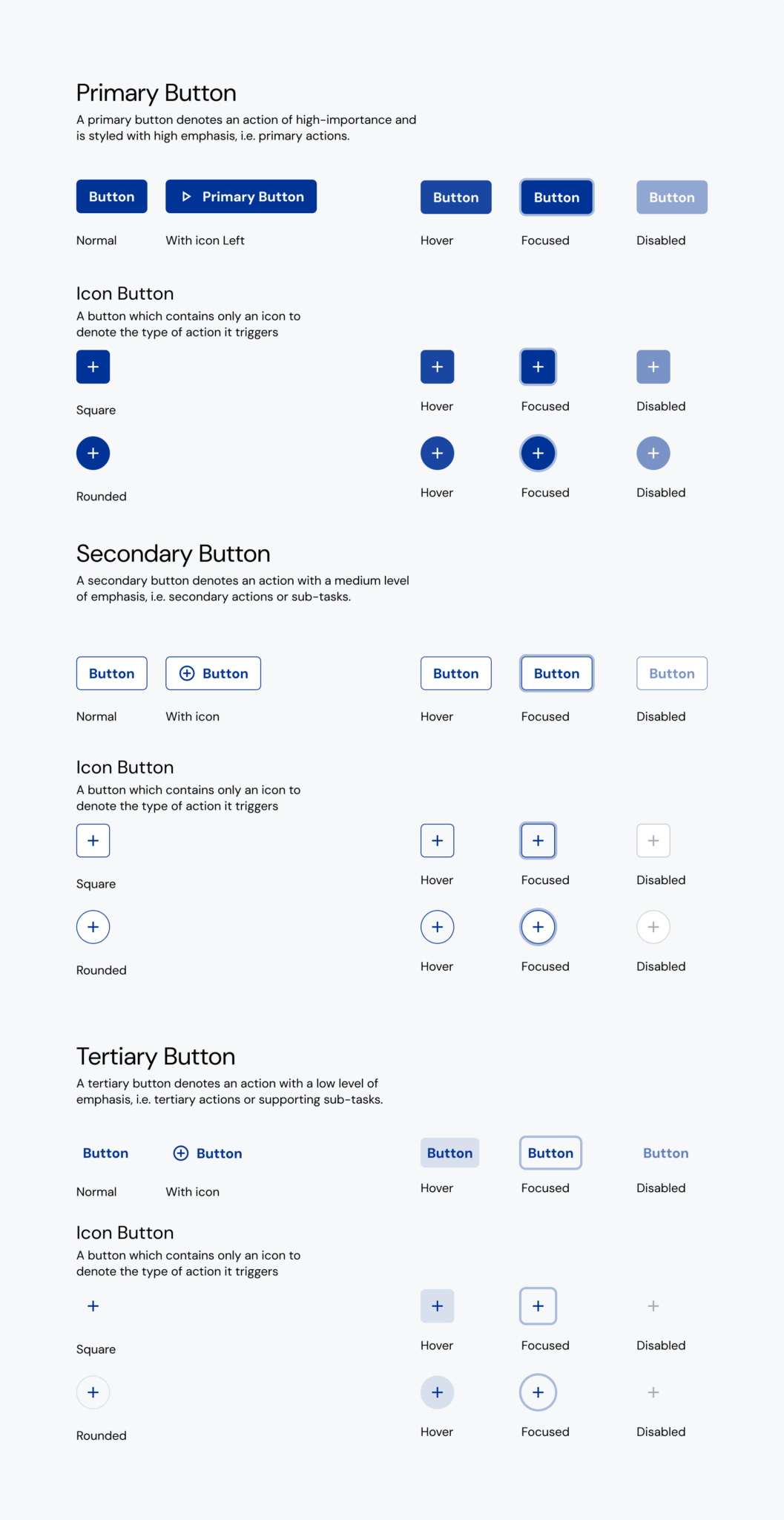
Components were engineered for efficiency as much as consistency. Thoughtful property architecture allowed designers to switch between variants and states with minimal effort, reducing repetitive clicks and making common workflows significantly faster.
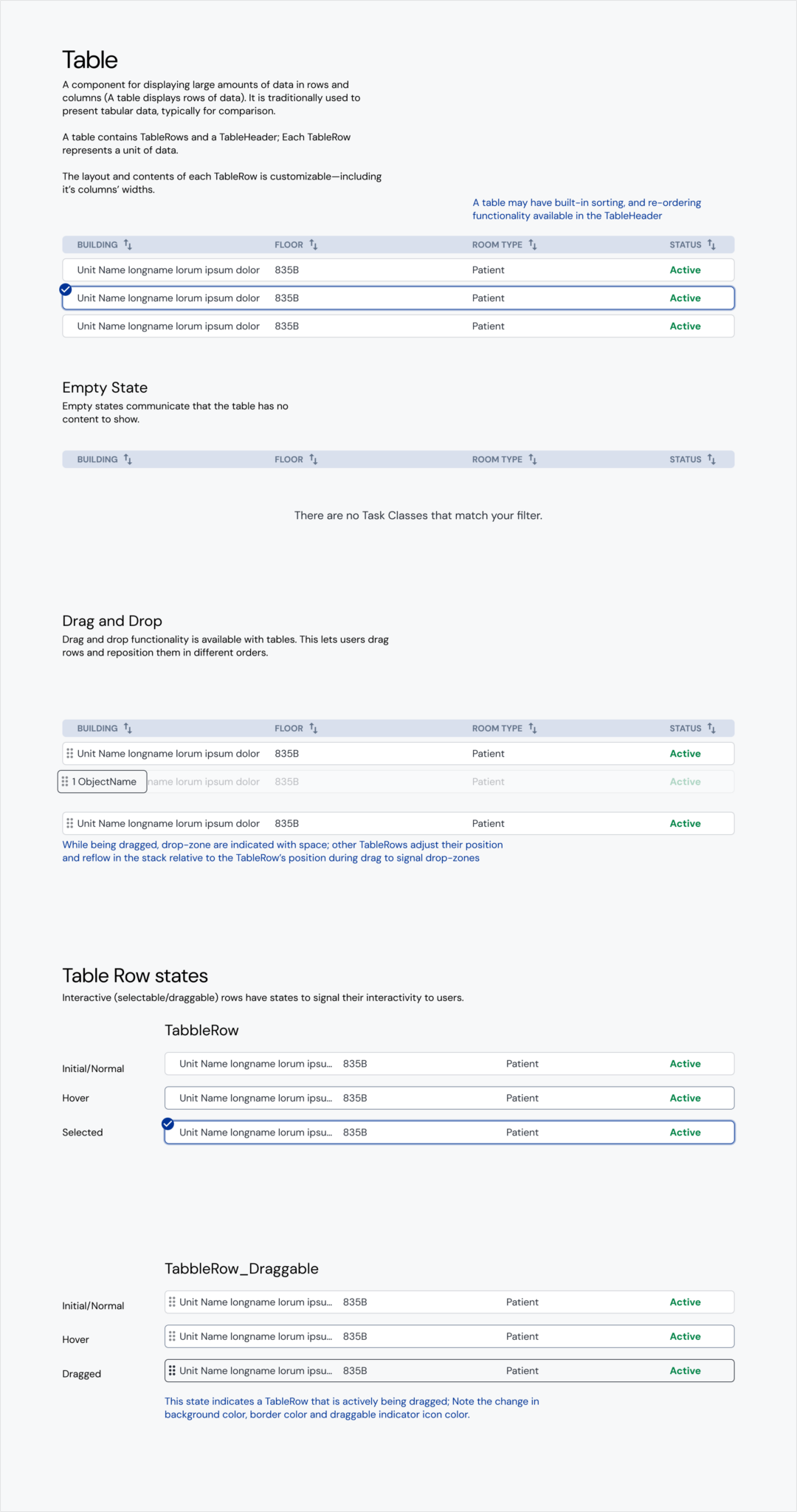
Complex components were documented beyond their visual design. Tables included interaction states, empty states, drag-and-drop behaviors, and sorting patterns, creating a shared reference for designers and engineers implementing advanced functionality.
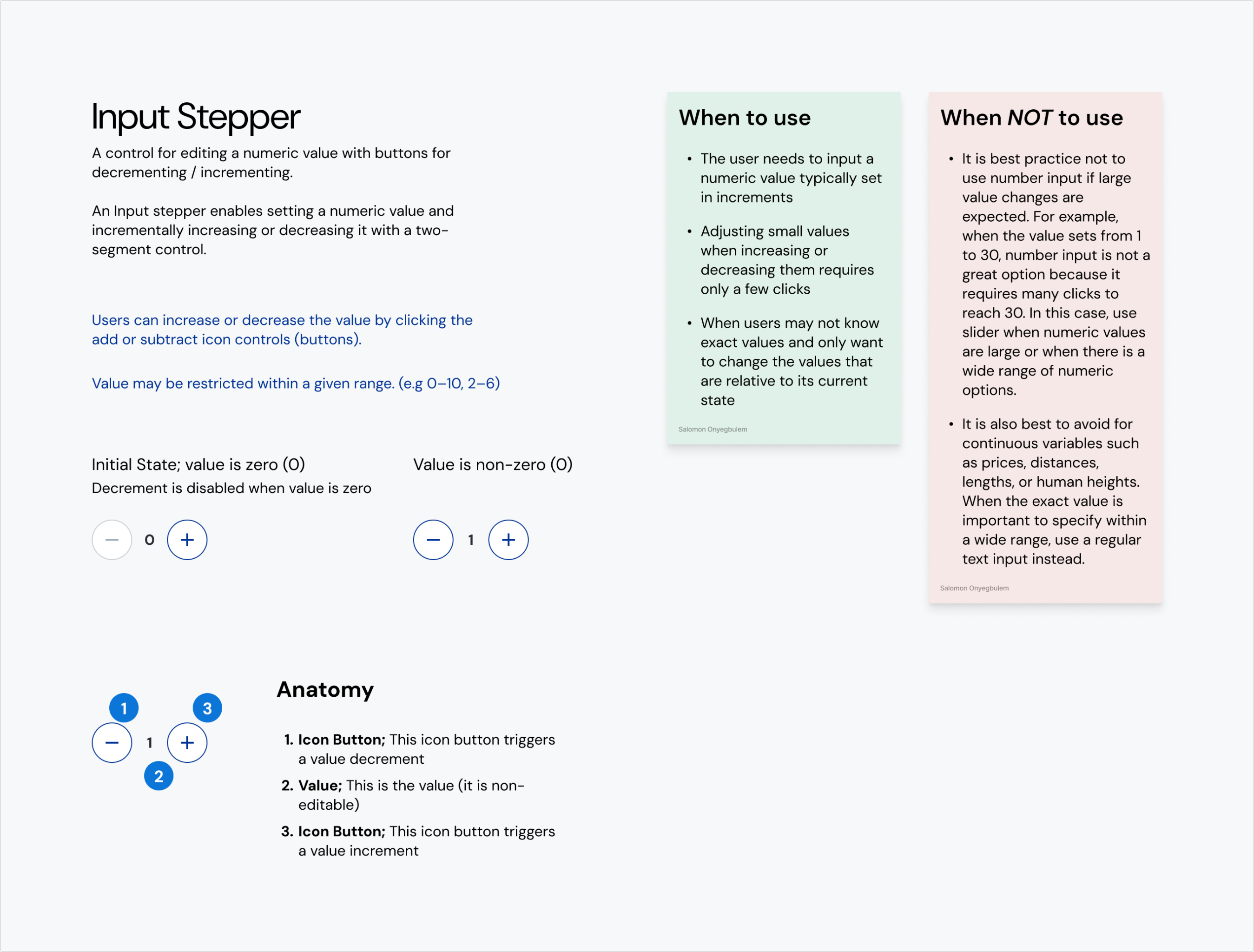
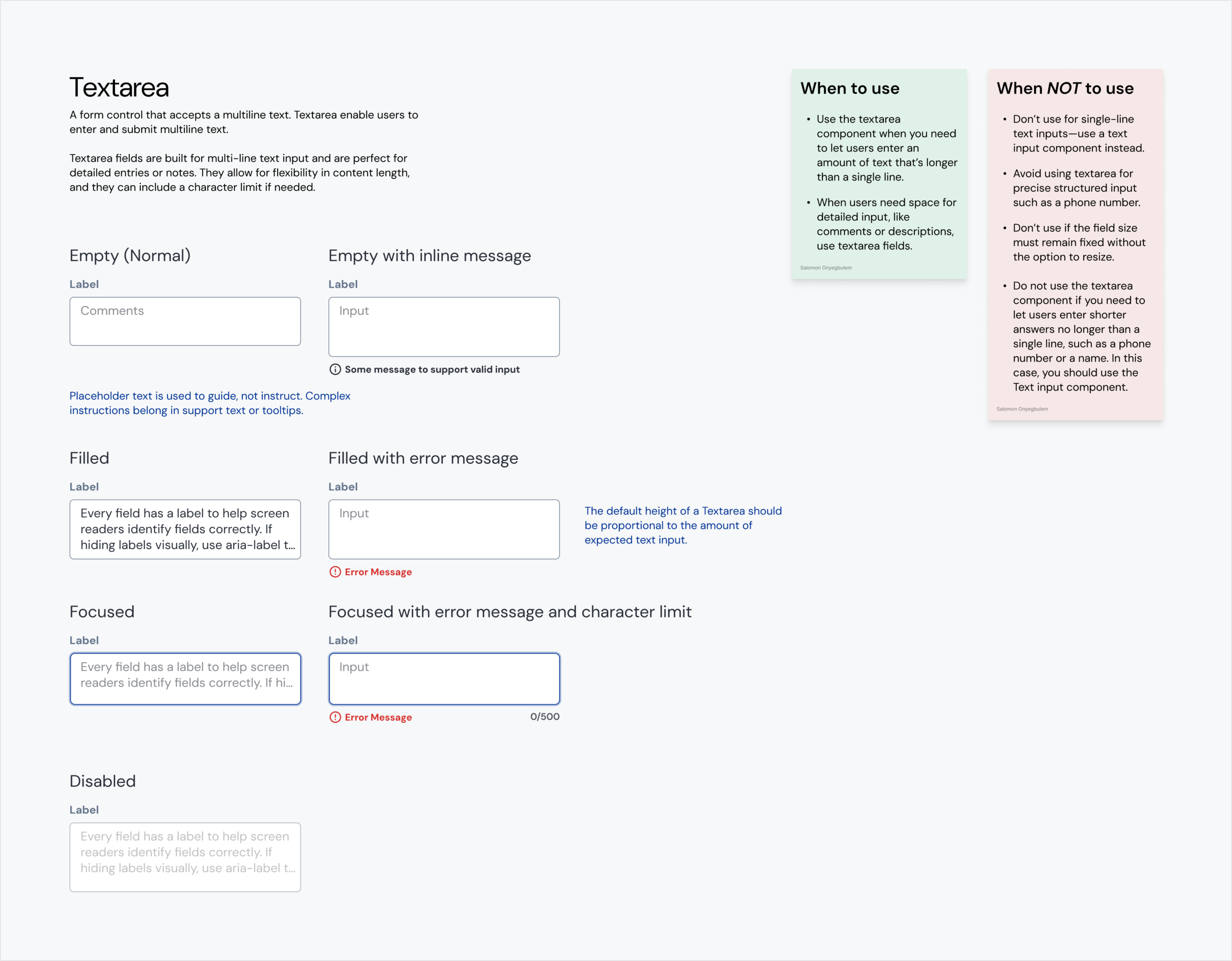
Component documentation includes interaction states, accessibility considerations, validation patterns, and content guidance. Providing clear usage recommendations reduced ambiguity and promoted consistent experiences across products.
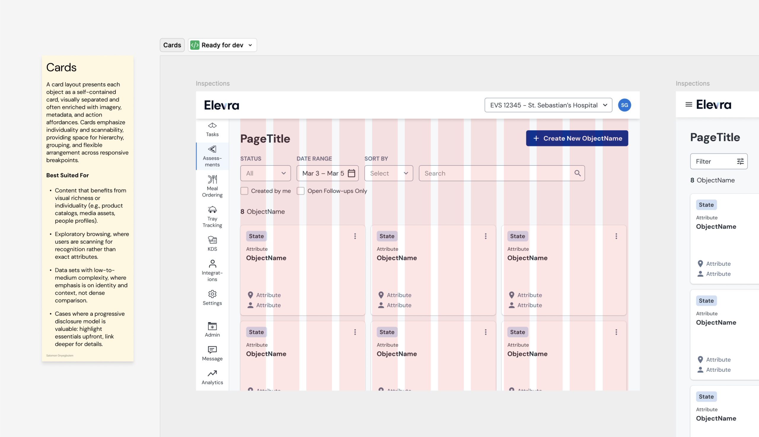
Pattern documentation established clear guidance for responsive layouts, defining when card-based interfaces were appropriate and how they should adapt across screen sizes. This reduced subjective design decisions and promoted consistency across products.
Components were accompanied with practical usage guidance. Documenting anatomy, behavior, and when to use (or avoid) a component helped teams make more consistent design decisions while reducing misuse.

Patterns were reviewed collaboratively, refined based on implementation feedback, and evaluated against existing product needs before becoming part of the system. The objective of which was to enable engineers to confidently reuse implementation while allowing designers to solve new problems without continuously reinventing existing interaction patterns.

Designing governance alongside the system

A successful design system is defined as much by how it evolves as by the components it contains. Rather than treating the library as a static deliverable, I established a collaborative governance model that allowed the system to evolve safely over time.

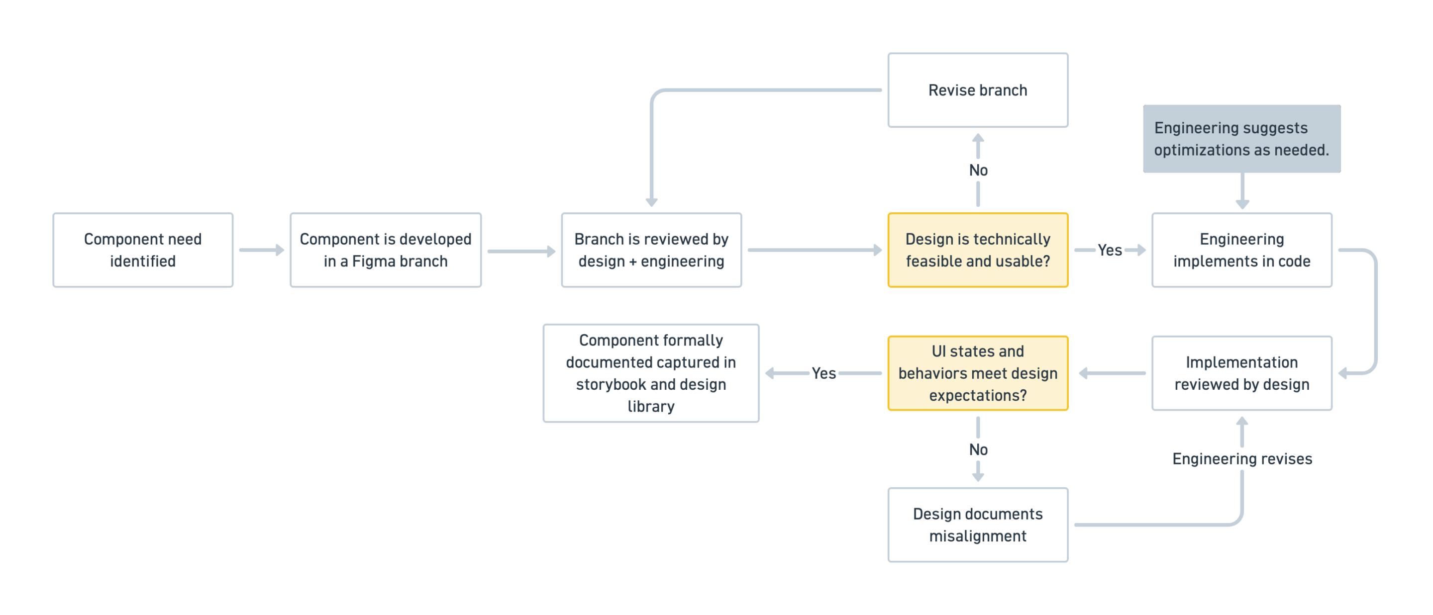
Using Figma branching, proposed additions and modifications were developed independently before entering a structured review process with engineering.

Together we established a simple principle:

Designers should never design with components that engineering couldn’t implement, and engineering should never implement components that hadn’t been reviewed by design.

A governed contribution workflow ensured that new components met both design and engineering standards before release. This process maintained parity between the Figma library and the coded component library while allowing the system to grow over time.

Once a component had been validated for both usability and technical feasibility, engineering implemented it within the shared component library. Only after implementation was complete was the corresponding Figma branch merged into the production design library and published for the wider design team.

This ensured that design and code remained synchronized while preventing the system from diverging over time.

Transforming a library into organizational infrastructure

I wasn’t really hired to build a design system

Over time, I learned the organization’s greatest challenge was the absence of a shared decision-making framework. Components were simply the visible outcome.

The real product was a shared language that allowed design, engineering, and product to reason about interfaces consistently.

That experience fundamentally changed how I think about design systems. They are not collections of reusable components. They are organizational tools that reduce ambiguity, enable collaboration, and allow product teams to move faster while delivering more coherent user experiences.

The design system became the shared source of truth adopted across more than ten (10) designers while providing engineering with predictable, reusable implementation patterns.

The component library introduced a repeatable process for making product decisions collaboratively Instead of debating interface details feature by feature, teams now began from a common foundation.

  • Consistency improved naturally.
  • Engineering rework decreased.
  • Designers spent less time recreating existing solutions.

Product teams delivered features more efficiently because interface decisions increasingly became matters of extension rather than invention. 👍


The design system is published as a live Storybook documentation site. Where designers and engineers could explore components, review implementation details, test behaviors, and reference the latest patterns from a single shared source of truth.

View the live Storybook

Next Case

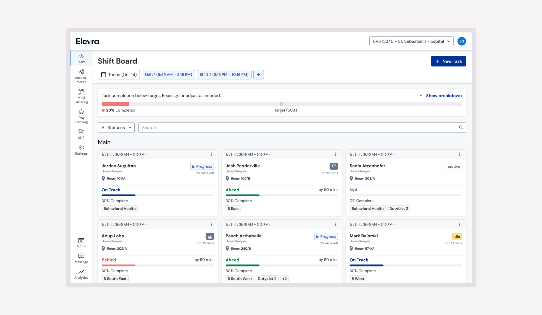
Improving real-time operations oversight