Case Study
Enhancing learning with AI-powered answers
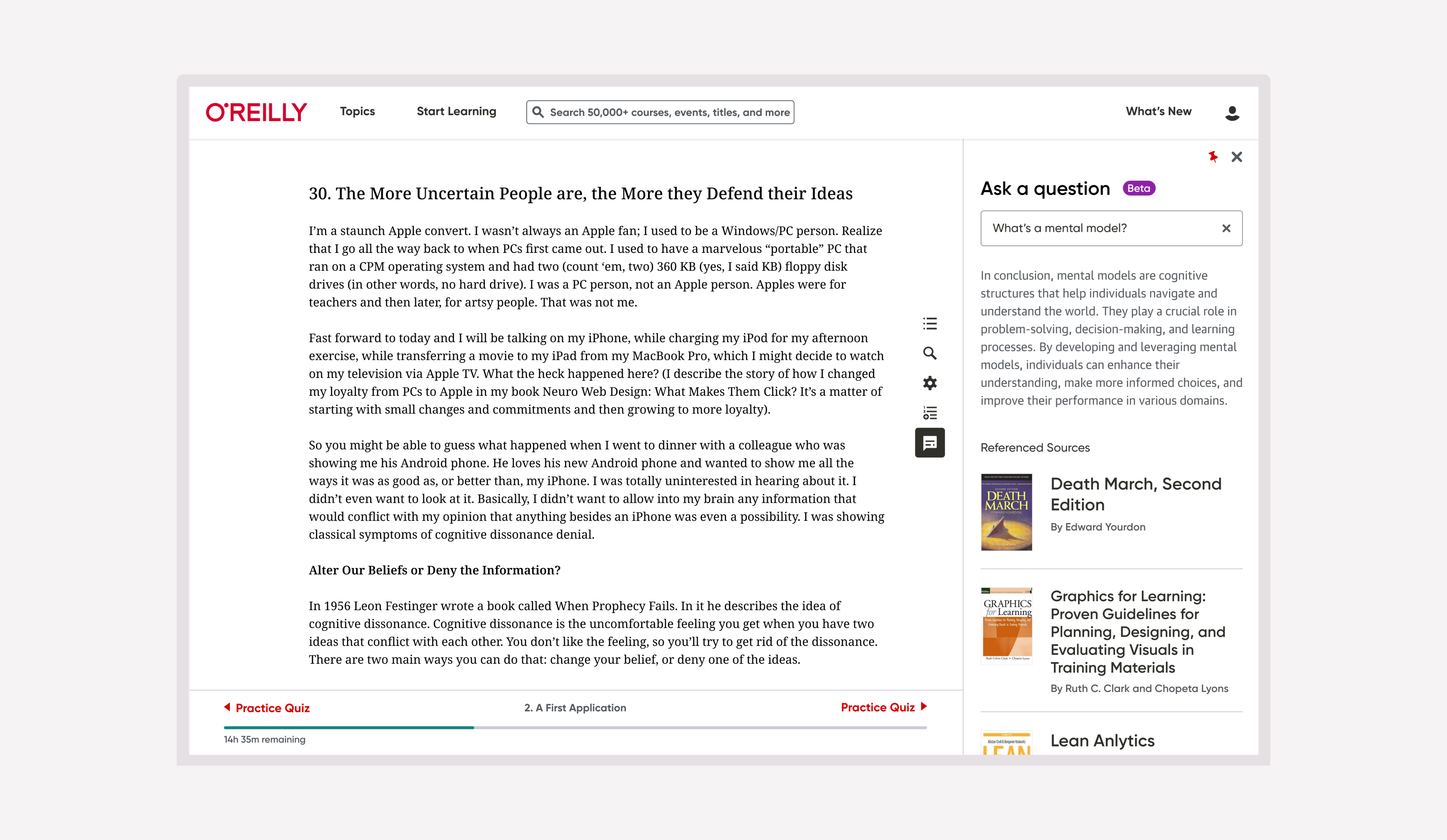
Improving the usability of an AI-powered answers bot in O'Reilly's online book reader.
I Introduced AI-powered answers in O’Reilly’s online learning book reading experience.
I joined the project after the AI team had successfully delivered a proof of concept for a real-time answers chatbot. My role was to enable a successful first-time release by optimizing the experience’s overall usability.
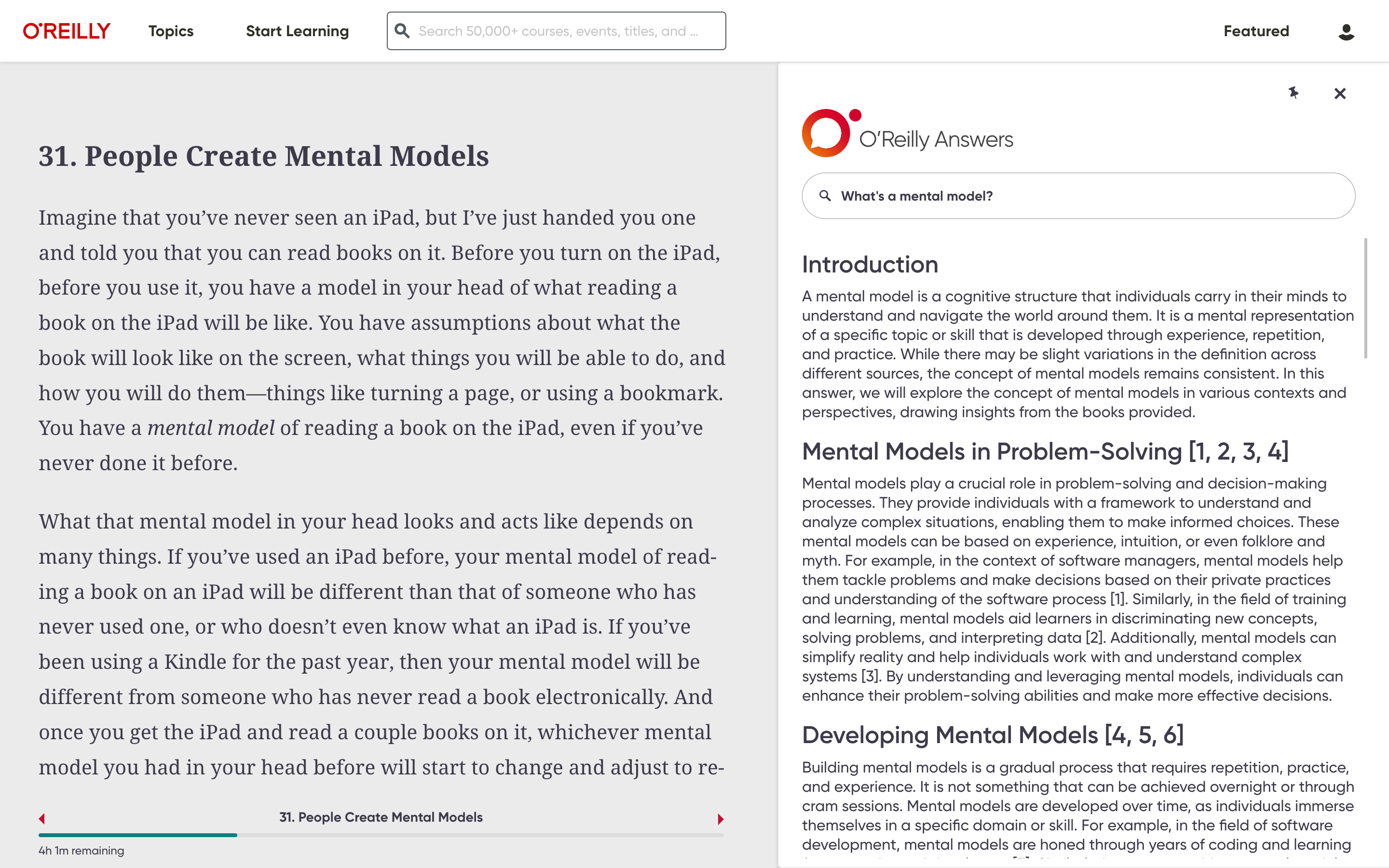
Evaluated the prototype against usability heuristics.
Given the project’s stage, a heuristic evaluation was the most practical way to identify design improvements. I focused on the principles most relevant to the experience and used them to prioritize changes.
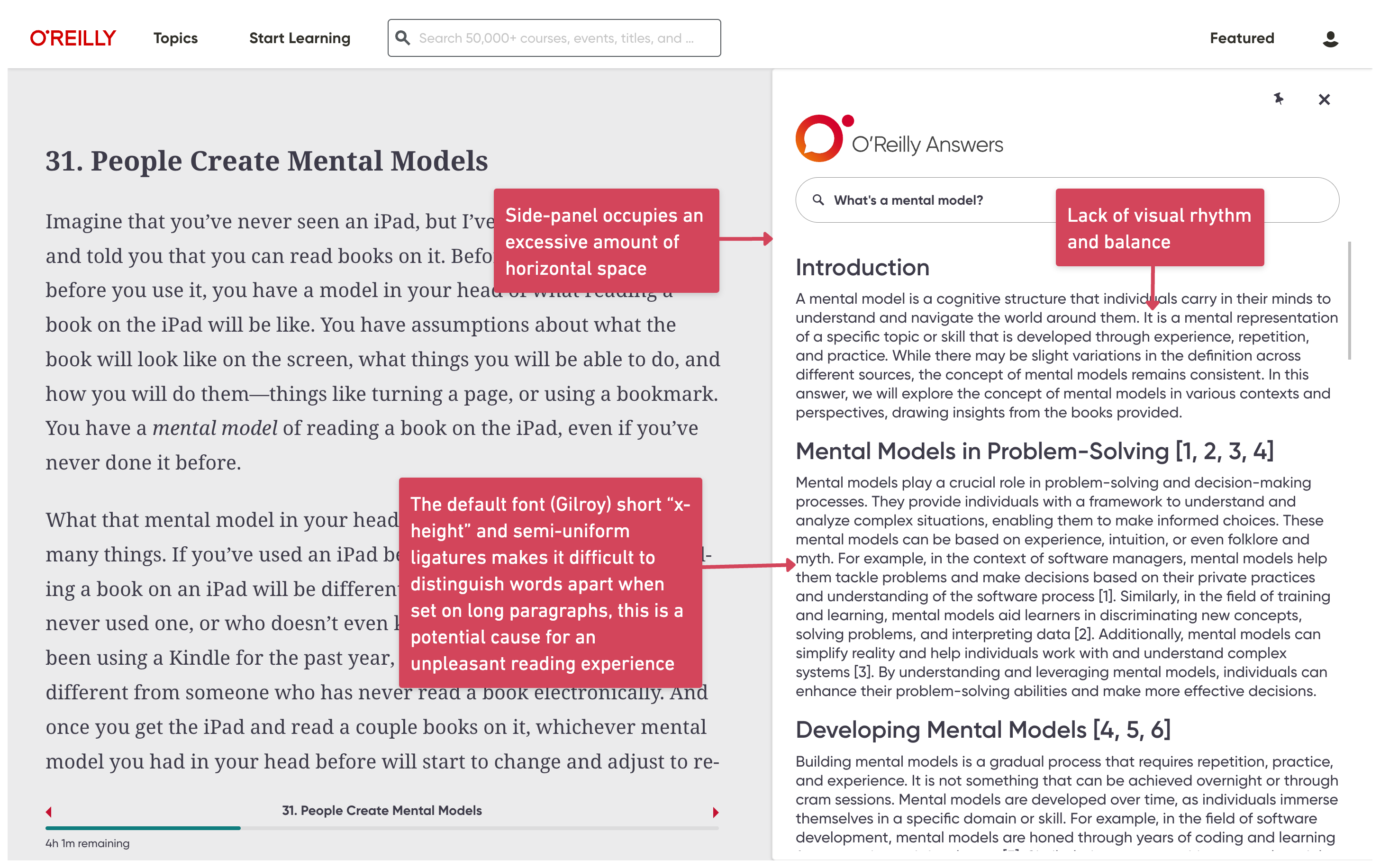
Improved readability and visual hierarchy.
I reduced the answer panel from one-half to one-third of the screen, replaced the typeface with one optimized for reading, improved spacing, and restructured long responses into shorter paragraphs so the book remained the primary focus.
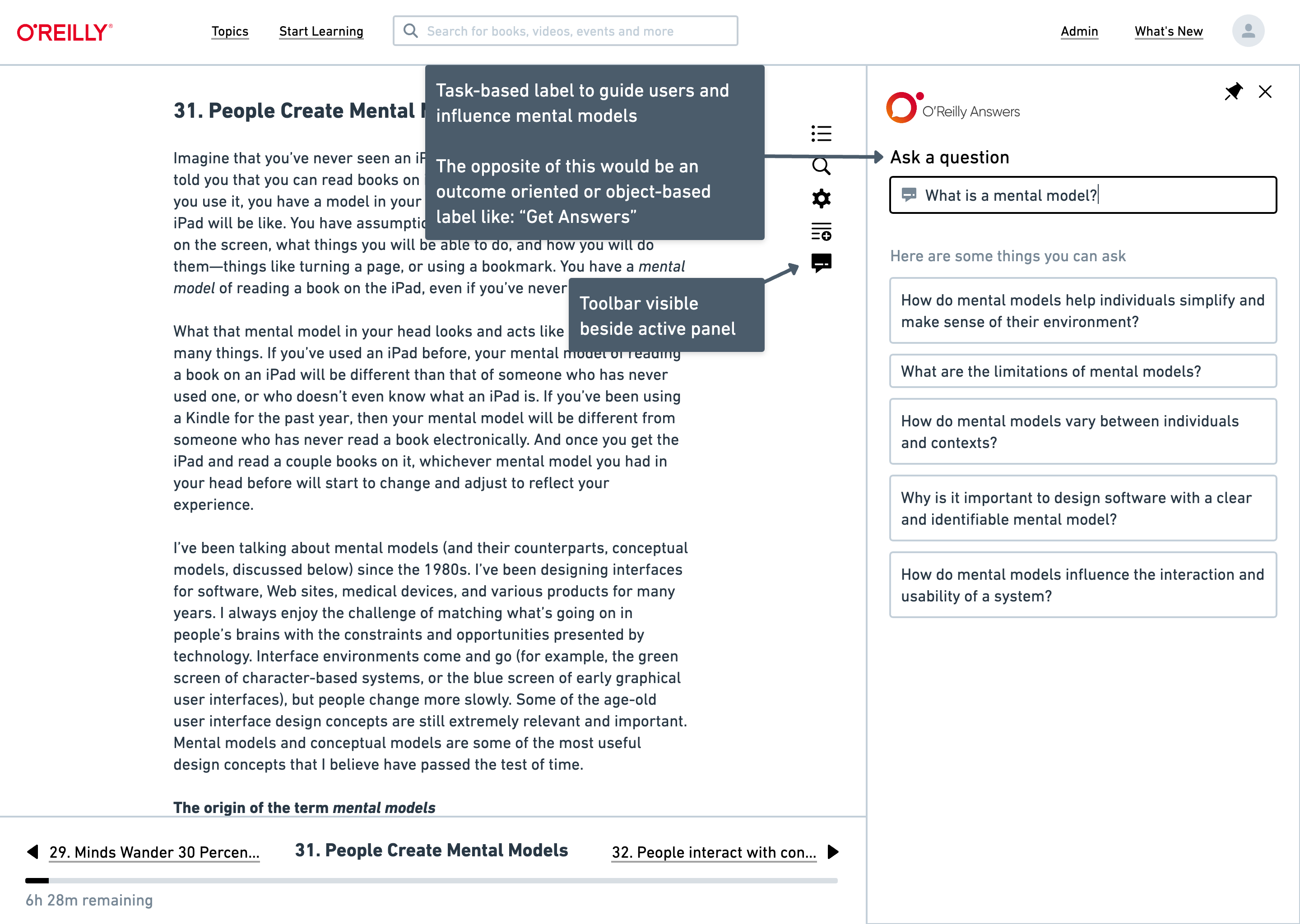
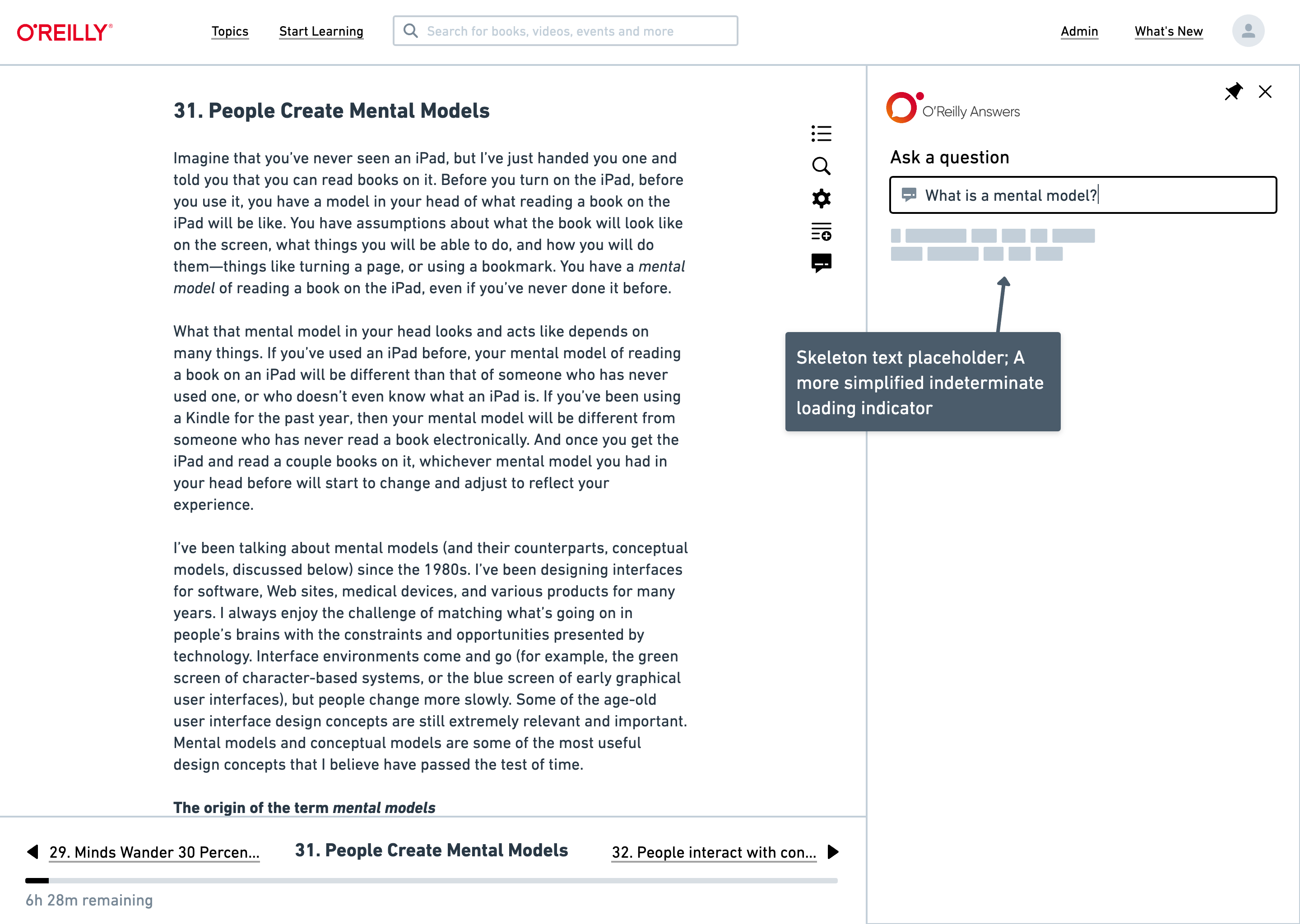
Simplified system feedback.
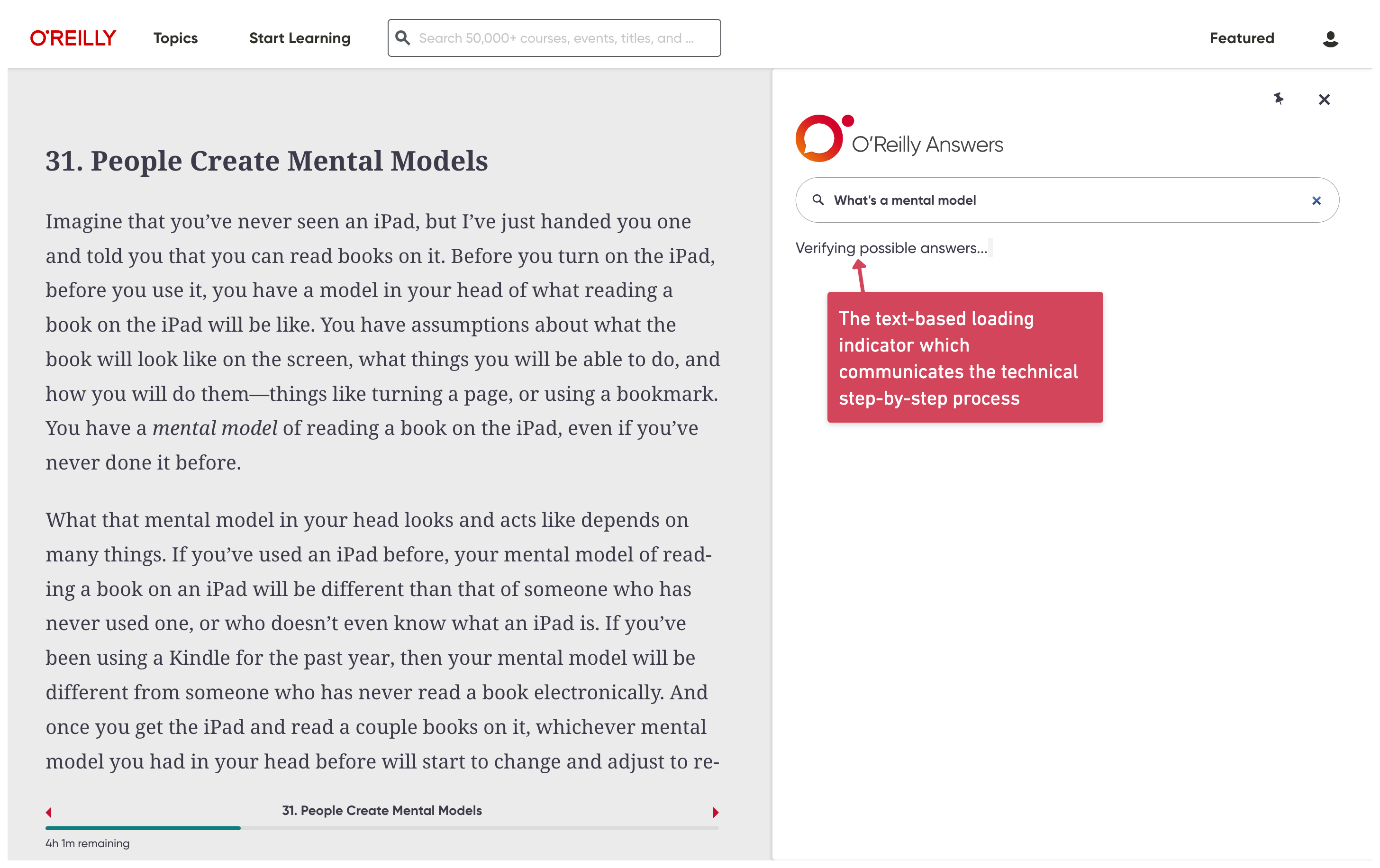
Instead of exposing technical processing steps while answers were generated, I replaced the loading experience with an indeterminate skeleton state that clearly communicated progress while reducing cognitive load.
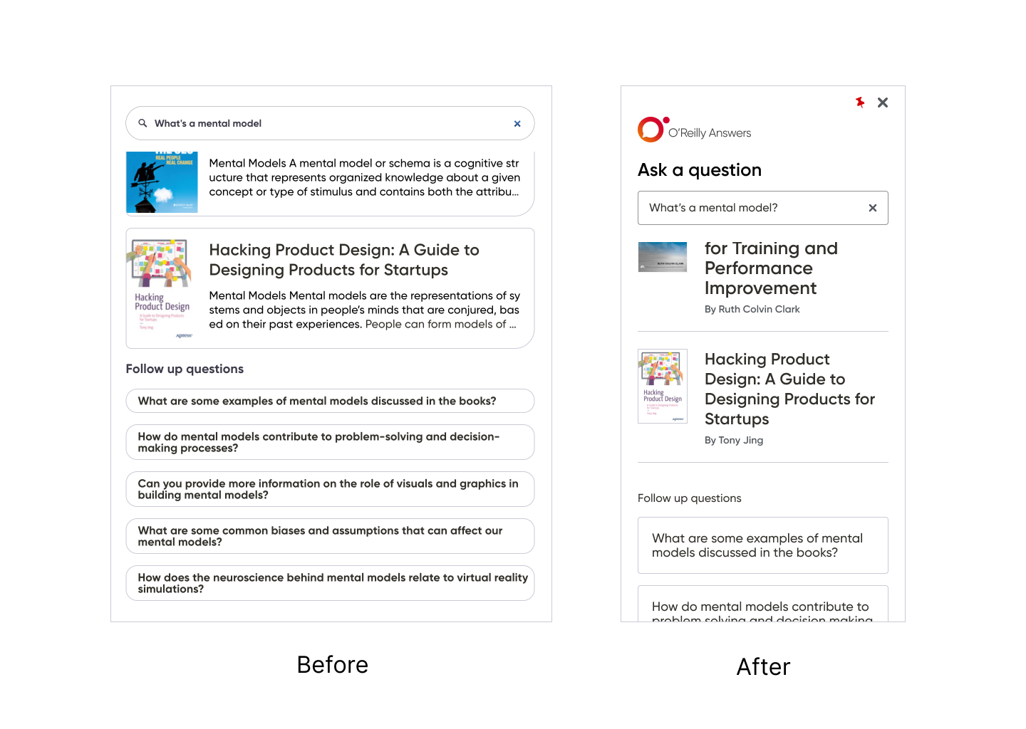
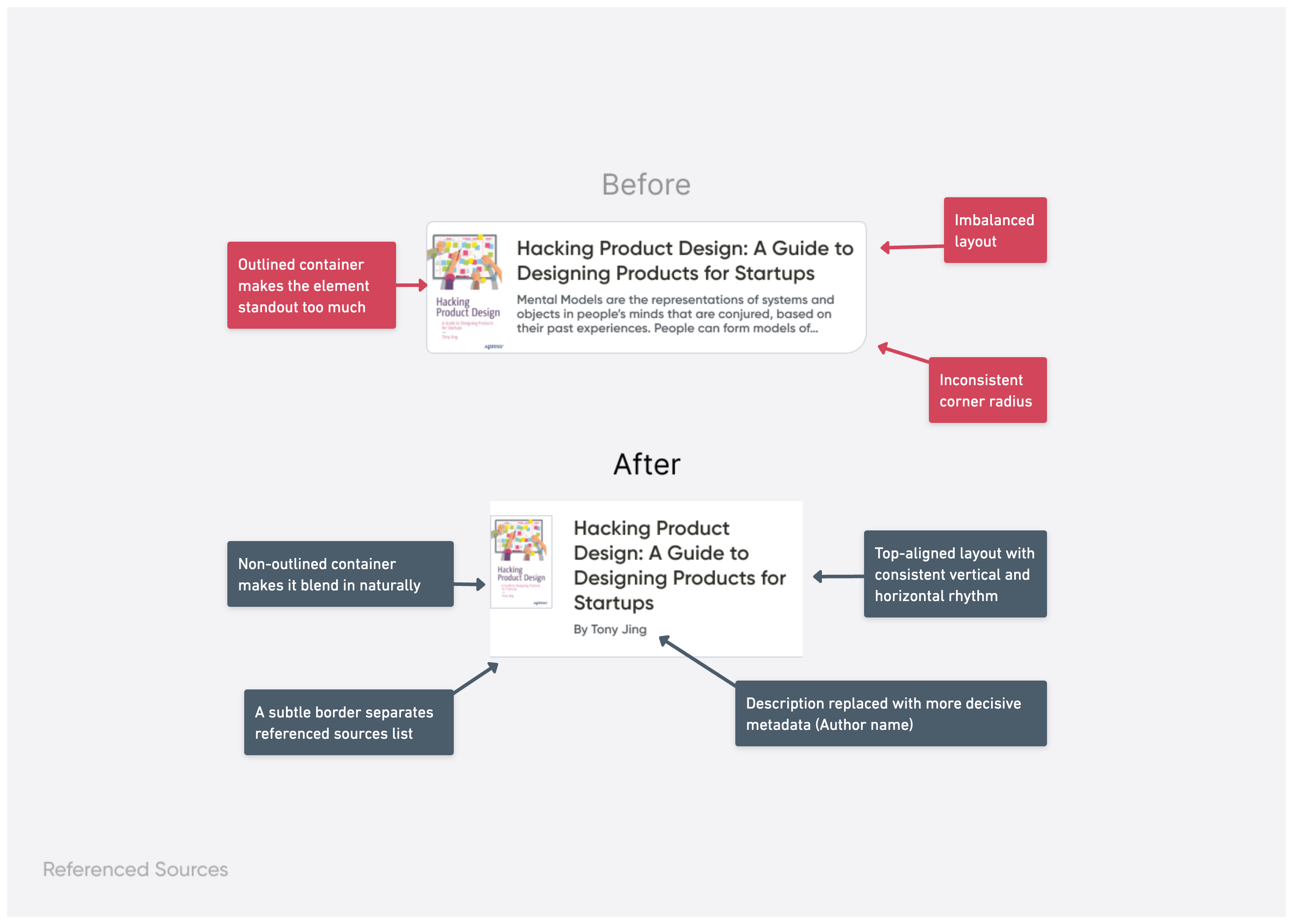
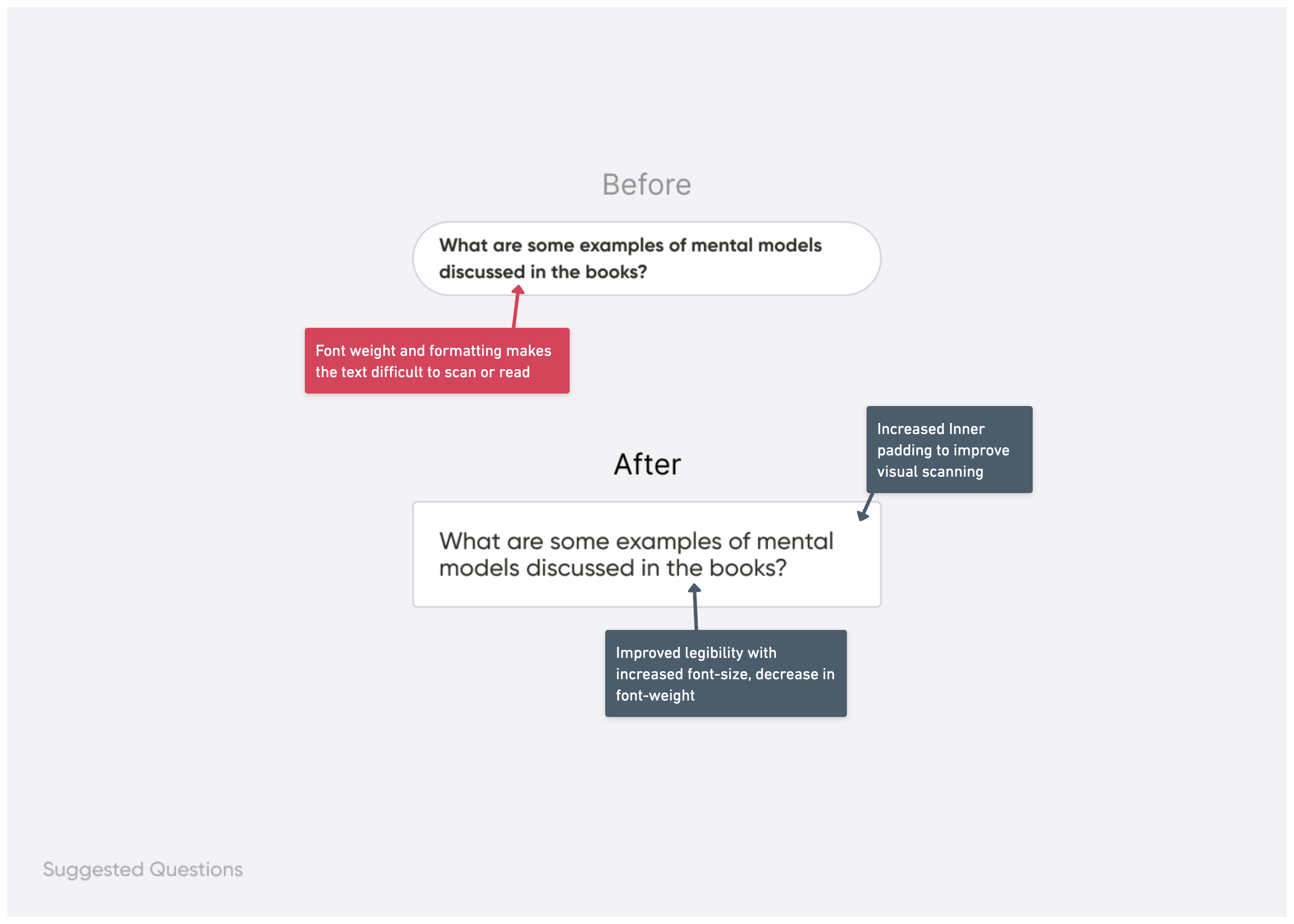
Aligned the experience with the design system.
I updated the answers panel, referenced sources, and follow-up questions to match the platform’s current design system, creating a more cohesive reading experience.
Focusing the first release on stakeholder goals
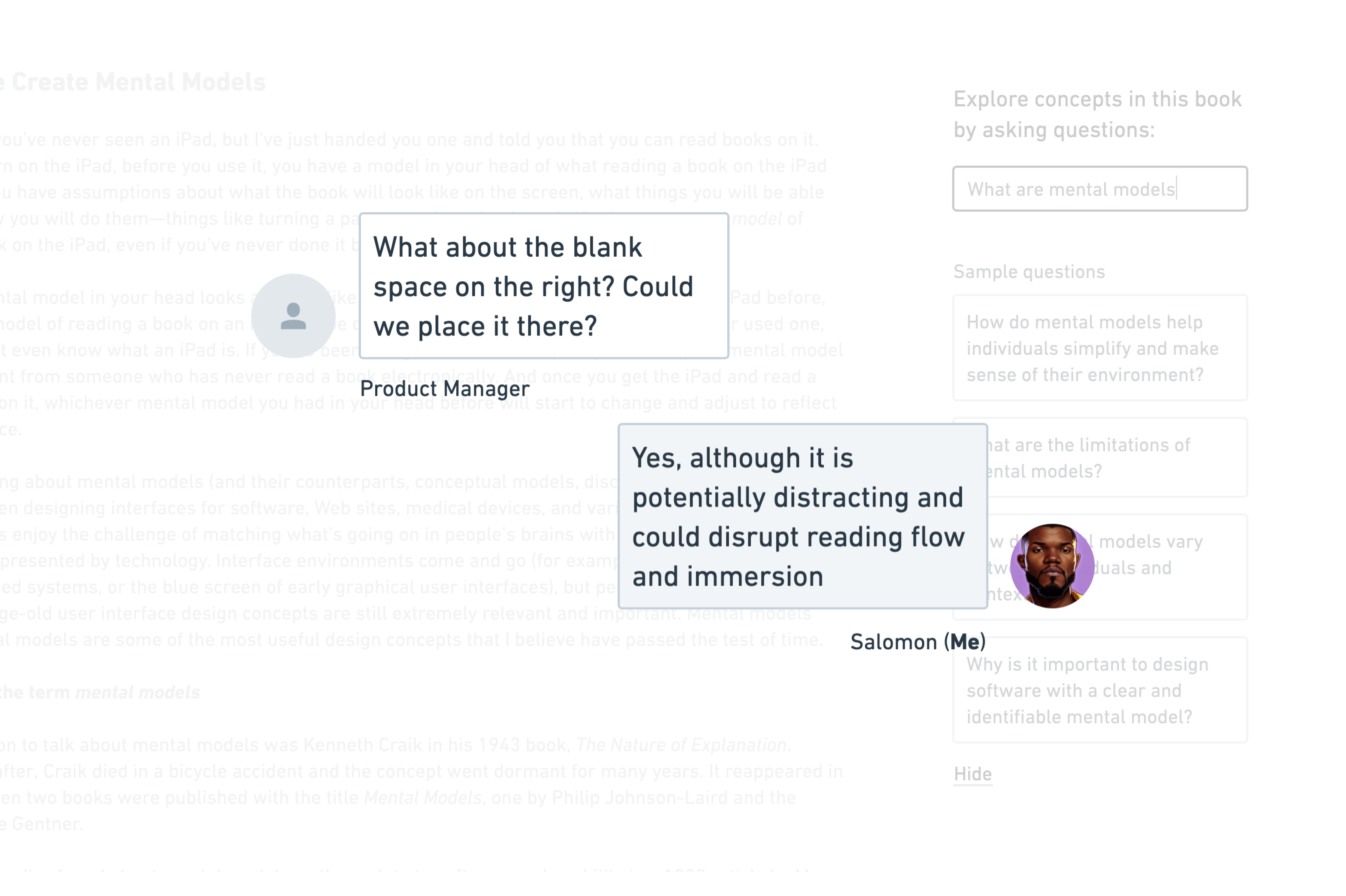
After discussing the project’s history with the Product Manager, we agreed that addressing stakeholder concerns while protecting the user experience was the best strategy for a successful initial release.
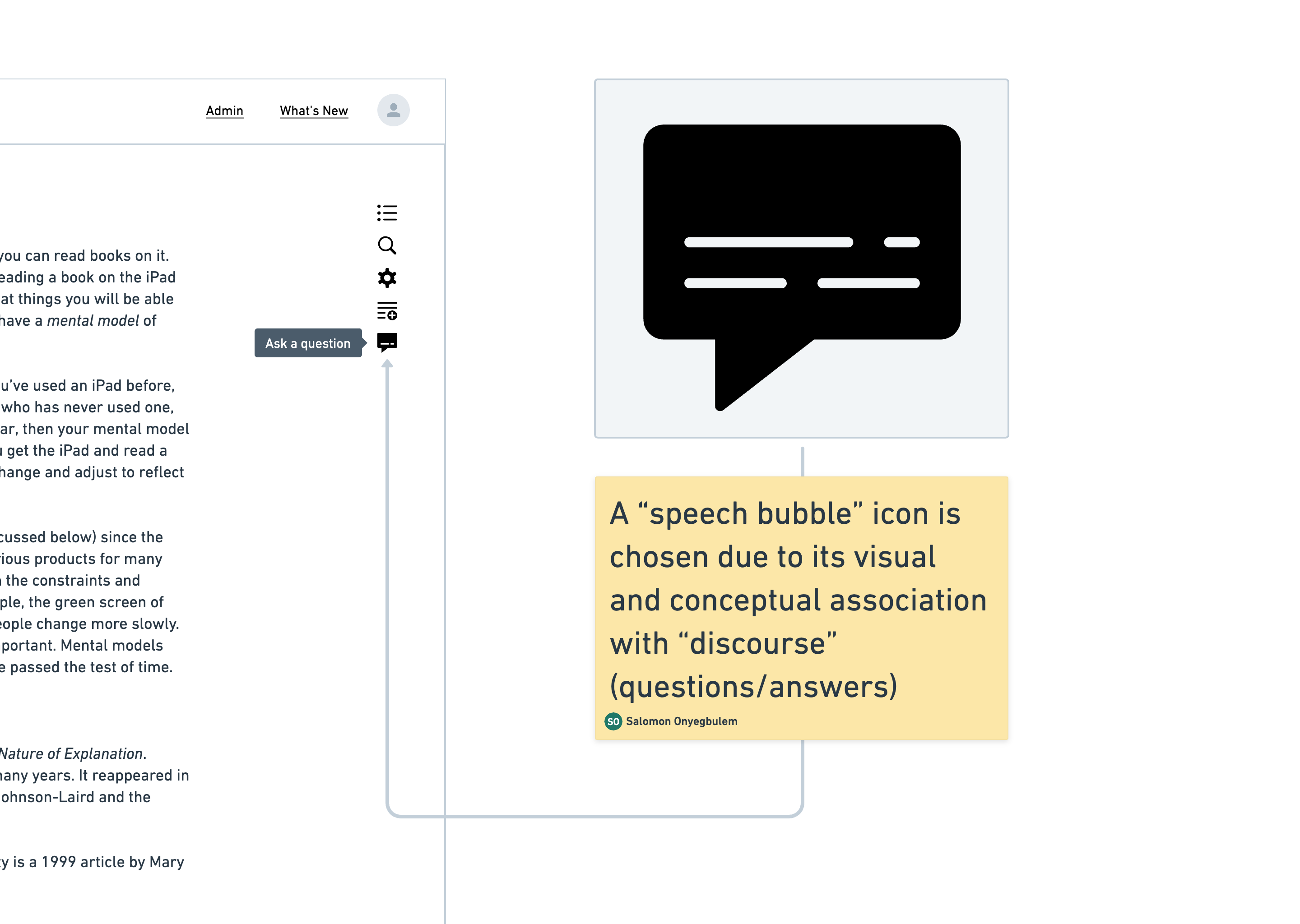
When stakeholders described the affordance as ‘too subtle,’ I investigated the underlying concern rather than immediately producing alternatives. The real objective was increasing discoverability and adoption.
Balancing discoverability with reading flow
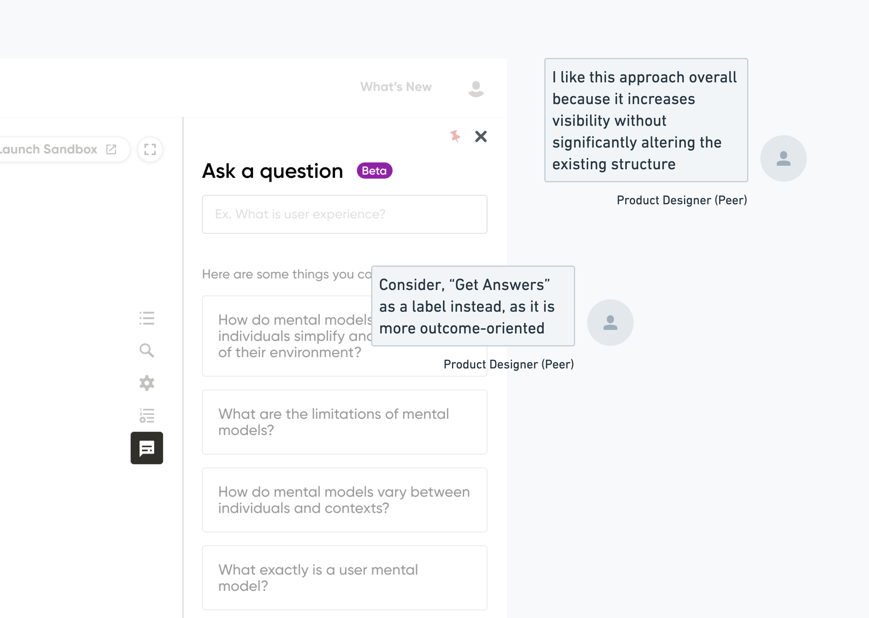
Rather than introducing a visually dominant button, I proposed displaying the panel by default for targeted users while allowing it to be dismissed and restored intuitively. This achieved stakeholder goals without disrupting immersion.
I shared the design with the Product Design team to gather feedback, ensure consistency, and create awareness of how the new capability fit within the broader platform.
Supported engineering through implementation
After approval, I created a high-fidelity prototype that served as engineering’s source of truth. I attended stand-ups, answered implementation questions, clarified design intent, and performed quality assurance throughout development.
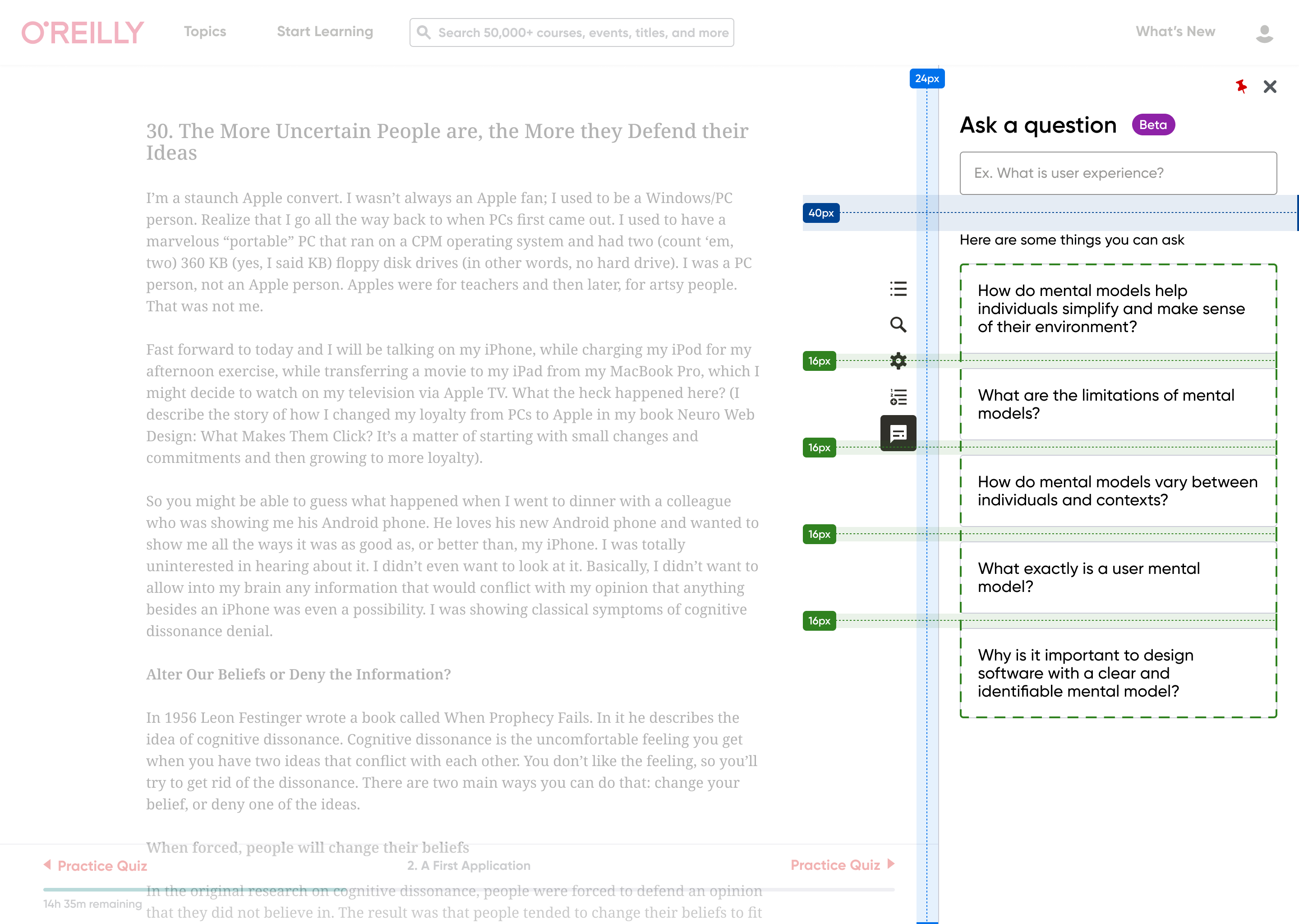
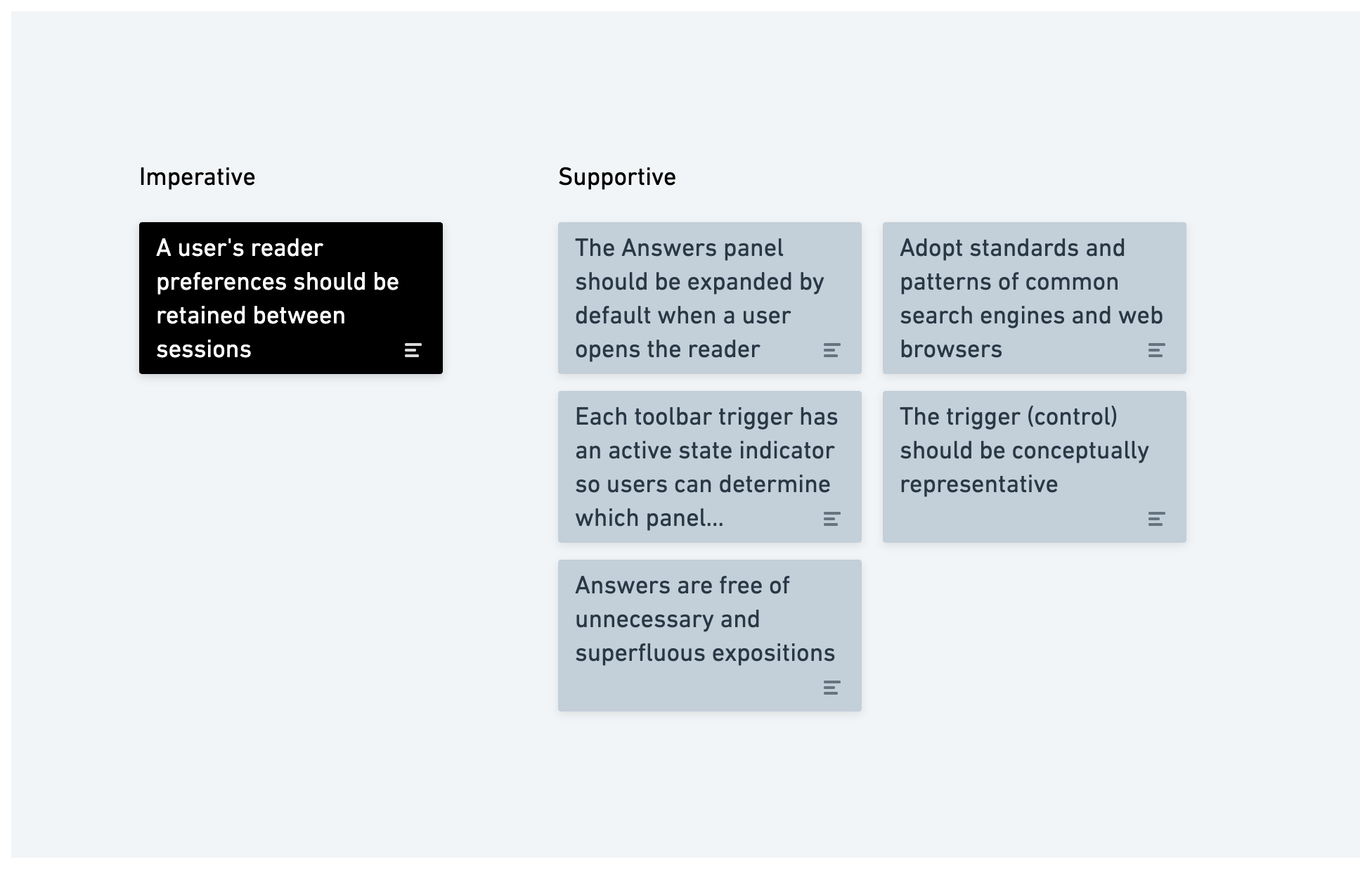
The final design differed only slightly from the initial concept because aligning stakeholders on goals proved more valuable than repeatedly redesigning the interface.
Identified future research opportunities
The feature demonstrated technical feasibility, but future research should validate assumptions about learner behavior, AI usefulness, answer quality, and whether users prefer embedded assistance over external resources.
Assumptions on its utility and desirability
There’s the overall assumption that learners often have questions while reading a book, indicating that there’s a natural inclination for users to seek additional information or clarification during their reading.
We assume that users would find it convenient or would prefer to access answers within the same environment they are reading, rather than using an external source (like Google, Quora or Stack exchange – sources which many users already use and trust)
We also assume that learners are motivated to seek answers to their questions as part of their learning process while reading a book, indicating a strong motivation for self-directed learning.
Assumptions on technological feasibility
There was an assumption that the 2024 state of Artificial intelligence and Machine learning technology made it feasible to provide real-time answers to a wide range of questions related to various books and topics.
There’s also the presupposition that real-time answers provided by such a system would be accurate, reliable, and relevant to users‘ questions and that there exists a source of information that the system can reference (or be trained with) to generate real-time answers.