Case Study
Optimizing hands-on learning experiences
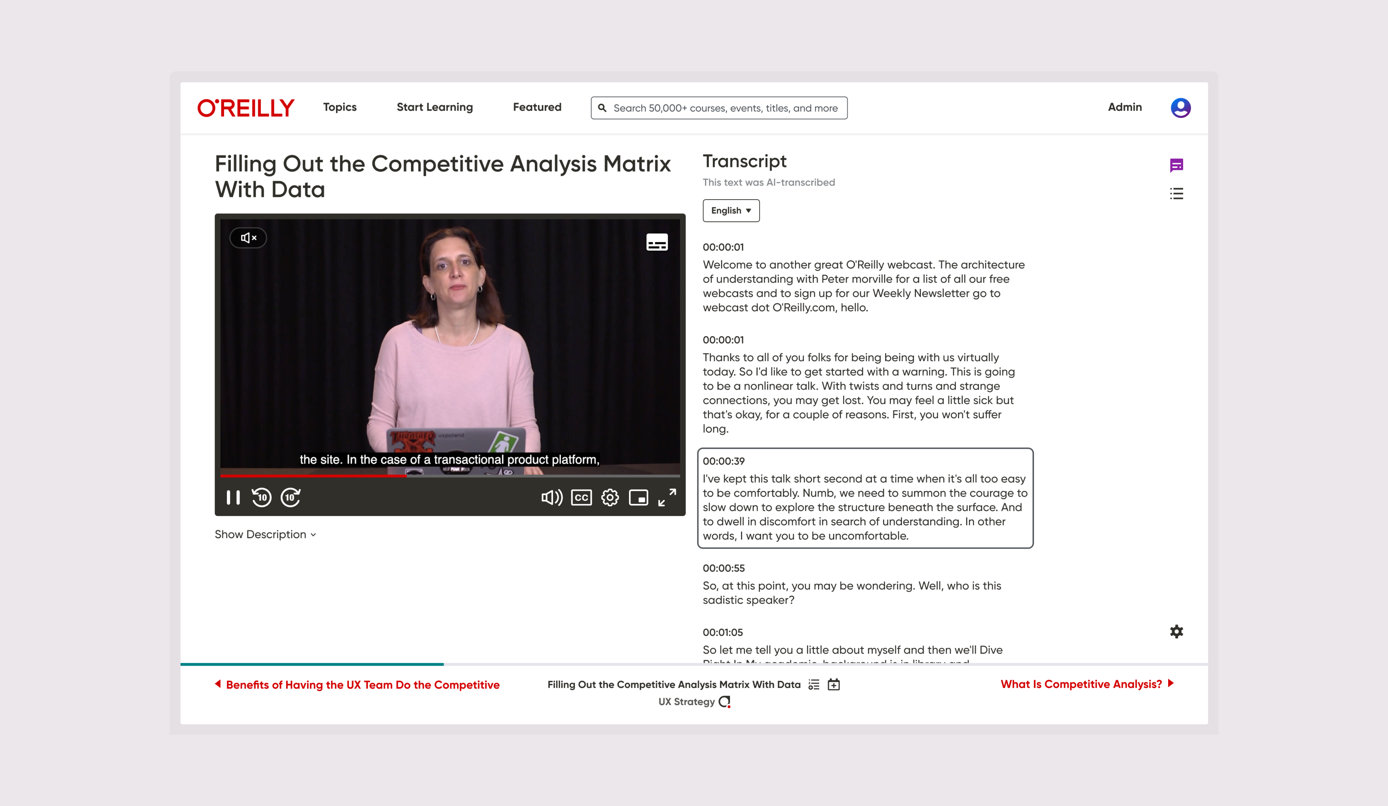
I led design for interactive learning experiences on the O'Reilly learning platform for 4 years. I designed flows to support content discovery and refined core hands-on learning user interactions for cloud-based IDEs (Integrated development environments).
I transformed O’Reilly’s hands-on learning experience into a more intuitive, efficient, and accessible product.
From 2021 to 2024, I was embedded within one of O’Reilly’s cross-functional product teams responsible for the hands-on learning experience. My work supported learners, educators, and organizations creating technical training programs that help people develop practical skills in open-source technologies.
Hands-on learning bridges the gap between theory and practice. Rather than simply consuming content, learners apply new concepts by completing real coding tasks in live development environments. My team is responsible for the product experience that enables those interactions, providing the tools and workflows authors use to create labs and learners rely on to build confidence through practice.

This case study examines the product challenges, design decisions, and trade-offs involved in creating a more intuitive, engaging, and effective learning experience for developers.
I defined the interface, interactions, and workflows that enable hands-on programming within O’Reilly’s interactive learning platform.
O’Reilly’s learners use hands-on labs to apply new concepts, practice coding, and experiment with unfamiliar technologies and programming languages in live development environments.
Because the interface is the primary medium through which learners engage with these experiences, its usability has a direct impact on their ability to understand instructions, complete programming tasks, and remain focused on learning rather than the tooling itself.
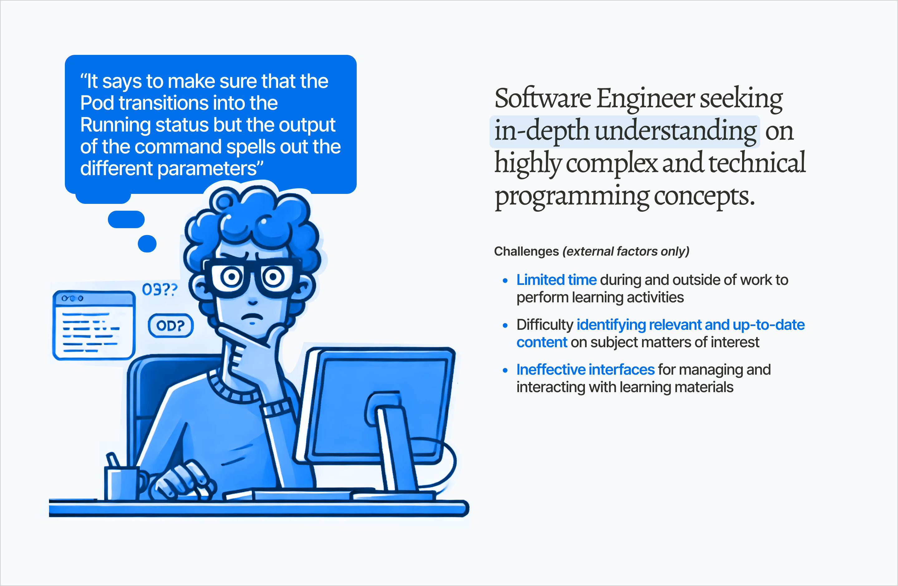
I lead the definition and design of the Interactive team’s learner-facing experiences, shaping how developers engage with O’Reilly’s hands-on learning content.
Working alongside three Product Managers, seven senior Software Engineers, and a Senior Project Manager, I helped translate user needs, business objectives, and technical constraints into product experiences that support effective learning.
My tasks and responsibilities (what I do)
- Leading research to understand learner behavior, uncover unmet needs, and identify opportunities to improve the hands-on learning experience.
- Synthesizing qualitative and quantitative insights to understand how—and why—learners engage with interactive content and using those findings to inform product direction.
- Defining interaction models, user flows, and interface behavior that enable learners to complete coding tasks efficiently while minimizing cognitive effort.
- Partnering with Product Management to establish measurable feedback loops, evaluate product outcomes, and guide future iterations with evidence gathered from production.
Designing key elements, flows, features and interactions:
While my work spans the end-to-end learner journey including content discovery and browsing experiences, my primary focus is the in-content learning experience, where learners spend approximately 96% of their time on the platform.
The sections that follow explore the core workflows and interface components that shape this experience, highlighting the product decisions, interaction models, and user-facing capabilities I led from concept through implementation to improve the discoverability, usability, and overall effectiveness of hands-on learning.
Individual learning experiences are represented as cards throughout the platform.
Content cards serve as the primary building blocks of content discovery across landing pages, search results, and browse experiences.

- By design, cards feature technology logos which aids users when scanning to visually identify relevant or related content more easily (images are more quickly cognitively processed than text)
- The layouts adapt to accommodate various content length. As it is part of our content strategy to consistently display full titles, text is never truncated but instead wraps to a new line when horizontal space is limited.
- Their height extend dynamically to allow wrapping titles to preserve the layout’s integrity and prevent content overlap.
- The presentation is primarily text-dominant; This reduces our over-reliance on imagery and custom assets, and limits the cognitive load caused by excessive imagery.


Each browsing experience organizes available learning content to help learners efficiently discover, evaluate, and select the material most relevant to their goals.
Learners browse collections of available lessons to discover content relevant to their learning goals. I designed these experiences to minimize visual noise, allowing the content itself to take precedence and making it easier for learners to scan, compare, and evaluate available options.
A restrained visual hierarchy reduces unnecessary cognitive load, helping learners identify relevant information quickly without distracting from the learning material.

I designed the browsing page to optimize for content find-ability and discoverability; topics are listed alphabetically in a sidebar and represented as selection controls. Popular topics and topics of interest are featured at the top of the results as selectable tiles for quick access.

An aesthetically minimal interface allows the text-dominant content to stand-out. Spacing is applied intentionally following 4px ratio to create vertical and horizontal rhythm.

Because learners spend 96% of their time within the learning experience itself, usability improvements were concentrated where they would have the greatest impact.
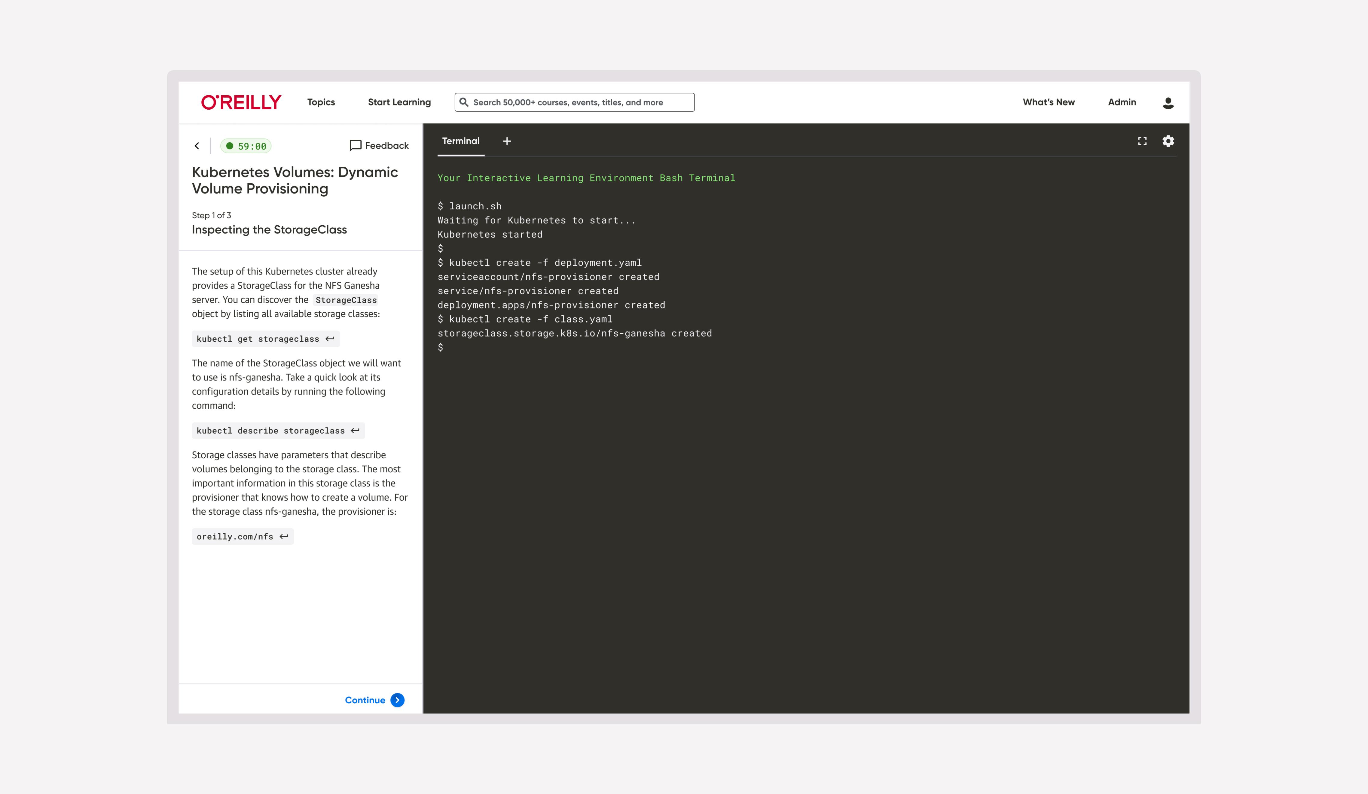
At its core, the hands-on learning experience revolves around following instructions while completing coding tasks within an IDE, a terminal, or both.

- I introduced a persistent session timer after discovering that hands-on labs were subject to time limits imposed by resource allocation constraints. By making remaining session time continuously visible, learners could better manage their progress, anticipate session expiration, and avoid unexpected interruptions.
- The instructional content remains anchored within a fixed sidebar, allowing learners to reference guidance without losing context as they work. I carefully considered typography, spacing, hierarchy, readability, and accessibility to ensure the experience supported prolonged reading while meeting both authoring and learner needs.
- The sidebar also serves as the primary interaction hub for the learning experience, providing contextual actions such as copying code, executing commands, and revealing solutions. Each interaction was designed with a consistent visual language and predictable behavior to minimize cognitive effort and keep learners focused on solving programming challenges rather than learning the interface.


Navigating technical constraints, identifying edge cases, and making thoughtful trade-offs to improve usability.
Design decisions were often shaped by input from multiple stakeholders, each bringing different priorities, perspectives, and ideas of what constituted an ideal learning experience. Feedback frequently extended beyond the interface itself to include content, structure, formatting, and instructional approach.
My role was to reconcile those perspectives by grounding discussions in user needs, product goals, and technical constraints. This involved managing expectations, advocating for learners, and making deliberate trade-offs that balanced usability, performance, and implementation feasibility.
Communicating system status
Hands-on labs are live, time-limited environments that rely on a stable internet connection. As a result, sessions can expire or disconnect unexpectedly due to network interruptions.
Previously, these state changes were poorly communicated, leaving learners with unresponsive environments and little indication of what had happened. This often resulted in confusion and frustration, particularly while actively writing code.
After identifying the impact this had on the learning experience, I advocated for treating lab state communication as a core usability concern. I defined the interaction logic and designed a system of contextual states that clearly communicated session status, guided learners through recovery, and set appropriate expectations throughout the experience.

Adapting to technical constraints
Technical constraints are not always apparent during discovery and often emerge as implementation progresses. My approach is to first define the ideal user experience, then collaborate closely with engineering to understand system capabilities and refine the solution as technical realities and edge cases become clearer.
For example, my initial design distinguished between connection failures during lab initialization and unexpected disconnections after a session had already started. From a learner’s perspective, these scenarios required different guidance and recovery paths. During implementation, however, we discovered that the platform lacked the observability needed to reliably differentiate between these underlying failure states. Rather than introducing inaccurate or misleading feedback, we simplified the interaction model to communicate what the system could determine with confidence while still providing learners with clear expectations and actionable next steps.

Bridging the gap between design and implementation
In most front-end applications, the codebase serves as the source of truth. Our implementation, however, introduced an additional layer of complexity: interface components inherited styles from multiple front-end frameworks simultaneously. As a result, the rendered interface did not always reflect the intended implementation, even when the underlying code was technically correct.
This frequently surfaced during the QA phase, which I led in close partnership with engineering. Rather than validating designs alone, QA often involved tracing visual inconsistencies back through competing style definitions to determine whether the issue originated in implementation, framework inheritance, or design intent. Understanding these constraints enabled us to distinguish genuine defects from architectural limitations and arrive at practical solutions together.
Balancing design intent with implementation often requires more than validating code. While the correct values may be applied to the appropriate properties, the rendered interface doesn’t always reflect the intended outcome and frequently requires further refinement.
Every engineer reads a design differently
Some engineers can implement a design with remarkable precision from a clickable prototype alone. Others want every spacing value, interaction, edge case, and behavioral nuance documented before they’re comfortable moving forward—and occasionally a reminder or two along the way.
Rather than expecting everyone to work the same way, I learned to tailor my communication to each collaborator’s preferred workflow. Whether that meant lightweight prototypes, detailed specifications, or frequent implementation reviews, the goal remained the same: establish a shared understanding before writing code.
Leading quality assurance at scale
As part of the design and development process, every UI change undergoes quality assurance before reaching learners. I led the initial rounds of QA, validating that each implementation faithfully reflected the intended interaction and visual design while identifying regressions early in the release cycle.
The challenge was one of scale. Even seemingly small interface changes affected more than 1,000 hands-on labs, making exhaustive manual verification impractical within delivery timelines. Rather than relying solely on individual lab reviews, I worked with the team to establish a more scalable validation approach. One that allowed us to confidently ship the new experience while quickly identifying and prioritizing labs that required further attention after implementation.
This approach balanced release confidence with delivery speed, enabling the migration of over 1,000 labs to the new interface without making comprehensive manual verification a prerequisite for every release.
Designing a scalable feedback loop
Migrating more than 1,000 hands-on labs to a new interface presented a practical challenge: while every lab could be individually reviewed, doing so would have significantly delayed delivery and still offered no guarantee against future issues. We needed a scalable way to identify problematic labs once they reached production.
To address this, I designed the end-to-end feedback experience as an operational mechanism rather than simply a feature. Released alongside the UI migration, it enabled learners to report issues directly from within a lab, allowing us to quickly surface and triage content requiring attention.

A key design decision was distinguishing general product feedback from reports of broken functionality. I introduced two clear reporting paths, including “The lab is not working”—a deliberately unambiguous label intended to reduce interpretation and ensure critical issues could be prioritized immediately.

The system has since generated more than 100 learner reports, providing a continuous stream of real-world insights. While it successfully identified problematic labs, the data also revealed a broader pattern: the majority of reported issues were related to platform performance, stability, and session persistence rather than the interface itself.
This shifted the conversation from “Is the new UI usable?” to “What underlying system issues are preventing learners from succeeding?” The feedback mechanism became valuable not only for maintaining content quality, but also for informing future product priorities with evidence gathered directly from production.
Once usability was no longer the dominant source of friction, the remaining challenges became far more visible.
With the interface redesigned and optimized for usability, learners were able to focus on following instructional content and completing hands-on coding tasks with no friction. The absence of significant usability-related feedback provided confidence that the redesigned experience was meeting its primary objective.
Learner reports however, consistently pointed to platform performance, session stability, and data persistence as the primary barriers to success. In other words, the redesign helped isolate the underlying system issues that continued to impact learner outcomes and provided clear evidence for where future product investment should be directed.
Post-launch reflections
Since launch, the overwhelming majority of learner feedback has centered on platform performance, session stability, and functional reliability rather than the usability of the interface itself. While this doesn’t suggest the experience is perfect, it does provide confidence that the redesign successfully removed usability as a primary source of friction.
For me, that’s one of the most rewarding aspects of product design. The best user experiences often go unnoticed—not because they lack impact, but because they allow people to focus entirely on accomplishing their goals. When the technology fades into the background and learners can simply learn, the design has done its job.
I redesigned the UI, and when the metrics didn’t meaningfully change, I investigated why. That investigation revealed the true bottleneck wasn’t usability, it was system reliability.
I deliberately prioritized usability, performance, stability, and efficiency over cosmetic modernization. The goal wasn’t simply to create a more visually contemporary interface, but to remove friction from the learning experience where it mattered most.
A meaningful observation
Despite significant investments in modernizing the interface over several years including the usability improvements described throughout this case study, our primary engagement metrics, such as session duration and session frequency, remained relatively unchanged. Rather than viewing this as a design failure, I saw it as evidence that the interface itself was no longer the limiting factor.
My research and experience suggest that developers are remarkably tolerant of minor visual imperfections. What they are far less willing to tolerate are interruptions that prevent them from accomplishing their goals: performance degradation, session instability, network interruptions, data loss, excessive latency, and unnecessary cognitive overhead.
These observations helped shift the conversation from “How can we make the UI better?” to “What is actually preventing learners from succeeding?” I documented these findings and identified the product qualities most likely to influence learner success and long-term business outcomes, providing the team with a clearer direction for future investment.