Case Study
Designing a scalable content experience
I owned the learning experience on the O’Reilly learning platform and led various feature releases and design enhancements since 2022, This case study covers my work optimizing the core interface to support feature releases planned for Q2 - Q3 of 2024. My work was released to all of O'Reilly's users in August 2024 and led to improved user satisfaction and a 15% increase in content engagement as a result.
Redesigned the in-content experience to support future growth.

I led the redesign of O’Reilly’s in-content learning experience to create a UI framework that could scale with the platform’s expanding feature set. This case study explains why the work was initiated, the design decisions that shaped it, and the implementation challenges I navigated along the way.
The existing interface could not accommodate the growing number of features planned for 2024.
Over time, new controls had been added to the same area of the interface, weakening its information architecture and making relationships between features increasingly difficult to understand.

Product stakeholders were concerned that continuing this approach would negatively affect customer perception and the overall quality of the platform. From a UX perspective, leaving the problem unresolved would make the interface harder to learn and navigate as additional functionality was introduced.
I developed a conceptual framework that defined where and how features should appear throughout the interface.
Working closely with product stakeholders, I mapped controls according to usage frequency, functional purpose, and impact scope because those characteristics most directly influenced placement and presentation.

The resulting conceptual model created a shared understanding of how the interface should evolve while providing a consistent decision-making framework for future enhancements.
I used conceptual modeling to align cross-functional teams
I first introduced conceptual modeling to O’Reilly’s Product Design organization in 2022 to help teams align on complex product requirements. I reintroduced the approach for this initiative to establish shared understanding and create alignment across product, design, and engineering.
While stakeholder alignment was important, the success of this project depended on creating a logical UI framework that would continue to scale as new capabilities were introduced.
Because learners would ultimately experience these decisions firsthand, validating them with users was essential. Our Chief Product Officer approved usability testing, allowing me to evaluate the proposed layouts before engineering implementation.
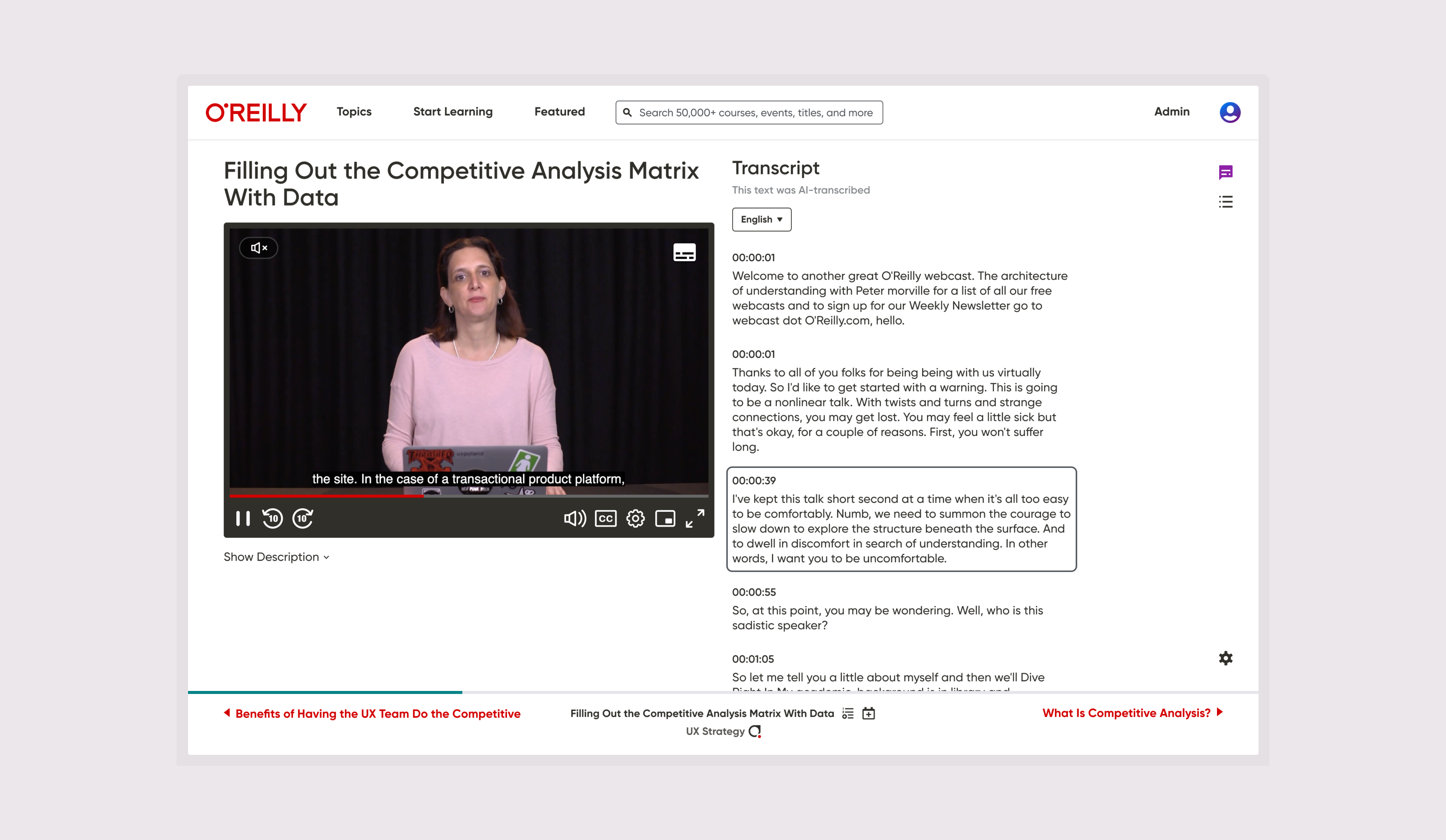
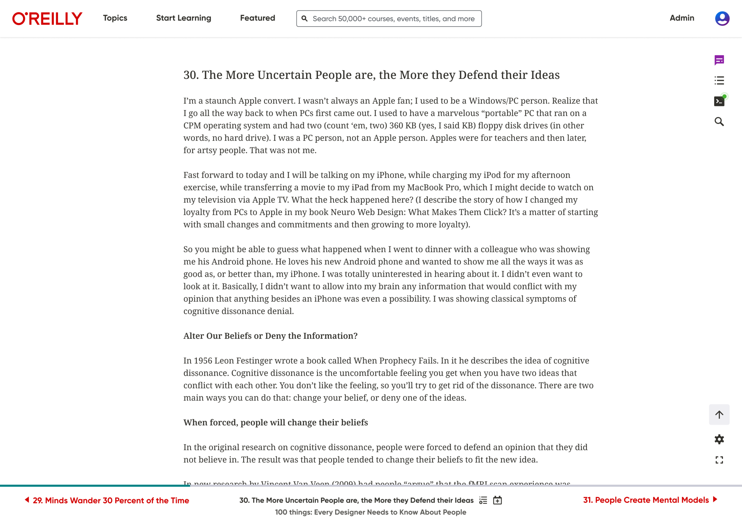
The following examples highlight the resulting designs for both video and text-based learning experiences.
I made badge eligibility visible without adding interface complexity
I moved the content title into the bottom navigation to create space for badge eligibility indicators. Placing the badge icon alongside the title allowed learners to easily recognize eligible courses and claim badges once they met the required criteria.

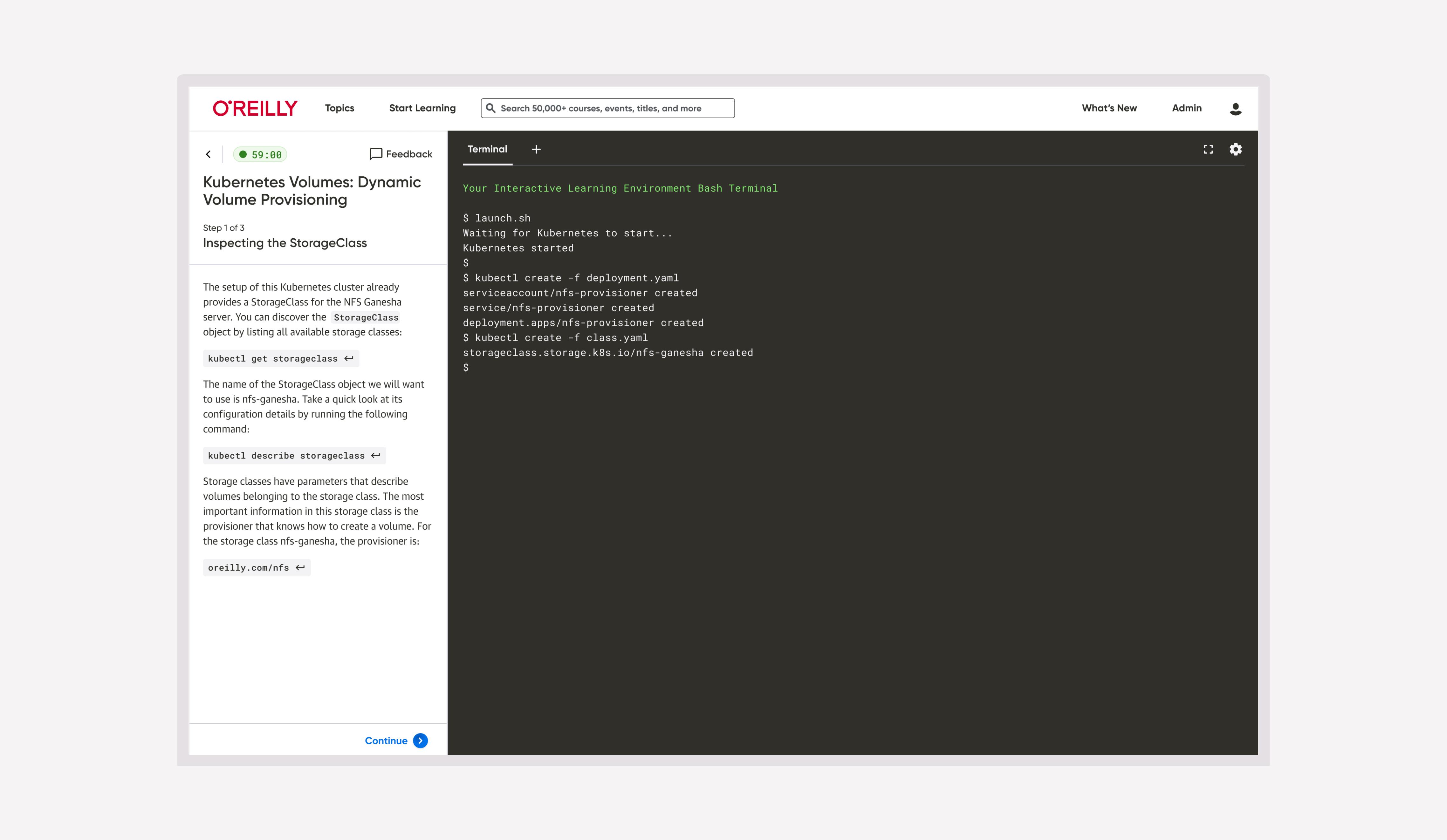
Integrated coding tools into a consistent learning tools framework.
For books that support hands-on coding, I represented the sandbox as part of a dedicated group of learning tools in the upper-right corner of the interface. Grouping related capabilities together improved consistency while keeping instructional content as the primary visual focus.

Following several stakeholder reviews, I finalized the design direction and conducted an unmoderated usability study with eight participants.
The study evaluated discoverability and usability across several key tasks.
Users easily located reading preferences
Participants were asked to increase the text size while reading a Python book. Every participant quickly identified the settings control, demonstrating that the preferences menu was both discoverable and intuitive.

Sandbox discoverability required further refinement
Participants were asked to access the coding sandbox to practice Python examples. Although everyone eventually completed the task, half required more than 30 seconds, resulting in an average completion time of 35 seconds.

I concluded that the terminal icon was unfamiliar to many participants outside software engineering. I recommended replacing it with an icon more closely associated with hands-on coding to improve recognition across a broader audience.

AI assistant was easy to find but expectations were evolving.
Participants located the AI assistant in an average of nine seconds and responded positively to its availability. Several expected AI functionality to be represented by a star icon, reflecting emerging conventions at the time of the study.


Improved perceived performance by removing unnecessary motion.
While auditing the interface, I identified animation effects that introduced noticeable input lag during layout changes. I removed these poorly implemented interactions, resulting in a more responsive interface and a stronger sense of functional stability.


Strengthened orientation within long-form content
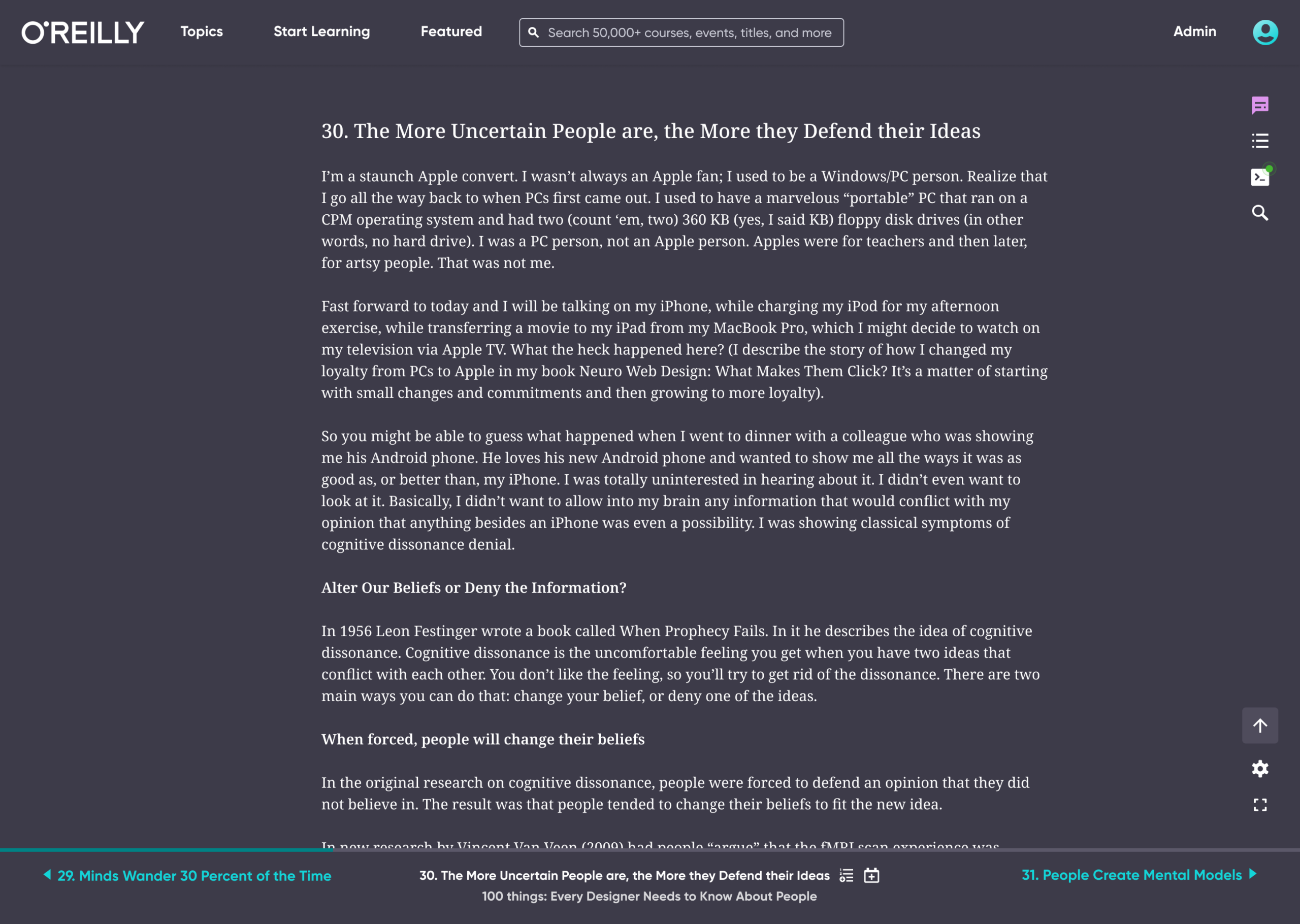
I redesigned the active table of contents state to make learners’ current location immediately recognizable. Distinct background treatment and a colored vertical indicator clearly differentiated the active module from surrounding content in both light and dark themes.


Improving engineering handoff through clearer implementation guidance
Engineering teams primarily worked from Jira tickets, but supporting design assets were not always referenced during implementation. As a result, interaction details such as focus states and keyboard accessibility were occasionally omitted because they were assumed rather than explicitly documented.

To reduce ambiguity, I created supporting implementation guidance, including a reusable spacing system after the team temporarily lost access to Figma Dev Mode. These resources helped engineers implement layouts more consistently while reducing design discrepancies during QA.

I continued supporting implementation throughout development by answering questions, providing clarification, and identifying issues during quality assurance. The experience reinforced how comprehensive design specifications directly improve implementation quality and reduce rework.

Established a scalable framework with stable product outcomes
The redesign was released to 100% of users at the end of August 2024. Beyond improving overall satisfaction with the interface, the project established a formal conceptual model and UI framework that stakeholders continue to reference when determining how future capabilities should be integrated.
Because this initiative was preventative rather than optimization-focused, success was measured by preserving existing performance rather than driving KPI improvements.
Metrics remained stable throughout the rollout, confirming that the redesign successfully accommodated future growth without disrupting the learner experience.